• Here is a plot I made showing which seeds advanced to the round of eight (green), eliminated in round of 16 (blue), or eliminated in the group stage (black).

    Some thoughts:

    • The only group that didn’t advance anyone to the final 8 was the “group of death”, group F.  France, Germany, and Portugal all lost their games in the Round of 16.  That’s the last two World Cup Champions and the last Euro Champion all eliminated.
    • Of the 8 teams to advance, three of them finished third in their group.
    • One 3 of the 6 group winners advanced to the Quarterfinals (England, Italy, Belgium).
    • Groups A, B, and D each had two teams advance.
    • Belgium and Italy who play each other in the Quarterfinals combined for 6 wins, 0 losses, 0 ties, and 18 points in group play.  The other 6 teams earned 26 points TOTAL from 7 wins, 7 losses, and 4 ties.
    • Two teams in the final 8 had two losses in the group stage (Denmark and Ukraine).
    • There were 7 teams that had 0 losses in the group stage.  Only 3 advanced to the Quarterfinals (Spain, Belgium, Italy).  And all three of these teams are on the same side of the bracket.
    • If you are wondering how the matchups in the knockout stage were decided, check out this wikipedia page. Cheers.   And go Denmark, Switzerland, and Czech Republic!

  • Below are Luke Benz’s Euro Cup 2021 predictions from June 10.  You should all be following Luke.

    Some thoughts on June 28:

    • The Czech Republic only had a 15% chance of reaching the quarterfinals!  And the Netherlands had the second highest probability of making the quarterfinals.
    • Belgium will play Italy in the quarterfinals.  That could have been a final.  Meanwhile, as Luke pointed out to me, either Denmark or Czech Republic will end up in the semi-finals.
    • England will not win this tournament.
    • Totally unrelated to this, it’s always weird when I remember that GREECE won Euro 2004.  GREECE!

  • This paper from the December 2020 issue of JQAS is wonderful: A Bayesian marked spatial point processes model for basketball shot chart.

    Simply put, the build a model looking at where players are taking shots and then given a location, how often are they making shots from those locations.

    I’m particularly interested in this point from the paper:

    The preferred models for all four players, which are intensity independent model for Curry and intensity dependent model for other three players, can reduce the MSE by 2.7, 1.3, 2.0, and 7.0%.

    I think the correct way to interpret this is that three of the players analyzed have different chances of making a shot based on where they shot is taken.  But for Curry, the probability he makes a shot is INDEPENDENT of where he is taking a shot.  Basically he’s just good everywhere.  (If this is NOT the correct interpretation, let me know!)

    I’d love to see the analysis expanded to all players in the league and see who else would end up with an intensity independent model.

    Cheers.


  • I made a shiny app for organizing openmics in Chicago.  (Yes, I’ve started doing stand up.  No, I’m not good……yet.)

    The code for making this app can be found on my github.

    And the wonderful Shiny cheatsheet can be found here.

    The real key for me to get this to work was the addition of the global.R file.  I didn’t realize you could add this along with the ui.R and server.R files.  I HIGHLY recommend the global.R file in your shiny apps.  I’m going to use this as an example of a shiny app in my Data Science 101 course that I am developing and will teach for the first time Spring 2022.


    Cheers.


  • So I’m working on an aging curve in baseball research project with two of my students here at Loyola.  While there has been quite a bit of work done on aging curves in many sports, including baseball, our question that we are interested in is this: What would the aging curve look like if players played every season from the age of 22 through 40.  Because what we observe are the players who “survive”.  What WOULD have happened if a player who was forced out of the league at the age of 30 had played until they were 40?  We view this as a missing data problem and are currently using multiple imputation with a hierarchical structure to impute missing seasons and then estimating the age curves based on the imputed data.  I’d like to do the aging curve estimation using functional data analysis, but……we’ll see.

    Anyway, I’ve started doing some lit review for this and I figured I’d post some of the interesting articles that I’ve found related to the topic:

    Albert (1992) looks at estimating models for home run rates and as part of this Albert incorporates an aging curve into his model.  A quadratic form is assumed for aging curve.

    Berry et. al (1999) incorporates an aging curve into their analysis, but instead of a quadratic form they use a nonparametric model.  They looked at hockey, golf, and baseball.  (Albert (1999) in a comment argues against the aging model presented in Berry et. al. (1999).

    Fair (2008) looks at aging curves in baseball and follows from previous work that looked at aging curves in running, swimming, and chess. (Fair (2007)).

    Wakim and Jin (2014) take a function data analysis approach to the problem and look at MLB and NBA.  This is probably the most sophisticated statistical analysis that I have seen so far in regards to aging curves.

    Dendir (2016) in the Journal of Sports Analytics looks at when soccer players peak and, based on their analysis, found that players in top leagues peak somewhere between 25 and 27.

    Vaci et. al (2019) looked at aging curve in NBA players.

    This is clearly not an exhaustive list of paper related to aging curve in sports, but it’s some of the interesting papers that I’ve come across so far.


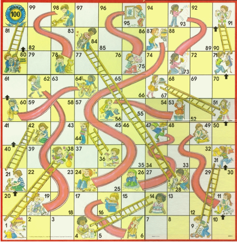
  • So my 4 year old daughter was sick yesterday and I spent part of the afternoon playing chutes and ladders with her.  (She won every game because there is apparently a law in my house that the sick child always wins the game).

    So I got to thinking about how many turns is the typical game of chutes and ladders.  And also what’s the least amount of spins you need to finish the game.

    So like every good father, I wrote a simulation!

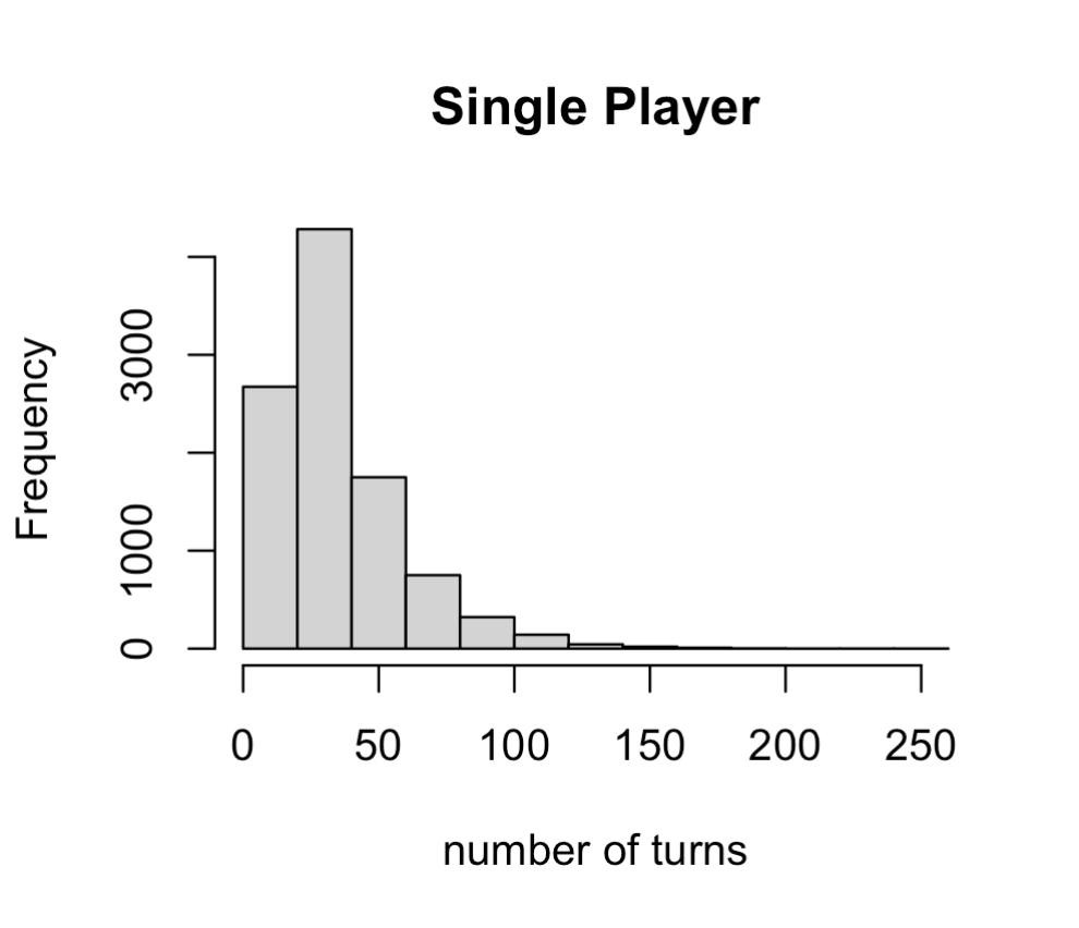
    So first, I wanted to know the distribution of the number of turns it takes a single player to complete the game.  I simulated the game 10000 times and found a median of 30 spins with an average of 35.84 spins.  In the 10000 simulations I performed the largest number of spins was 243 (I would have quit at about 50 spins) and the lowest number was 7 spins, which happened 21 times in the 10000 simulations.

    You can see a histogram of the distribution of the the number of turns it would take a single player to complete the game.

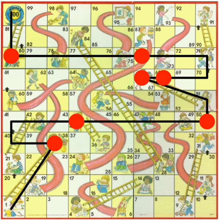
    And for fun, here is one way to win the game in 7 moves.  The spins in the game below are 1, 6, 6, 1, 1, 6, 6.  (Some other ways to do it include: (4, 6, 2, 6, 6, 6, >3) and (4, 6, 3, 5, 6, 5, 6), with this second one actually including the player hitting a slide!)


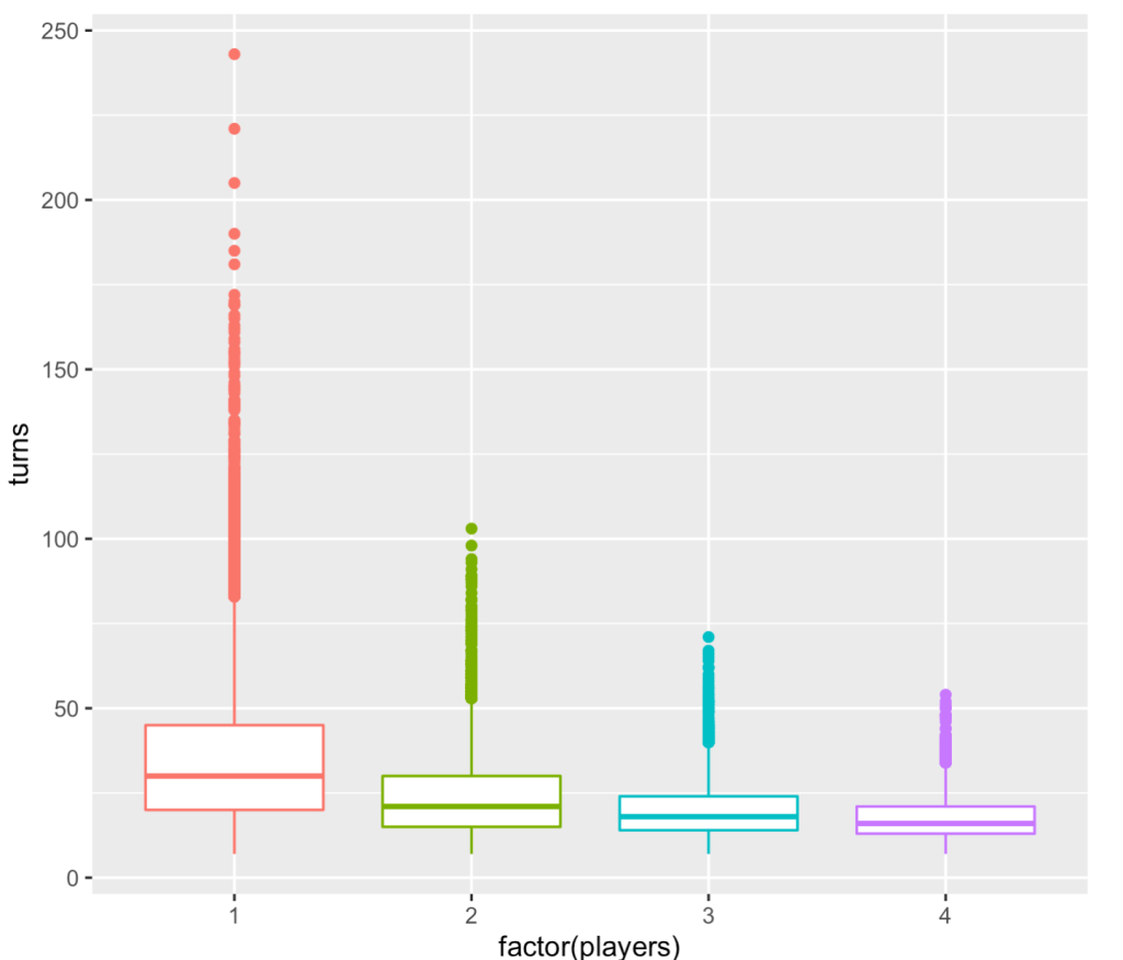
    But most people don’t play chutes and ladders by themselves.  So how long will the game take before anyone you are playing with wins the game? If you have two people the average number of turns is 24.1 with a median of 21 turns.  Three players will last an average of 19.9 turns with a median of 18. and four players will average 17.66 turns with a median of 54.


    So, that it’s.  Really important summer stuff that I’ve been doing.

    If you are interested, here is another article about chutes and ladders and here is a link to my code is here on github.

    Cheers.

  • What does 95% efficacy even mean?

    The Pfizer Covid-19 vaccine has an efficacy rate of 95%. The Moderna Covid-19 vaccine has an efficacy of 94.1%. The Johnson and Johnson Covid-19 vaccine has efficacy of 66.3%.

    But what does this MEAN?

    In my casual observation, it seems to me that there are a lot of people who see these numbers and think, quite reasonably, that 95% effective means that 5% of the people who get the vaccine will get Covid-19.  Or, if you were to get the Johnson and Johnson vaccine, there is still a 33.7% chance that you’ll get Covid-19.  So, they then make the argument that if there is still about a 1 in 3 chance that you’ll get Covid even AFTER the vaccine, why even bother getting the vaccine?

    Well, that’s not a correct interpretation of efficacy rate.

    I will illustrate this with some simple examples.

    Example 1 

    Let’s say that we find 10,000 people and we inject them with a placebo.  And we find another 10,000 people and we inject them with a vaccine.  We follow all 20,000 for 90 days to see if they develop the disease of interest (in this case Covid-19).

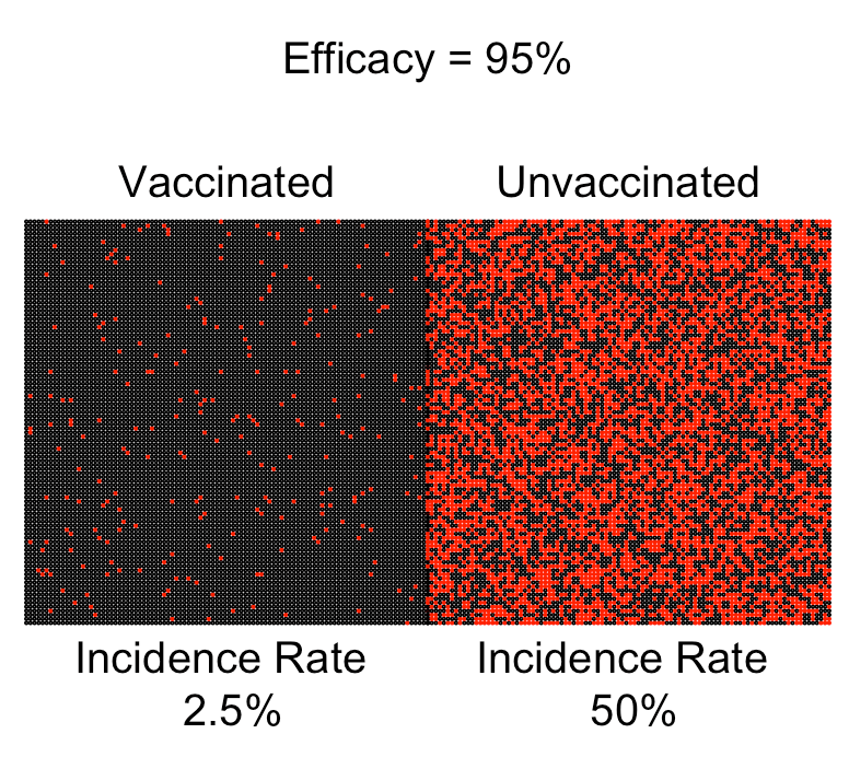
    Let’s say that 5,000 people who received the placebo get the disease while only 250 of the vaccinated group get the disease.  In this case we have the following quantities:

    Incidence rate UNvaccinated: 5,000 / 10,000 = 0.5 (or 50%)

    Incidence rate vaccinated: 250 / 10,000 = 0.025 (or 2.5%)

    (Note: Incidence rates are also known as “attack rates”.  I didn’t know that until this morning.  I’ve always just called these incidence rates).

    Now using these incidence rates, we can calculate something called relative risk (RR):

    RR = Incidence rate vaccinated / Incidence rate UNvaccinated = 0.025 / 0.5 = 0.05

    The efficacy is then defined as 1 – RR = 1 – 0.05 = 0.95 (or 95%).

    So in this scenario the vaccine was “95% effective” while 2.5% of the vaccinated group developed the disease.
     

    (Note: You can also calculate efficacy this way and get the exact same answer: 

    Efficacy = (Incidence rate UNvaccinated – Incidence rate vaccinated) / Incidence rate UNvaccinated = (0.5 – 0.025) / (0.5) = 0.95

    It’s exactly the same result.)

    Example 2 

    let’s look at a second example with the same initial set up: we find 10,000 people and we inject them with a placebo.  And we find another 10,000 people and we inject them with a vaccine.  We follow all 20,000 for 90 days to see if they develop the disease of interest (in this case Covid-19).

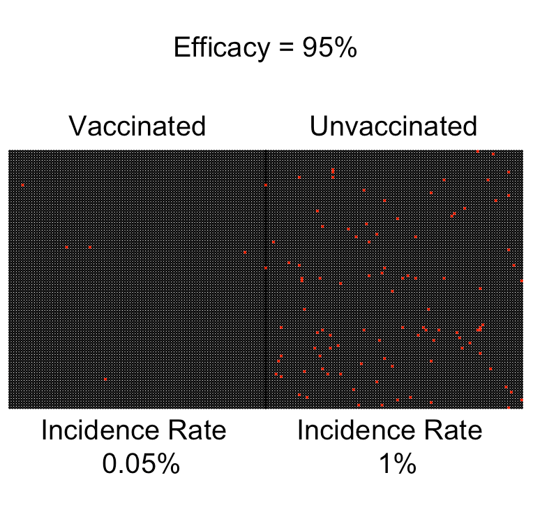
    Let’s say that 100 people who received the placebo get the disease while only 5 of the vaccinated group get the disease.  In this case we have the following quantities:

    Incidence rate UNvaccinated: 100 / 10,000 = 0.01 (or 1%)

    Incidence rate vaccinated: 5 / 10,000 = 0.0005 (or 0.05%)

    Now using these incidence rates, we can calculate something called relative risk (RR):

    RR = Incidence rate vaccinated / Incidence rate UNvaccinated = 0.0005 / 0.01 = 0.05

    The efficacy is then defined as 1 – RR = 1 – 0.05 = 0.95 (or 95%).

    So in this scenario the vaccine was ALSO “95% effective” while only 0.05% of the vaccinated group developed the disease.
    Takeaways

    • In the first example given here, 2.5% of the vaccinated group developed the disease, and in the second example, 0.05% of the vaccinated group developed the disease, but in BOTH EXAMPLES the efficacy was 95%.
    • Vaccine efficacy is a RELATIVE reduction in risk when compared to a placebo group.
    • There are many different incidence rates that will result in a 95% efficacy.
    • This is why a vaccine that has efficacy of 50% is really an incredible vaccine.  It doesn’t mean that 50% of the people who get the vaccine will get the disease; it means that the relative risk has been reduced by 50%!  Which is a ton!
    • Someone should get on national television and explain this to the American people.


    Further reading:


    Cheers.