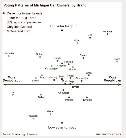
What Car Brands Tell Us About Our Political Participation

Cheers.
I read this story about some badminton players that were thrown out of the Olympics for intentionally losing a match. In the words of Deadspin:
The Chinese team of Wang Xiaoli and Yu Yang and South Koreans Jung Kyung-eun and Kim Ha-na played a farce of a match in which players served into the net on purpose or lazily launched shots out of bounds. The Chinese players’ incentive to lose was a bracket placement that would keep them on the opposite side from the other top-ranked Chinese team, meaning they’d avoid facing them until the finals. The Koreans, having sensed the plot from Wang and Yu, attempted to lose themselves in response.
Wait. What? They were trying to lose the match on purpose to avoid playing a team that they didn’t want to play until the finals? That seems like a totally rational thing to do. The goal at the Olympics is to win a medal. The goal is not to get as high a seed as possible coming out of pool play. If you don’t want situations like this then, don’t play this format. Sure, they were throwing the game, but they weren’t involved in a betting scandal or anything. They were losing on purpose to give themselves, in their minds, the largest probability to win a medal. Isn’t that the rational thing to do if your goal is to win a medal? And the goal is to win medals, right? Right?
Now, you could look at this as China colluding to try to maximize the number of medals they can win. By avoiding each other in the elimination rounds until the finals, they avoid eliminating each other from medal contention. This might be frowned upon, but again, isn’t it the rational thing for the Chinese team to do? I guess “always trying your hardest” is more of an Olympic ideal than “doing the rational thing”.
Cheers.

Cheers.
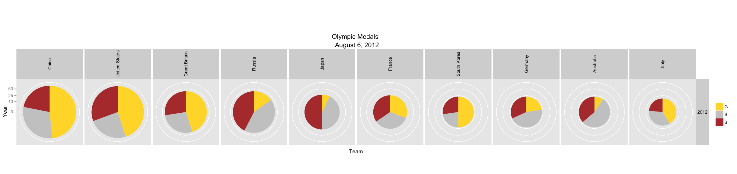
First off, for the R nerds out there, (If you don’t care about R, skip to the next paragraph) I’m quickly becoming a huge fan of ggplot2. Below is an example of combining a facet grid with pie charts using polar coordinates. Pretty cool. (I know most graphics people hate pie charts, but I think it works nicely, especially to display Olympic medal counts). My only question about ggplot2 is how can I color in the background of a plao without changing the pie chart. I’d like to highlight the plots for a country in years where they hosted the Olympics. I’ve tried geom_rect() with unlimited bounds, but this seems to have problems in polar coordinates. Then I started to try using some grobs commands, but they appear to be out of date. Any ggplot2 experts out there have any suggestions?
Below is a plot of the Olympic medals won by year for the top 26 countries (by medal count in the 2008 Olympics) for the years 1952 through 2008. The size of the pie chart is proportional to the number of medals won by a team on a square root scale, and each pie chart shows the break down of total medals by type (gold, silver, or bronze). So you can see, for instance, that in 2008 China won about 100 medals (in fact, it was exactly 100) and, it’s easy to see that over half of them were gold. You can also see that the United State won slightly more medals that China (110 to be exact), but the distribution of medals was nearly evenly distributed across the three types (36 gold, 38 silver, 36 bronze).
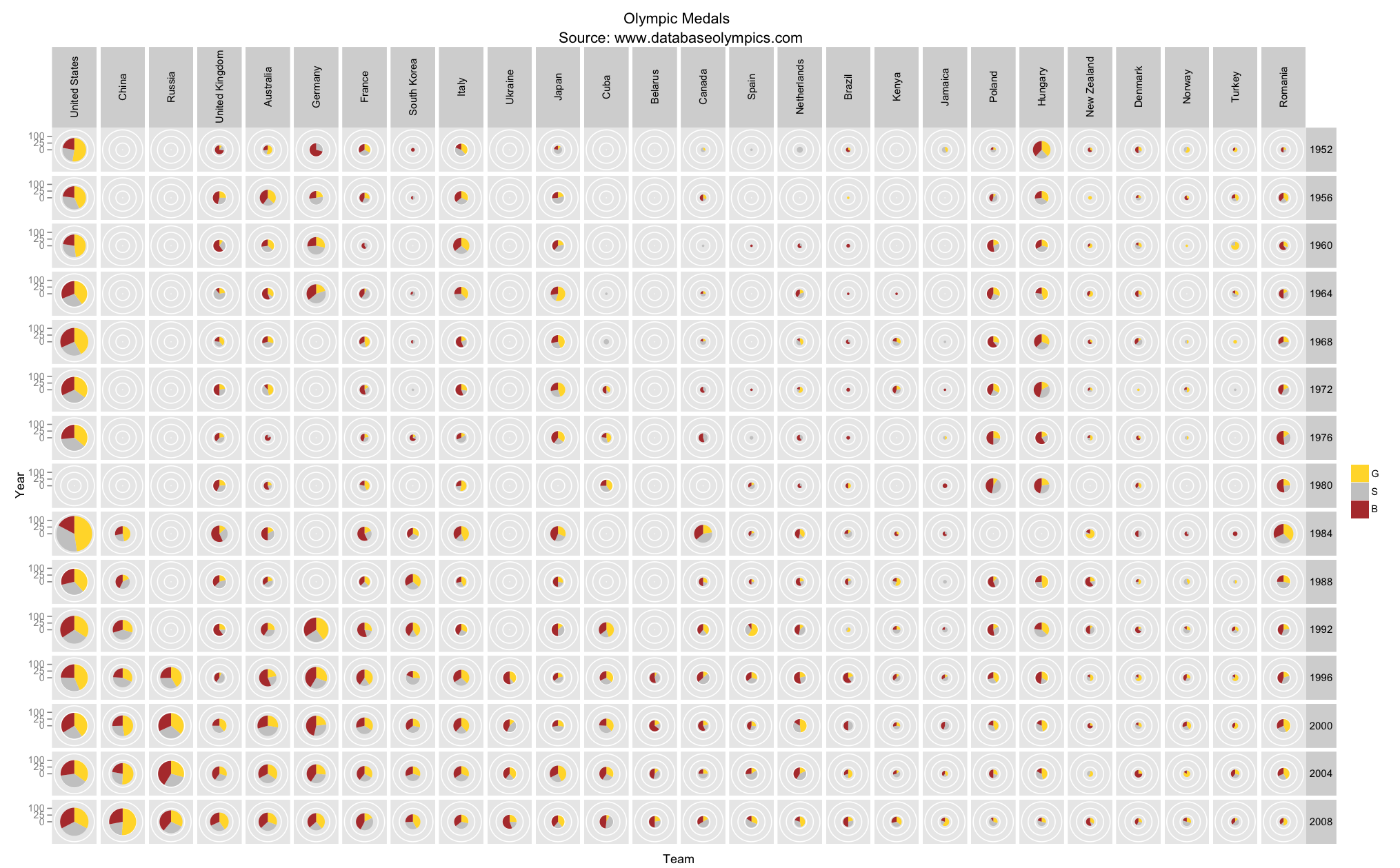
The graph below is the same as above, but using raw values instead of square root. This demonstrates why I used a square root scale.

Here is a graph of the top 26 countries by medal count from the 2008 Olympics, across the years from 1896 through 2008.

And finally, if you’re interested, here is a graph of all of the countries from 1952 through 2008, but it’s hard to really see anything. 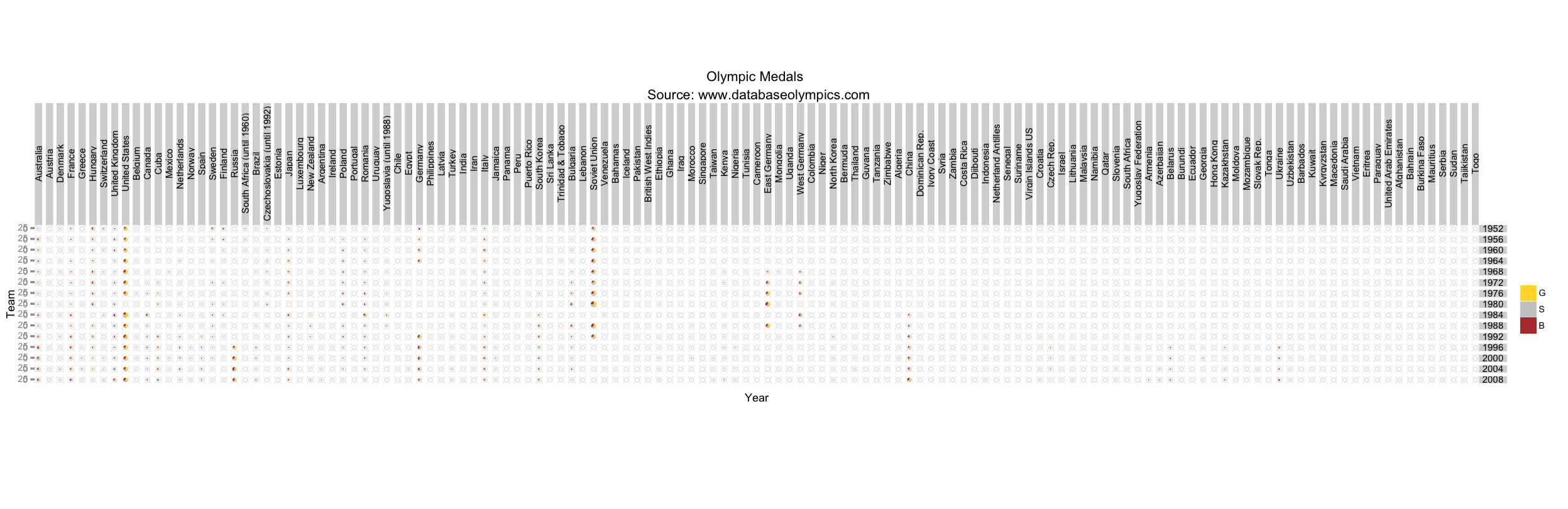
Cheers.
StatsInTheWild MLB rankings as of July 23, 2012 at 11:58am. SOS=strength of schedule
| Team | Rank | Change | Record | ESPN | TeamRankings.com | SOS | Run Diff |
| NYY | 1 | – | 57-38 | 1 | 1 | 5 | +76 |
| Texas | 2 | – | 56-38 | 2 | 2 | 13 | +80 |
| LA Angels | 3 | – | 52-44 | 6 | 3 | 8 | +46 |
| Toronto | 4 | ↑2 | 48-47 | 17 | 13 | 3 | +29 |
| Boston | 5 | – | 48-48 | 15 | 14 | 6 | +43 |
| Washington | 6 | ↑2 | 55-39 | 3 | 4 | 23 | +66 |
| Detroit | 7 | ↑2 | 52-44 | 5 | 6 | 12 | +21 |
| Oakland | 8 | ↑3 | 51-44 | 12 | 7 | 7 | +17 |
| ChiSox | 9 | ↓5 | 50-45 | 10 | 11 | 14 | +39 |
| TampaBay | 10 | ↓2 | 49-47 | 14 | 15 | 2 | +2 |
| Cincinnati | 11 | ↑1 | 55-40 | 4 | 5 | 27 | +51 |
| Baltimore | 12 | ↓2 | 51-44 | 16 | 9 | 1 | -44 |
| Pittsburgh | 13 | ↑2 | 54-40 | 9 | 8 | 29 | +42 |
| St. Louis | 14 | ↓1 | 50-45 | 13 | 16 | 30 | +86 |
| Atlanta | 15 | ↓1 |
52-43 | 7 | 10 | 21 | +24 |
| SF | 16 | ↑4 | 53-42 | 8 | 12 | 28 | +16 |
| Seattle | 17 | ↑2 | 42-55 | 24 | 15 | 4 | -13 |
| LA Dodgers | 18 | – | 52-44 | 11 | 18 | 26 | +14 |
| Cleveland | 19 | ↓3 |
47-48 | 20 | 17 | 11 | -47 |
| NY Mets | 20 | ↓3 | 47-48 | 18 | 19 | 17 | +5 |
| Arizona | 21 | ↑1 | 47-48 | 19 | 20 | 25 | +21 |
| Kansas City | 22 | ↓1 | 40-54 | 25 | 23 | 10 | -51 |
| Milwaukee | 23 | ↑1 | 44-50 | 21 | 24 | 24 | -11 |
| Minnesota | 24 | ↑1 | 40-55 | 26 | 22 | 9 | -90 |
| Philadelphia | 25 | ↑1 | 42-54 | 23 | 26 | 19 | -30 |
| Miami | 26 | ↓3 |
44-51 | 22 | 25 | 16 | -71 |
| San Diego | 27 | ↑3 | 41-56 | 27 | 28 | 22 | -59 |
| Chic Cubs | 28 | ↓1 | 38-56 | 28 | 27 | 18 | -77 |
| Colorado | 29 | – | 36-58 | 29 | 29 | 20 | -78 |
| Houston | 30 | ↓2 | 34-62 | 30 | 30 | 15 | -107 |
Past Rankings:
Cheers.
Last week, I posted some boxplots of Olympic athletes’ ages by sport, which I then updated using ggplot2 to look nicer. I had a few requests for the code that I used to generate these plots, so I posted my code here.
Isomorphismes has suggested (politely) some improvements to my code in this post, “Outer Product of Character Vectors in R”, on R-bloggers.com. I’ve been reluctant to post my code in the past as I don’t consider myself to a very good coder, but I need to get over this. There is too much to be gained by putting my code out there and having it critiqued by others who have more experience with coding than I do, as opposed to just keeping my crappy code to myself.
Cheers.
Here is a graph of the ATP points for the top 8 tennis players in the world since 2009. It’s interesting to note that since 2009, Andy Murray has been ranked above each of Nadal, Djokovic, and Federer at some point, but never above them all at once. Also, over that same time period n0one of the players currently ranked 5-8 have ever been ranked higher than any of the top 4 players.

Cheers.
About a week ago, Roger Federer won his seventh Wimbledon title, which ties Pete Sampras, and his 17 Grand Slam title overall, extending that record even further. Less (more?) importantly, Mr. Federer regains the ranking of number 1 in the word by the slimmest of margins (11075 to 11000) over Novak Djokovic. Here is my updated plot of the 19 players who have reached number 1 since 1990. Notably (still) absent is Mr. Andy Murray. But as he said himself after his Wimbledon defeat: “I’m getting closer.”
Note: This graph has been updated as it originally included Andy Murray and Benjamin Becker instead of Boris Becker. I apologize for the mistake.

Cheers.