• Season Preview

    It’s almost here! Another season of grown men smashing their brains together for our entertainment.  And entertained we will be.

    So, let’s start at the end: which teams are most likely to be suffering life-lengthening (Not really) massive head injuries in February 2013 in New Orleans?  I’m once again making a not so bold prediction and taking Green Bay over New England in the Super Bowl this year.

    Some Comments

    AFC

    East

    New England has the easier road to New Orleans of the two by playing the softest regular season schedule of any team this year.  For starters, they play in the AFC east which features Buffalo, Miami, and  the New York Jets.  None of those teams had winning records last year, and they all failed to make the playoffs.  The Patriots then go on to play the AFC South and the NFC West.  The teams in these two divisions had a combined record of 56-72 last year.  In fact, they play only 3 games all of 2012 against teams that had winning records in 2011.  If they beat baltimore in week 3, they could very reasonably be 8-0 at their bye week.  If they start the first half of their season any worse than 6-2, it’s a disaster.

    The Jets, Dolphins, and Bills are good teams, but none of them are very good teams.  They all get screwed annually by having to play New England twice every single year.

    North

    I always feel bad for the wild card team that always seems to come out of this division.  You win 11+games and, not only do you not get a bye week, you have to go ON THE ROAD to play some crap team from the AFC west after they “earned” home field advantage.  (What I’m saying is that Pittsburgh should not have had to go to Denver last year.)

    I think Pittsburgh wins this division in a close race by either one game or in a tie-breaker with Baltimore.  The season’s biggest game outside the division is Baltimore’s game against New England.  Pittsburgh avoids having to play the Patriots this year and that might just be enough to get them the division title.

    South

    Texans.

    West

    Any of these teams has a legitimate shot to limp to a division title and playoff game (at home!).  I think San Diego wins it this year thanks to a much, much easier schedule than division foe Denver, who is the most likely team to challenge for the division.  Denver’s first 8 opponents all had at least 8 wins last year, and six of those 8 went to the playoffs.  Good luck Peyton.  Any of the four teams could realistically win this division, and there is a chance they could do it 2010 Seattle Seahawks style.  The AFC West drew the AFC North and the NFC South this year on their schedule.  So they’ll have to play Pittsburgh, Baltimore, Cincinnati, New Orleans and Atlanta:  All 2011 playoff teams.  At least they all get to console themselves with the statement “Hey, at least we get to play [Insert AFC West team] twice”.  My dream is to see a team a 6-10 team make the playoffs and this year’s schedule and division of mediocrity are certainly keeping my hopes alive.

    NFC

    East

    New York, Dallas, or Philadelphia has a real chance to win this division this year, but I think the Eagles get it done.  I thought the Eagles were the best team in this division last year, and I think they’re the best team in the division again.  It also helps that they have the easiest schedule of any of the teams that have a legitimate chance to win the division  (Washington does not).

    North

    Green Bay wins the division by at least two games.  The interesting question is who finishes second.  I’m taking Detroit as runner-up and earning a wild card spot and 5th seed in the NFC.

    South

    I think New Orleans is going to win this division again, but Atlanta will make it close.  I’ll pick Atlanta to get the second wild card because I have to pick someone.  But there are at least 6 other teams that have a real shot at it (New York, Dallas, Chicago, Carolina, Seattle, Arizona).

    West

    San Francisco is too talented to not win this division again, but I think it’ll be a lot closer than a lot of people are making it out to be.  I think the real question in this division is can two teams get to the playoffs.  Two years ago, this division was been all-time bad (they sent a 7-9 team to the playoffs!), but it was  much more competitive in 2011.

    Seattle has 11 games in 2012 against teams that were 8-8 or worse in 2011.  If they can manage a winning record in those 11 games and pick up a few quality wins they can make a nice little run at the wildcard, but their going to have to earn it.  They aren’t getting into the playoffs this year thanks to an easy schedule.  They play San Francisco in Seattle on December 23 and could prove to be a critical game for both teams.

    Arizona also has a very difficult schedule.  They play games at New England, at Green Bay, at Atlanta, and at San Francisco.  I’d be surprised if they won any of these games, and I’d be stunned if they won 2 or more.  Unfortunately, this tough schedule probably leaves them out of the playoffs.

    2012 Pre-Season Rankings

    Team Rank Ex W SOS SB Odds WSEX odds 2011 Wins
    Green Bay 1 11.17 23 6.7-1 6-1 15
    New England 2 10.68 32 7.7-1 7-1 13
    New Orleans 3 10.47 24 9.1-1 15-1 13
    San Francisco 4 10.18 10 9.4-1 13-1 13
    Baltimore 5 9.73 7 11.5-1 17-1 12
    Pittsburgh 6 9.85 22 15.3-1 15-1 12
    Detroit 7 9.15 12 21-1 30-1 10
    Houston 8 9.15 29 18-1 10-1 10
    Atlanta 9 9.00 30 27-1 25-1 10
    Philadelphia 10 8.56 11 30-1 12-1 8
    Cincinnati 11 8.54 19 38-1 45-1 9
    New York (G) 12 8.01 1 44-1 17-1 9
    Chicago 13 8.31 13 42-1 23-1 8
    San Diego 14 8.44 26 40-1 25-1 8
    New York (J) 15 8.09 15 54-1 32-1 8
    Seattle 16 7.91 5 87-1 65-1 7
    Tennessee 17 8.06 18 54-1 90-1 9
    Dallas 18 7.85 6 35-1 25-1 8
    Miami 19 7.79 21 53-1 110-1 6
    Arizona 20 7.33 2 103-1 80-1 8
    Denver 21 7.25 4 115-1 20-1 8
    Oakland 22 7.49 27 77-1 100-1 8
    Carolina 23 7.35 20 115-1 45-1 6
    Buffalo 24 7.24 28 142-1 65-1 6
    Kansas City 25 7.01 31 146-1 50-1 7
    Washington 26 6.52 17 350-1 70-1 5
    Jacksonville 27 6.41 14 710-1 160-1 5
    Cleveland 28 6.17 8 1000-1 200-1 4
    Minnesota 29 6.20 9 4501-1 180-1 3
    Tampa Bay 30 5.70 25 2500-1 100-1 4
    St. Louis 31 5.17 3 2500-1 110-1 2
    Indianapolis 32 5.22 16 1600-1 120-1 2

    Ex W – Average number of wins a team would have if the season was played 100,000 times.

    SOS (Strength of schedule) – The average of the strength coefficients for each opponent on a team’s schedule.

    SB Odds – SITW estimated odds that the team wins the Super Bowl

    WSEX Odds – http://www.wsex.com odds to win Super Bowl

    Predicted Standings for 2012 Season

    Team: Predicted Record (Prob Make Playoffs, Super Bowl Wins Odds)

    AFC East

    1. New England Patriots: 11-5 (85.44%, 7.7-1) 
    2. New York Jets: 8-8 (37.3%, 54-1)
    3. Miami Dolphins: 8-8 (34.84%, 53-1)
    4. Buffalo Bills: 7-9 (26.38%, 142-1)

    AFC North

    1. Pittsburgh Steelers: 10-6 (65.96%, 15.3-1)
    2. Baltimore Ravens: 10-6 (68.52%, 11.5-1)
    3. Cincinnati Bengals: 9-7 (41.86%, 38-1)
    4. Cleveland Browns: 6-10 (7.1%, 1000-1)

    AFC South

    1. Houston: 9-7 (68.54%, 18-1)
    2. Tennessee: 8-8 (33.04%, 54-1)
    3. Jacksonville: 6-10 (11.12%, 710-1)
    4. Indianapolis Colts: 5-11 (4.24%, 1600-1)

    AFC West

    1. San Diego Chargers: 8-8 (40.48%, 40-1)
    2. Oakland Raiders: 7-9 (26.82%, 77-1)
    3. Denver Broncos: 7-9 (26.84%, 115-1)
    4. Kansas City Chiefs: 7-9 (21.52%,  146-1)

    NFC East

    1. Philadelphia Eagles: 9-7 (49.38%, 30-1)
    2. New York Giants: 8-8 (41.42%, 44-1)
    3. Dallas Cowboys: 8-8 (41.4%, 35-1)
    4. Washington Redskins: 7-9 (13.54%, 350-1)

    NFC North

    1. Green Bay: 11-5 (87.42%, 6.7-1)
    2. Detroit: 9-7 (52.74%, 21-1)
    3. Chicago: 8-8 (38.22%, 42-1)
    4. Minnesota: 6-10 (6.7%, 450-1)

    NFC South

    1. New Orleans: 10-6 (75.2%, 9.1-1)
    2. Atlanta: 9-7 (50.36%, 27-1)
    3. Carolina: 7-9 (18.08%, 115-1)
    4. Tampa Bay: 6-10 (3.16%, 2500-1)

    NFC West

    1. San Francisco: 10-6 (75.68%, 9.4-1)
    2. Seattle: 8-8 (24.26%, 87-1)
    3. Arizona: 7-9 (20.44%, 103-1)
    4. St. Louis: 5-11 (2%, 2500-1)

    Predicted Playoffs for 2012 Season

    AFC

    1. New England
    2. Pittsburgh
    3. Houston
    4. San Diego
    5. Baltimore
    6. Cincinnati

    Houston and Baltimore advance out of the wild-card weekend.  This creates a New England vs Baltimore match-up, once again demonstrating why it might be better to be the two seed, as Pittsburgh gets a weaker opponent in Houston.  New England and Pittsburgh advance with New England representing the AFC in the Super Bowl.

    NFC

    1. Green Bay
    2. New Orleans
    3. San Francisco
    4. Philadelphia
    5. Detroit
    6. Atlanta

    San Francisco and Detroit advance to the divisional round of the playoffs where San Francisco would play New Orleans in a rematch of a very exciting playoff game from last year.  Green Bay beats Detroit and advance to the NFC championship game where they play New Orleans.  Green Bay then defeats New Orleans to go to the Super Bowl.

    Super Bowl

    Green Bay defeats New England in the Super Bowl.

  • Corey Chivers's avatarbayesianbiologist

    If you haven’t yet discovered the competitive machine learning site kaggle.com, please do so now. I’ll wait.

    Great – so, you checked it out, fell in love and have made it back. I recently downloaded the data for the getting started competition. It consists of 42000 labelled images (28×28) of hand written digits 0-9. The competition is a straight forward supervised learning problem of OCR (Optical Character Recognition). There are two sample R scripts on the site to get you started. They implement the k-nearest neighbours and Random Forest algorithms.

    I wanted to get  started by visualizing all of the training data by rendering some sort of an average of each character. Visualizing the data is a great first step to developing a model. Here’s how I did it:

    Which gives you:
    Notice the wobbly looking ‘1’. You can see that there is some variance in the angle of…

    View original post 127 more words

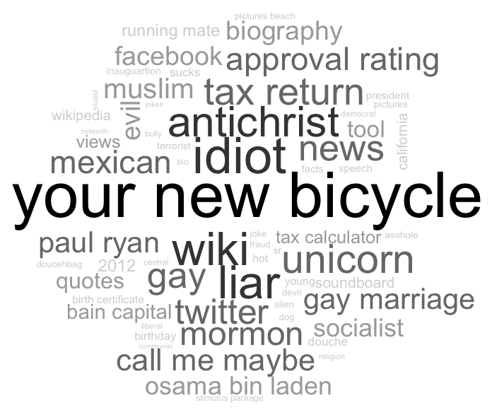
  • Finally, I’ve managed to post something that’s not about @BillBarnwell‘s flawed “study” titled “Mere Mortals” (Here’s why he’s wrong.  Here is what happens when I apply his logic to something else….you get non-sense).  Anyway, here is an update to the presidential candidates search engine auto-complete word clouds (The original post and description of how the data is collected and processed is here).

    According to search engines Obama is a gay, socialist/communist, muslim terrorist version of the Antichrist (or possible, not even living thing, but a bicycle), and Romney is an idiot, douche bag, ass hole, mormon unicorn that lies.


    Cheers.

  • It seems I can’t stop writing about Bill Barnwell (here, here, and here) and his article, Mere Mortals, which presents “evidence” that baseball players who played during the years 1959 through 1988 have a higher mortality rate than football players.  it seemed immediately obvious to me when I read the article that the two groups he was comparing were not directly comparable, and it seemed likely that the difference in mortality rates was probably due to differences in ages between the cohort, rather than the sport itself.  Up to this point, however, I was just making well educated guesses as to how to explain the results.

    So, I went and collected data myself and ran a quick analysis to check.  The findings?  When age is added to a model predicting death, the effect of the sport on mortality rate completely disappears.  This means that if two players are the exact same age and one played professional football and the other played professional baseball for at least five years and one of those years was between 1959 and 1988 there is no evidence that the football player nor the baseball player is more likely to be deceased.  

    Data collection

    Football

    Using R, I scraped http://www.football-almanac.com to get a list of players names.  I then used this list of players names to scrape http://www.pro-football-reference.com to get information about each players date of birth, age at death (if they have died), the start and end years of their careers, height, and weight.  (A note about a shortcoming of my data collection for football: If a player had the same name as another player, I only collected one. I believe this is a small issue and will not affect the overall results, but it is worth noting.)  In total, the football player data set had 14, 396 players.

    Baseball

    Using R, I scraped http://www.baseball-almanac.com to get a list of players names.  I then used this list of players names to scrape http://www.baseballl-reference.com to get information about each players date of birth, age at death (if they have died), the start and end years of their careers, height, and weight.  For baseball players, I was able to collect all players, including those who had the same name as another player.  In total, the baseball player data set had 5,587 players.

    Time Frame

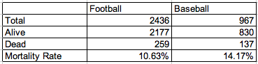
    Both the baseball and football data sets were whittled down to only consider players who played at least five seasons and any of those seasons fell between 1959 and 1988.  (These are slightly different standards than in the Barnwell article, but, again, the larger point should remain the same.)  This left  2,436 football players and 967 baseball players.  The mean age of baseball players in my sample was 64.19 while the mean age of football players was 60.91.  (Barnwell tweeted that the difference in ages between his two groups, which were defined slightly differently, was about 24 months.)  The mean ages of my two groups is significantly different with a p-value of <0.00000000000001.  That’s a big deal.

    The distributions of the ages of the football and baseball players is displayed below using a density estimator in R.  You’ll notice that there are many more young players in the football group than in the baseball group.  This indicates that mortality rates cannot be compared directly to one another as is done in the Barnwell article.

    Think for a minute about the graph below.  Without knowing anything about which color represents which sport, which of these two groups should have a higher mortality rate?  (Hint: The blue one)

    Analysis

    Fisher Exact Test

    259 out of the 2436 qualifying football players was deceased according to http://www.pro-football-reference.com for a mortality rate of 10.63%.  Among baseball players, 137 out of 967 were dead for a mortality rate of 14.17%.  Both of these rates are lower than Barnwell’s, but are of similar relative magnitudes.  Using a Fisher exact test, the null hypothesis of no association is rejected with a p-value of 0.004407, which is essentially identical to Barnwell’s p-value of 0.004.  So there is a statistically significant difference between these groups.  That’s a fact. But….

    Logistic Regression

    This type of analysis estimates the probability of a certain event, in this case, death, while taking into account multiple factors that could be related to the event.  Running a logistic regression model with death as an outcome and only sport as a dummy variable predictor yields a p-value of 0.00384 for the significance of sport being associated with death.  This is largely the same result as the Fisher exact test as neither are controlling for any other variables besides sport.

    When age, actually, it’s technically years since birth since some people are deceased, is added to the model, the effect of sport disappears entirely.  The p-value for age is < 2^{-16} and the p-value for sport is 0.441, which is not significant.
    Conclusions and Future work

    To reiterate, what we can conclude from this is that if two players are the exact same age and one played professional football and the other played professional baseball for at least five years and one of those years was between 1959 and 1988 that neither the football player nor the baseball player is more likely to be deceased.

    The purpose of this work is to demonstrate that the conclusions reached in Barnwell’s article Mere Mortals is at the very least misleading.  The author makes the case that baseball players are dying more often than football players.  While it is true that baseball players from this time period are more likely to be deceased than their football counterparts, I have demonstrated that it is not BECAUSE they played baseball, rather it is their age, a pretty serious risk factor for death, that is a more significant predictor of being deceased.

    I think a more interesting analysis than the one presented here by myself would be to look at survival times after retiring from each of the sports looking at risk factors including age, BMI, and years in the respective league.

    A Final Request

    Is it possible that baseball players die at a younger age than football players?  I suppose it is possible, but I think it’s unlikely.  What is for sure is that Bill Barnwell’s article, due to the flawed application of statistical methods, does not in any way demonstrate that baseball players are dying more often than football players.  I believe it to be irresponsible to present work which falsely understates the potential dangers of playing football especially with the recent concussion and CTE studies involving NFL players.  Therefore, I am requesting that Bill Barnwell openly retract his article, Mere Mortals, in writing on Grantland.com due the major statistical flaws of the study.

  • Bill Barnwell demonstrated what many are calling a stunning result when he showed that the mortality rate of baseball players was actually higher than that of football players who played at least five seasons during the years 1959 through 1988. How can this be explained?  Especially with all of the recent news about head injuries and player suicides in football.  Football sure seems like it should be more dangerous.  But the comparison of baseball players to football players doesn’t make any sense to me. I think a better comparison is baseball players and Supreme Court justices.  Football players are in peak physical condition during their playing days, whereas Supreme Court justices just sit and wait.  Their levels of physical activity are probably more comparable to that of a baseball player standing and waiting for something to happen.  Then, after all that waiting in the Supreme Court, a high profile case come along and raises stress levels.  Similarly, baseball players, after long periods of waiting in games, must sprint all out at certain times.  In this way, the healthcare hearings in the Supreme Court are very much like hitting a double or a triple in baseball.  These similarities make comparing baseball players to Supreme Court justices more “apples to apples” than baseball to football players.

    The methodology

    I’ll be using the same methodology in Barnwell et al. to compare mortality rates.

    Justice/Player Pool

    Since, data on baseball players has already  been collected, there is no need to collect the data again.  I will include any Justice in the pool who served at least one year between 1959 and 1988.  This includes Tom C. Clark, Earl Warren, John Marshall Harlan II, William J. Brennan, Charles Evans Whitaker, Potter Stewart, Byron White, Arthur Goldberg, Abe Fortas, Thurgood Marshall, Warren E. Burger, Harry Blackmun, Lewis F. Powell, Jr., William Rehnquist, John Paul Stevens, Sandra Day O’Connor, Antonin Scalia, and Anthony Kennedy.

    The Findings

    That’s correct: Supreme court justices who served any years between 1959 and 1988 died at a much higher rate than  baseball players from the same time frame.  The difference between the two is statistically significant and allows us to reject the nul hypothesis.  Therefore, there is a meaningful difference between the mortality reates of baseball players and supreme court justices.

    The 95% confidence interval for baseball players is 14.1% to 17.8% and for the Supreme court justices it is 58.6% to 96.98% and the p-value for the Fisher exact test is .000224!  Highly significant.

    Conclusions

    Football is safer than baseball, and baseball is safer than the serving on the Supreme Court.  So, why is it that Supreme Court justices from the ’60s, ’70s, and ’80s are dying more frequently than baseball players from the same era? Well, in the words of Barnwell:

    Truthfully, as a layman, I can’t say with any certainty, and I don’t think it’s appropriate to speculate.

    Cheers?

  • On Monday, I posted in response to Bill Barnwell’s article on Grantland called “Mere Mortals” where he makes the claim that regular NFL players who played between 1959 and 1988 have a statistically significantly lower mortality rate than regular baseball players of the same era.  I suspect all that has been demonstrated is that older people die more often than younger people because the groups are not directly comparable, since age was not controlled for in the comparison.  What I believe we are dealing with here is correlation and not causation.  Baseball, almost surely, is not killing people faster than baseball players.  And even if it was, it has not been demonstrated.  Not even close.

    So, I’ve been reading some other stuff by Barnwell (which I really enjoy) including his Twitter feed lately and two particular tweets interested me greatly.  The first one:

    Appreciate the kind words about the study. For those who asked: Average age of MLB player at time of passing was 60.9; for NFL, it was 58.8.

    And the second one:

    Went back and looked at age for all players in my study by request; MLB players in sample were on average 24 months older than NFL players.

    The first tweet should make someone pause and think about how this can be, while at the same time, baseball players have a higher mortality rate.  I suspected, originally, and still do, that it was because one group was simply older than the other group.  Which…..is exactly what was tweeted in the second tweet.  MLB players in the sample were TWO YEARS older than NFL players in the sample.  Can you name something that 62 year olds do more often than 60 year olds?  I can.  They die more often.

    So, it seems to me like all that the study has actually demonstrated is that older people die more often.  So, maybe Barnwell will dial back his “stunning” claims?  Maybe not.  This is the tweet directly before tweet number 2:

    ICYMI: Wrote about the stunning respective mortality rates of MLB and NFL players from 1959-88 on @grantland33. http://ow.ly/d1QGH

    Cheers.


  • StatsInTheWild MLB rankings as of August 20, 2012 at 12:18pm.  SOS=strength of schedule

    Team Rank Change Record ESPN TeamRankings.com SOS Run Diff
    NYY 1 – 75-50 4 1 4 +102
    Texas 2 – 71-50 5 3 13 +89
    Tampa Bay 3 ↑6 68-54 7 4 5 +69
    Washington 4 – 76-46 1 2 23 +109
    Oakland 5 – 65-56 13 6 8 +32
    Atlanta 6 ↑4 70-52 3 5 21 +84
    Chi WSox 7 ↓2 66-55 9 10 14 +67
    Cincinnati 8 ↓2 74-49 2 7 30 +73
    Detroit 9 ↓1 64-57 12 9 12 +24
    LA Angels 10 ↓7 62-60 15 11 7 +21
    Boston 11 – 59-63 17 12 3 +34
    Baltimore 12 ↑2 66-56 14 8 2 -47
    St. Louis 13 – 65-56 11 17 29 +106
    Toronto 14 ↓2 56-65 19 18 1 -25
    Seattle 15 ↑1
    59-64 20 13 6 0
    LA Dodgers 16 ↑3 67-56 10 16 25 +38
    Arizona 17 – 62-60 16 19 24 +40
    SF 18 – 67-55 8 14 26 +30
    Pittsburgh 19 ↓4 67-55 6 15 28 +19
    Kansas City 20 ↑2 54-67 25 20 11 -47
    NY Mets 21 ↓1 57-65 18 21 15 -33
    Philadelphia 22 ↑3 57-65 22 22 18 -30
    Cleveland 23 – 54-68 23 24 9 -125
    Milwaukee 24 – 55-66 24 27 27 -11
    Minnesota 25 ↓4 51-70 26 23 10 -86
    Miami 26 – 56-67 21 25 16 -84
    San Diego 27 ↑1 54-70 27 26 22 -70
    Chi Cubs 28 ↓1 47-75 28 29 20 -98
    Colorado 29 – 47-73 29 28 19 -112
    Houston 30 – 39-83 30 30 17 -169

    Past Rankings:

    8/14/2012

    8/6/2012

    7/23/2012

    7/9/2012

    7/2/2012

    6/25/2012

    6/19/2012

    6/9/2012

    5/28/2012

    5/23/2012

    5/14/2012

    5/7/2012

    4/30/2012

    4/23/2012

    4/16/2012

    4/13/2012

    Cheers.

  • Grantland recently published this article, Mere Mortals, which claims that:

    Baseball players who accrued at least five qualifying seasons from 1959 through 1988 died at a higher rate than similarly experienced football players from the same time frame.  The difference between the two is statistically significant6and allows us to reject the null hypothesis; there is a meaningful difference between the mortality rates of baseball players and football players with careers that emulated the [National Institute for Occupational Safety and Health] NIOSH criteria.

    The authors then go on to collect data on football and baseball players who played at least 5 years between 1959 and 1988, and their results are below:

    Baseball Football
    Qualifying Players 1,494 3,088
    Alive 1,256 2,694
    Deceased 238 394
    Mortality Rate 15.9 percent 12.8 percent

    From this table, to their credit, they calculated confidence intervals for the mortality rate, as well as performing a fisher exact test to test for independence between the rows (dead or alive) and columns (baseball and football). For football players, the 95% confidence interval for the mortality rate was (11.6, 13.9), and, for baseball players, the 95% confidence interval was (14.1,17.8).  The Fisher exact test gives a p-value of about 0.004 and from this they conclude, correctly, that the mortality rate is significantly different between the groups at the 0.01 level.

    So, the big question is, as they pose it:

    Why is it that baseball players from the ’60s, ’70s, and ’80s are dying more frequently than football players from the same era? Truthfully, as a layman, I can’t say with any certainty, and I don’t think it’s appropriate to speculate. A deeper study into the mortality rates of baseball players that emulated the NIOSH focus on specific causes of death versus the general population might prove valuable.

    Well, I’ll “field” (pun intended) this one.  Baseball players are dying more often because they are older that football players.  The authors, as far as I can tell, never controlled for the age of the players, or any other risk factors for that matter. In 1959, there were, as far as I can tell, 12 NFL teams each with 40 players.  That 480 players.  In 1988, there were 28 teams with 59 players each; A total of 1652.  In baseball, in 1959 there were 16 teams with, let’s use the largest number, 40 man teams, for a total of 640 players.  That number in 1988 was 1040 (26 teams with 40 players).  So there were almost 3 and half time more players in the NFL in 1988 than there were in 1959.  The number of baseball players only increased about 1.6 times over this same period.

    These numbers aren’t exact, but the point still stands:  The group of football players that has been collected here has a greater proportion of younger people in it than the baseball group.  So it’s not exactly apples to apples.  In fact, it’s not even close.  You’d expect, just based on the ages of the players in these groups for baseball players to have higher rates of mortality than the football players.  So basically they have demonstrated that the old die more often than the young.

    Cheers.

    P.S. My first boss once gave me this example.  Remember the ad where it was claimed that 90% of all trucks sold in the last ten years were still on the road?  You’re comparing cars that are ten years old in the same group with cars that are less than a year old.  Not exactly apples to apples.

  • In the past I’ve posted search engine auto-completes for some of the presidential candidates.  For instance, here are Romney and Obama’s results from 5/30/2012, here are Romney and Obama’s results from 4/16/2012, and here are the republican primary candidates from 12/29/2011.  Below you will find the auto-completes for the two presidential candidates from 8/16/2012.  I’m also including word clouds now.

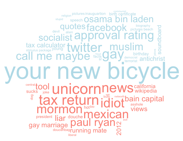
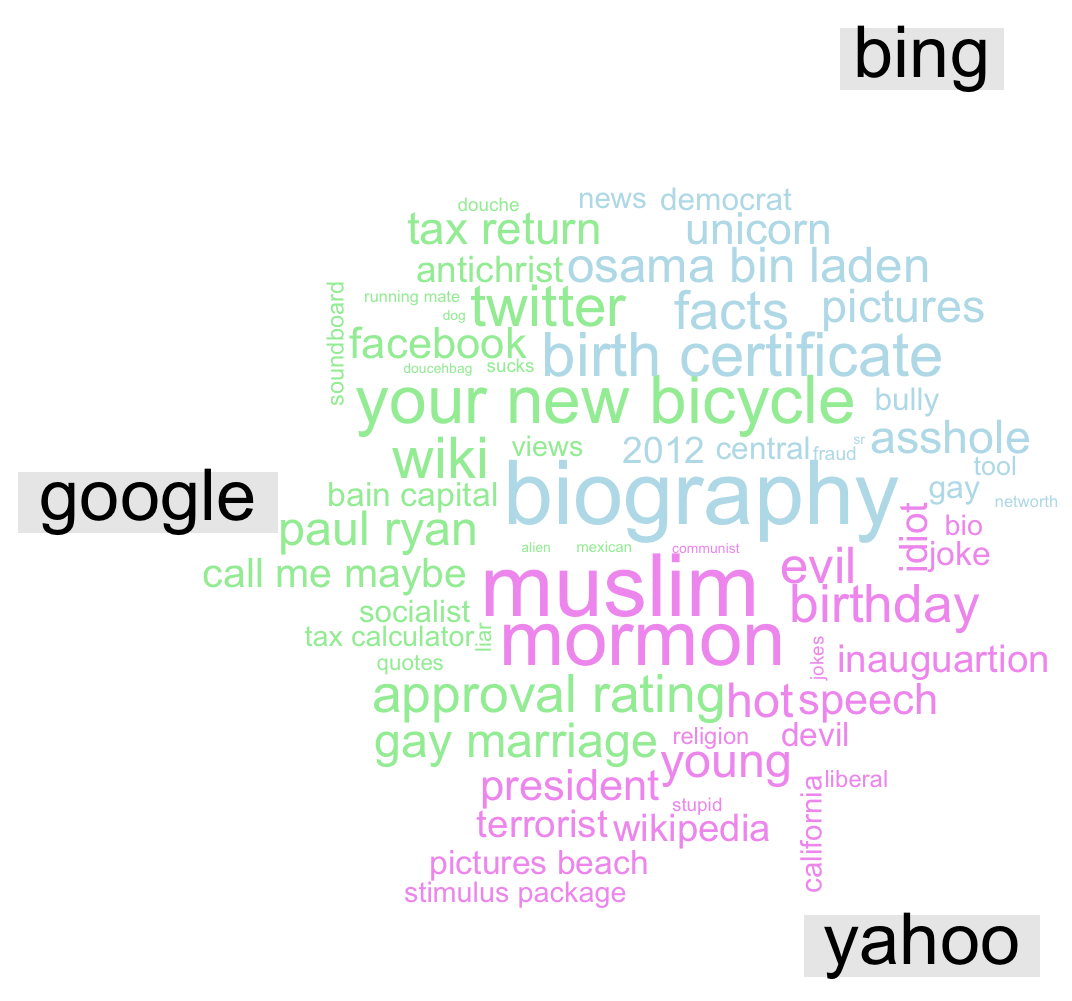
    I’m using three search engines (Google, Bing, and Yahoo!) and two search terms for each candidate (Mitt Romney, Mitt Romney is, Barack Obama, Barack Obama is).  I’m then weighting the terms from 10 to 1 for Google and Yahoo and 8 to 1 for Bing (as they only return 8 search terms), based on the order they appear in the auto-completes.  For the first two word clouds, I’m additionally weighting the search engines with Google getting weight 11.7, Bing gets 2.7, and Yahoo gets 2.4.  (These numbers are approximately the number, in billions, of searches performed on each site respectively in February 2012.)

    The first word cloud represents all of the words with weighting for both presidential candidates.  Kind of makes you think a little bit about the political discourse in this country when some of the tops words for presidential candidates are idiot, liar, and  antichrist.  (For those of you new to the internet, here is the explanation for “your new bicycle”.)

    This next word cloud is the same as the previous one, except it is separated by candidate.  The blue and red words are Obama and Romney, respectively.  If you’re wondering about the “Unicorn” on the Romney side of the word cloud, you may be interested in this facebook page.  According to them, “There has never been a conclusive DNA test proving that Mitt Romney is not a unicorn. We have never seen him without his hair — hair that could be covering up a horn. No, we cannot prove it. But we cannot prove that it is not the case.”  Truer words have never been spoken….

    The final wordcloud of the trio breaks down the auto-complete terms by search engine.  Note that, these words for this wordcloud are not weighted by search engine, but they are weighted by order within each search engine.  I think it’s kind of interesting that, for Yahoo, the big words are religions: Muslim and Mormon.  This makes me wonder if different search engines might predict in some way political affiliation, and, apparently, I’m not the only one who’s thought about this.  Looks like a group called Engage has already looked into this and their results are summarized nicely in this graphic.  According to them, Googlers tend to be more Democratic and Bingers (?) tend to be more Republican.  (I don’t see Yahoo on their graphic, which I find odd.)  Also, according to Alexa.com Bing users tend to be older than the average internet user, slightly more likely to have “some college” education, and slightly less likely to have a graduate degree.  Google and Yahoo users tend to be very much the average internet user with the exception that they are much less likely to be over the age of 65.

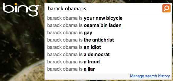
    Below here, you’ll find screen shots of the Google, Yahoo, and Bing auto-completes if you’re interested in the raw data that I used.

    GOOGLE


    YAHOO!


    BING


    Cheers.

  • kenbonzon's avatarblog maverick

    When it comes to getting a job, the USA has bifurcated into two employment worlds, the digital world and the brick and mortar world.

    The brick and mortar world is everything you physically touch. Its manufacturing. Its retail sales. Its distribution. Its construction. Etc.

    The digital world is everything defined by what you find on computing devices. It can be on your desk, in your hand or in the cloud.

    What has happened is that the brick and mortar world has had every bit of intelligence that can be sucked out of it completely removed.  Any information that can be created, identified or recognized is being captured in as automated a process as possible and delivered to “big data” or even small data databases in the cloud. What used to require some intelligence at the brick and mortar work place has been seeded and ceded into the cloud.

    Every smart…

    View original post 990 more words