• Update 11-11-2020: I’ve had a lot of comments on this post since Biden beat Trump in the 2020 election.  And I’ll probably mess around with the data when the final totals are certified.  Until then, @standupmaths, posted an excellent video explaining Benford’s Law in relation to the 2020 election.  He explains when Benford’s Law can be applied and when it can’t, and he gives a great example of data from Chicago (the best city in America).  In the video, he also mentions a paper, which I have downloaded and posted here for everyone to read because academic work shouldn’t sit behind paywalls: benfords_law_and_the_detection_of_election_fraud.  Once again, as I said in the original post, there is no evidence of election fraud in either 2016 or 2020.  The only fraud in these election is Donald Trump who never won the popular vote.  #sickburn Fuck Trump.

    Original post: 

    Before I begin this post, I need to make it clear to the conspiracy lunatics out there that this is not evidence that the 2016 election was rigged.  As of right now, there is basically no evidence that this election was anything other than a massive, but fair, fuck up by the American people.  Could the election have been rigged?  Sure.  Anything, no matter how unlikely is possible in the world we live in now.  (I mean Donald Trump a racist, xenophobic, misogynist, was elected president of the United States of America, which was basically an impossibility like 3 weeks ago.)  But let me again say there is no evidence that the election was rigged.  And that includes this post.

    Ok, now that we have that out of the way, let’s talk about Benford’s Law (tip of the hat to @mulderc for this idea).  Benford’s law states that in a list of numbers the leading digits does not appear uniformly.  The digit 1 is expected to be first about 30% of the time, while the digit 9 is expected to be first only about 4.5% of the time.  Specifically, for a digit d between 1 and 9, the probability that number appears first is given by the following formula:

    p(d) = log_{10}(1+\frac{1}{d})

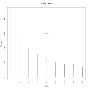
    So let’s apply this to the 2016 election.  I downloaded data on the 2016 election at the county level from here.  Using all of the data for each of the candidates I get the following two plots.  The height of the bar is what is actually observed and the red dots are what is to be expected by Benford’s law.  It really is amazing how well this distribution fits the data.

    benfordclintonall2016benfordtrumpall2016

    And if we go back to 2012, we see exactly the same thing.  Amazing.  Benford’s Law seems so counterintuitive, but it’s observed in so many different places.
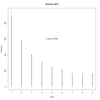
    benfordromney2012_allbenfordobama2012_all

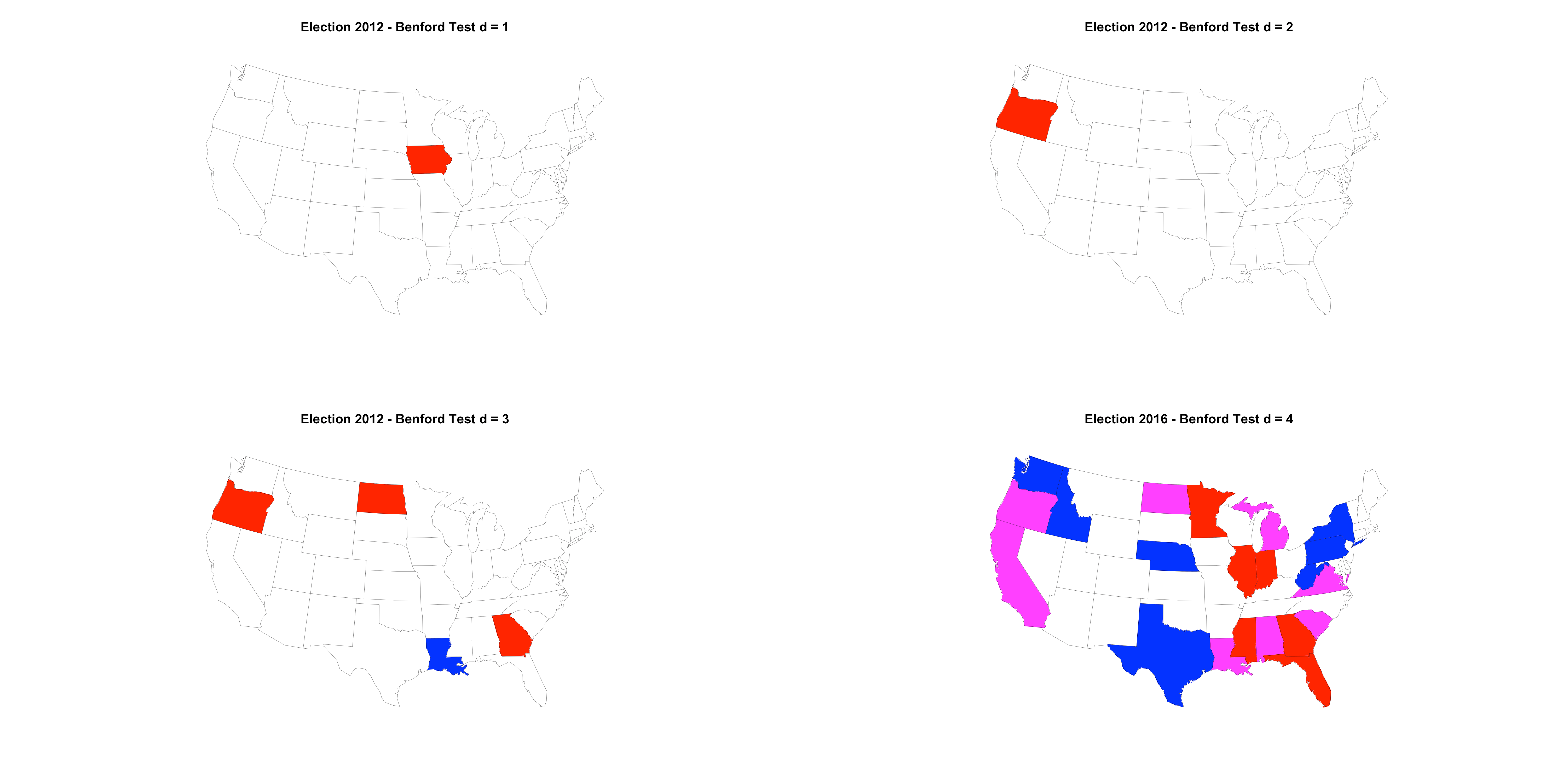
    Next I wanted to look at individual states.  This is problematic for at least a few reasons.  Most notably, there are a some states that have very few counties in them (e.g. Massachusetts, Alaska, etc.).  So I went ahead and tested each state with at least 30 counties individually to see if their votes followed Benford’s Law.  I also went a step further, as Benford’s law can be extended to the first two digits, three digits, etc.  Below are the results of individual state goodness-of-fit tests for Benford’s law for 1-4 digits using a Bonferroni correction to control the family-wise error rate (FWER).  States where the null hypothesis is rejected for Trump and Clinton are colored red and blue, respectively.  States where the null is rejected for both Clinton and Trump are colored purple.  I’m pretty sure I shouldn’t even be doing a Benford’s goodness of fit on the first 3 or 4 digits when I only have 30 observations.  But I did it anyway.  I’d pay more attention to the plots for the digits 1 and 2.  On those plots we see that the null hypothesis for Trump’s totals in Iowa and Mississippi was rejected for 1 digit and for 2 digits the null was rejected in Mississippi only.  Let’s go look at Iowa and Mississippi in more detail.

    benfordtestmap2016_bonf

    If we look at Trump’s and Clinton’s vote totals in Iowa, we get the plot below.  This is significantly different than Benford’s Law with a p-value of 0.0205.

    benfordtrumpclinton2016_ia

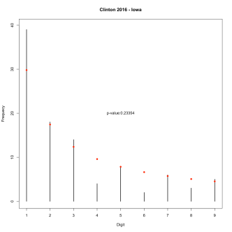
    Next I looked at each candidates vote totals individually.  The departure from Benford’s Law is entirely driven by Trump’s vote totals.  Trump has way less 1’s than expected and more than expected for 2 through 5.
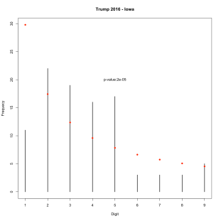
    benfordtrump2016_iabenfordclinton2016_ia

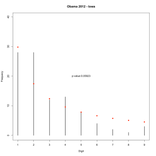
    Before you go flipping out about how this is evidence of election fraud, you should look at Iowa from 2012.  Basically we see the same thing with the Republican candidate.  Too few 1’s and more 2’s and 4’s than we expect.  My guess as to what is happening here is that the types of counties that Republicans are winning in Iowa are not expected to follow Benford’s law?  Is that plausible?   But I’d love to hear other ideas as to what is happening in Iowa.
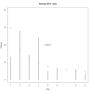
    benfordromney2012_iabenfordobama2012_ia

    Now let’s look at Mississippi.  When we look at Clinton and Trump together, there is nothing significant.  Though we do see far fewer 1’s than expected, just like in Iowa.
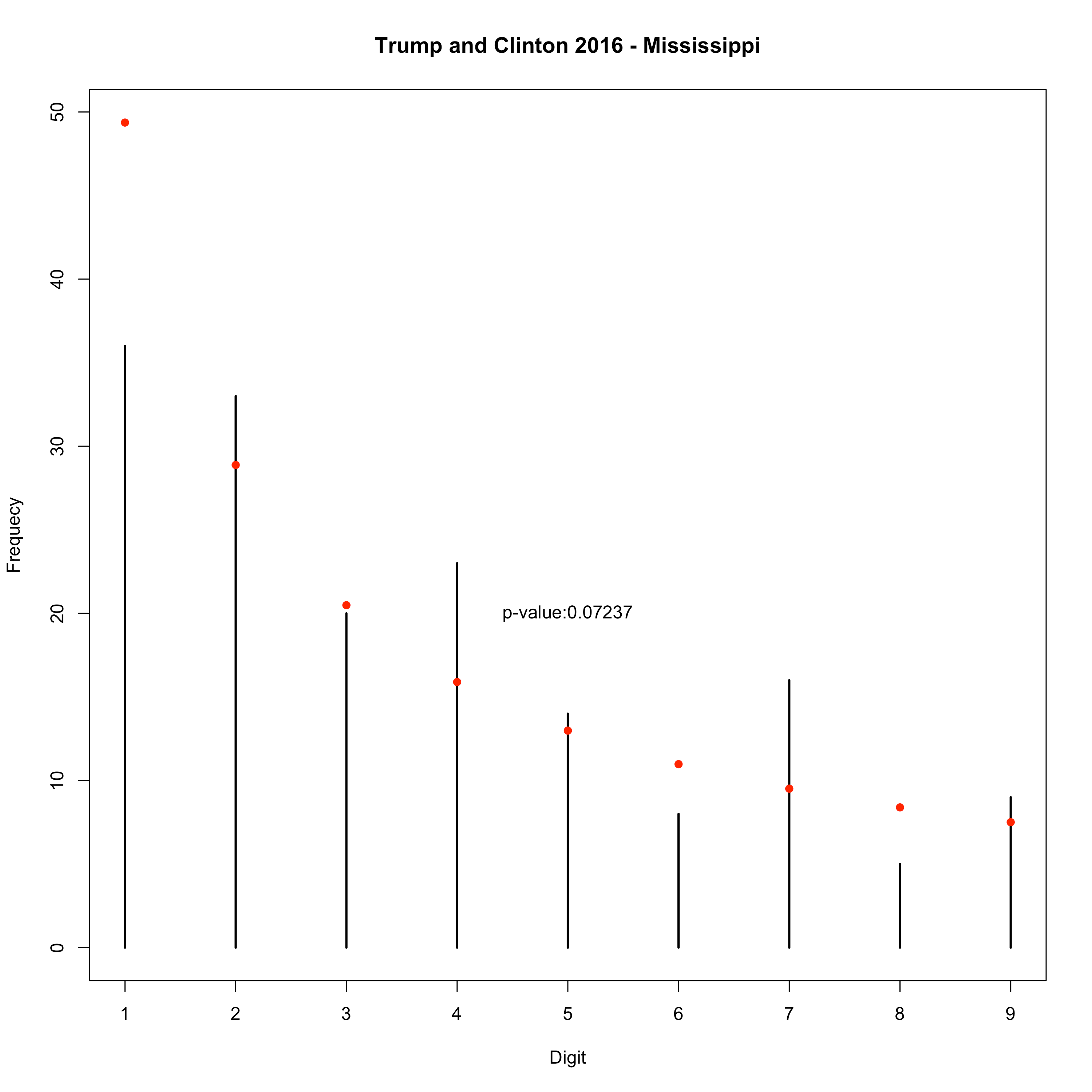
    benfordtrumpclinton2016_ms

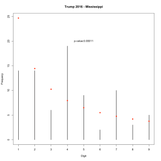
    When we look at Trump and Clinton individually, we see that Clinton’s vote totals are not significantly different than Benford’s Law expects, but Trump’s are very different again with far too few 1’s and way too many 4’s.
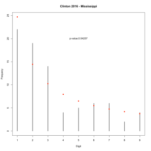
    benfordclinton2016_msbenfordtrump2016_ms

    Finally, here are the plots for test for 2012 using a Bonferroni correction to control the FWER.  Iowa shows up again when d=1, but Oregon shows up when d=2.
     

    benfordtestmap2012_bonf


    In conclusion, Benford’s law is fun and there’s something weird about Iowa and Mississippi.


    Cheers.
  • Well, the 2016 presidential election is over and Donald Trump is going to be the president of the United States.  (How do I feel about that?  Here are my open letters to Donald J Trump and the American people.)

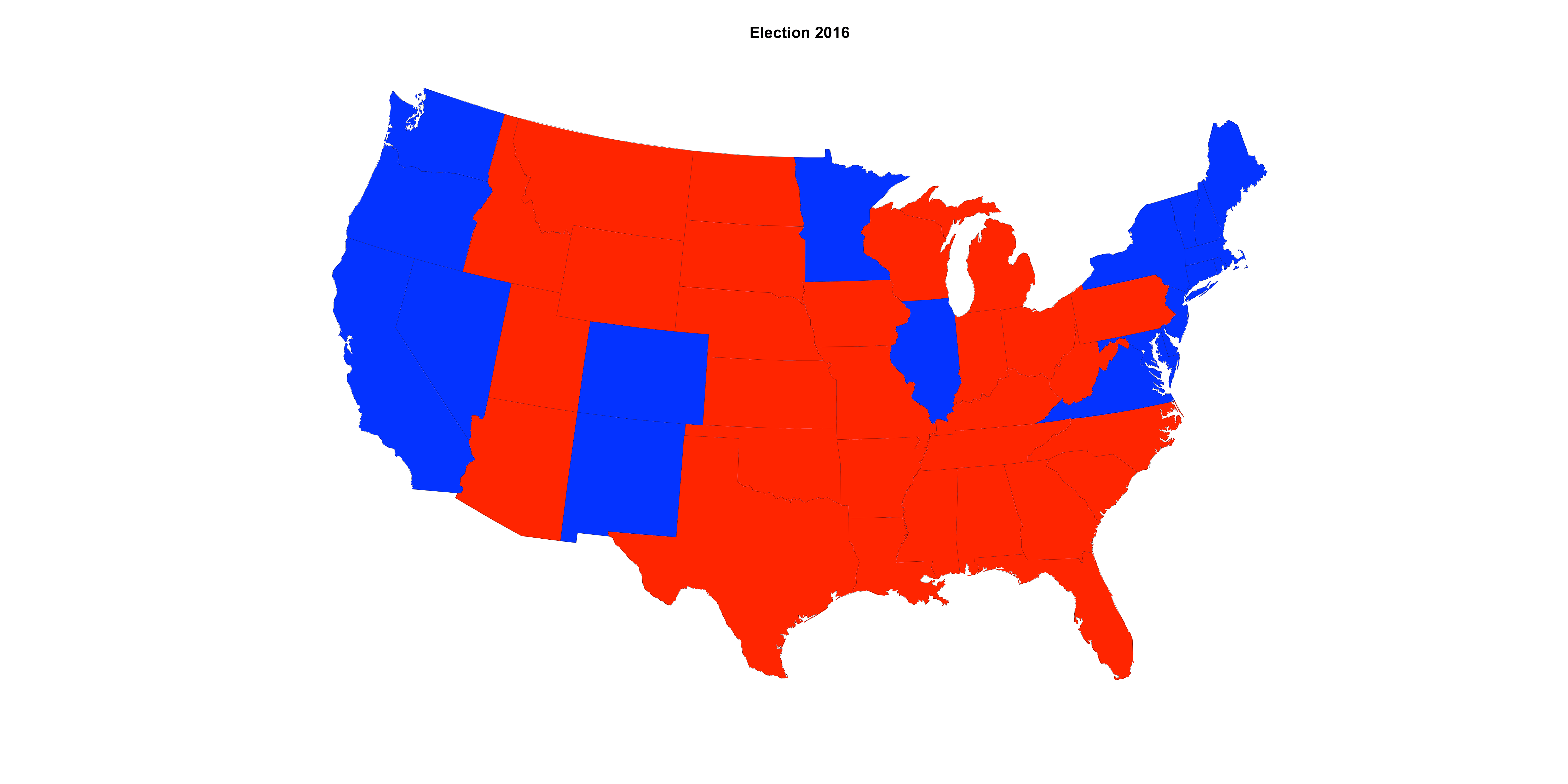
    You’ve probably seen a map that looks like this a bunch of times showing which candidate won each state.  It tells an interesting story about the United States in 2016 in that it is a nice summary of the idea that there are two America’s.  One exists largely on the east and west coasts and the other exists basically in the middle of the United States.

    candidatesTWOstates_EC.png

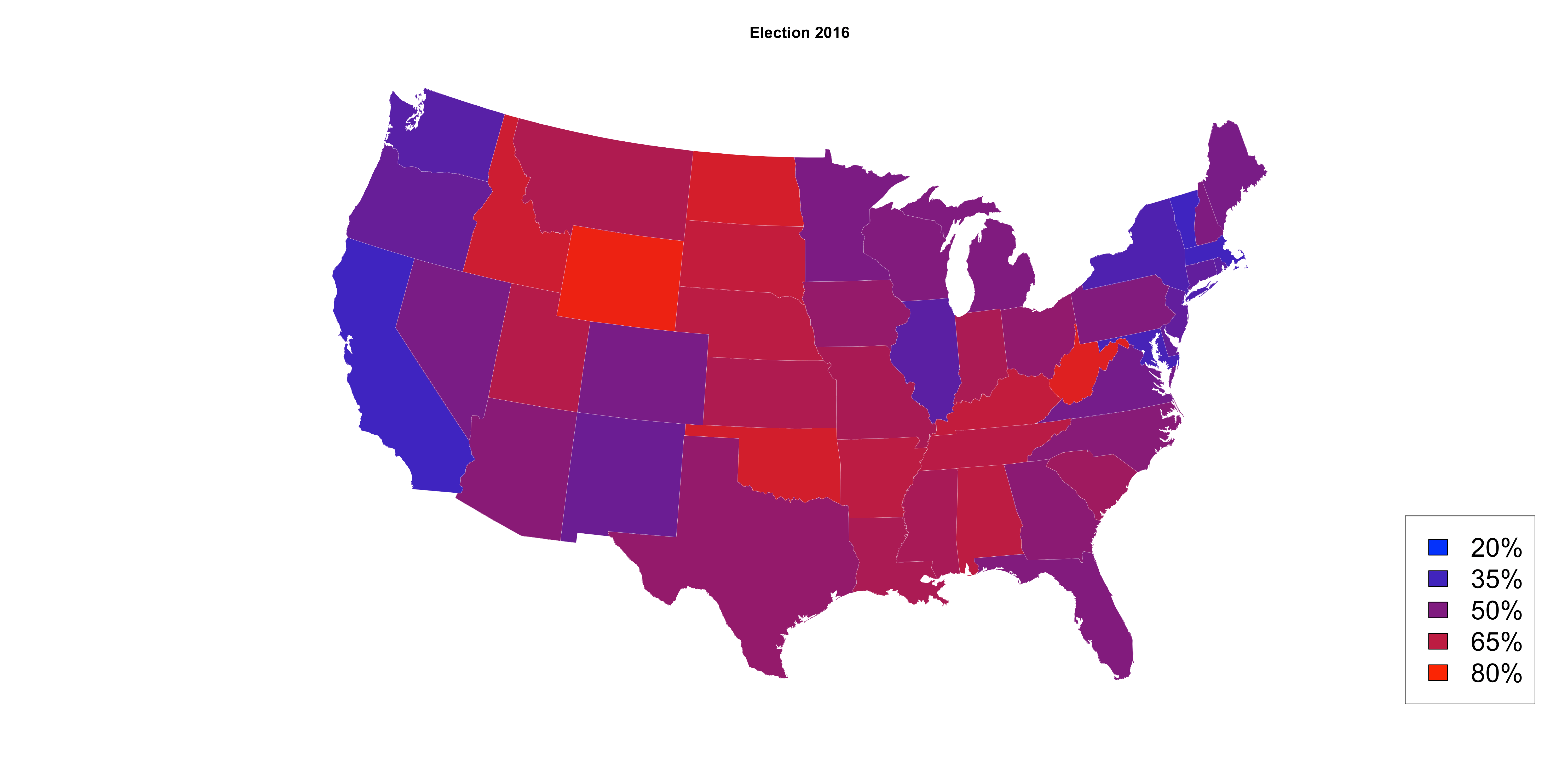
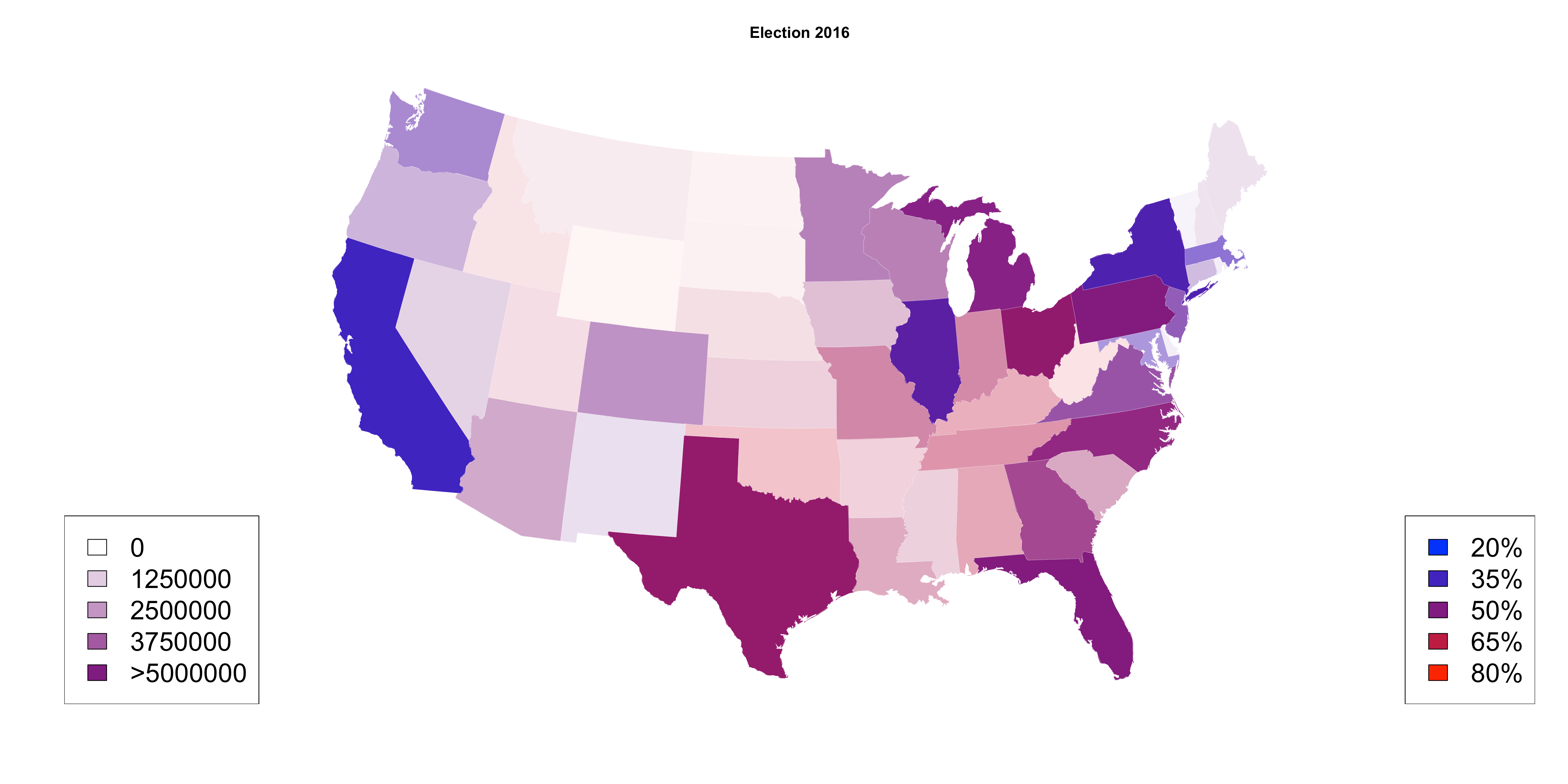
    What I dislike about this plot is that it is far too simplistic.  A better way to look it would be to shade in the state on a scale of red to blue.  That would look like this.  America isn’t really red and blue, it’s very purple.  One problem with this plot is that we don’t get any idea of the population in each of these states.

    candidatestwostates

    I added in the population by using the opaqueness and that plot looks like this.  Again, America isn’t really red and blue, it’s purple.

    candidatestwostates_dens1


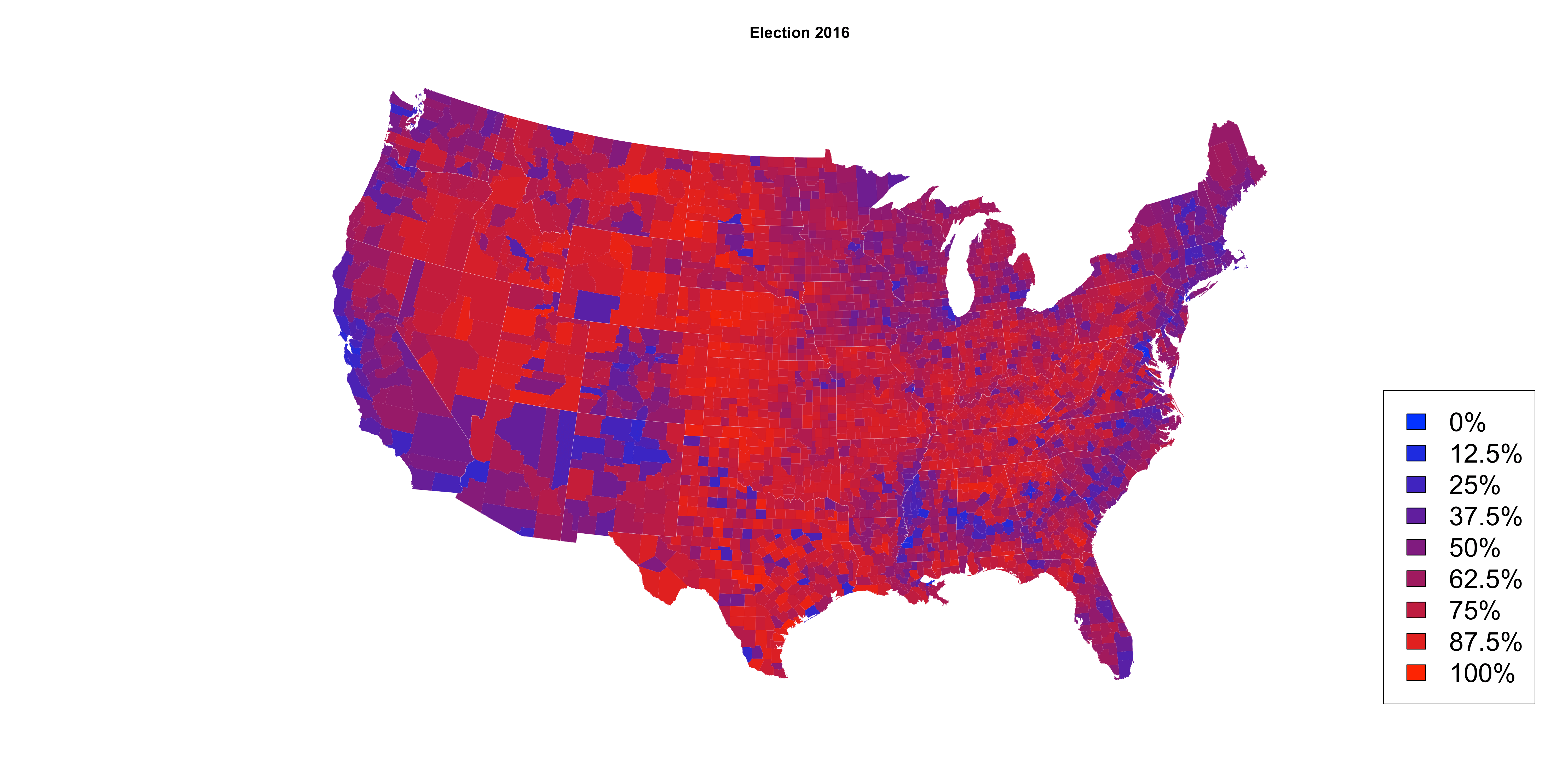
    These plots are nice, but I’d like to drill down further.  So I downloaded data from Kaggle’s Data sets for the 2016 election at the county level to make this plot. I much prefer this plot with a color scale for percentage of votes in each county, rather than giving each county to one candidate or the other.  The percentages here are computed by only considering votes cast for the two major party candidates and then calculating what percentage each of those two candidates received.  You’ll notice that the west coast and east coast are not surprisingly mostly blue and the middle of the country is red.  Some interesting exceptions are New Mexico, Arizona, and Colorado are much bluer than the other states that surround them.  There is also an interesting band of blue in the south that runs from North Carolina west through South Carolina, Georgia, Alabama, and Mississippi.  I can’t explain that, but I’d love to hear theories about that.  It’s also interesting to see just how purple the upper midwest is in states like Wisconsin, Iowa, and Minnesota.

    candidatestwo_dens1

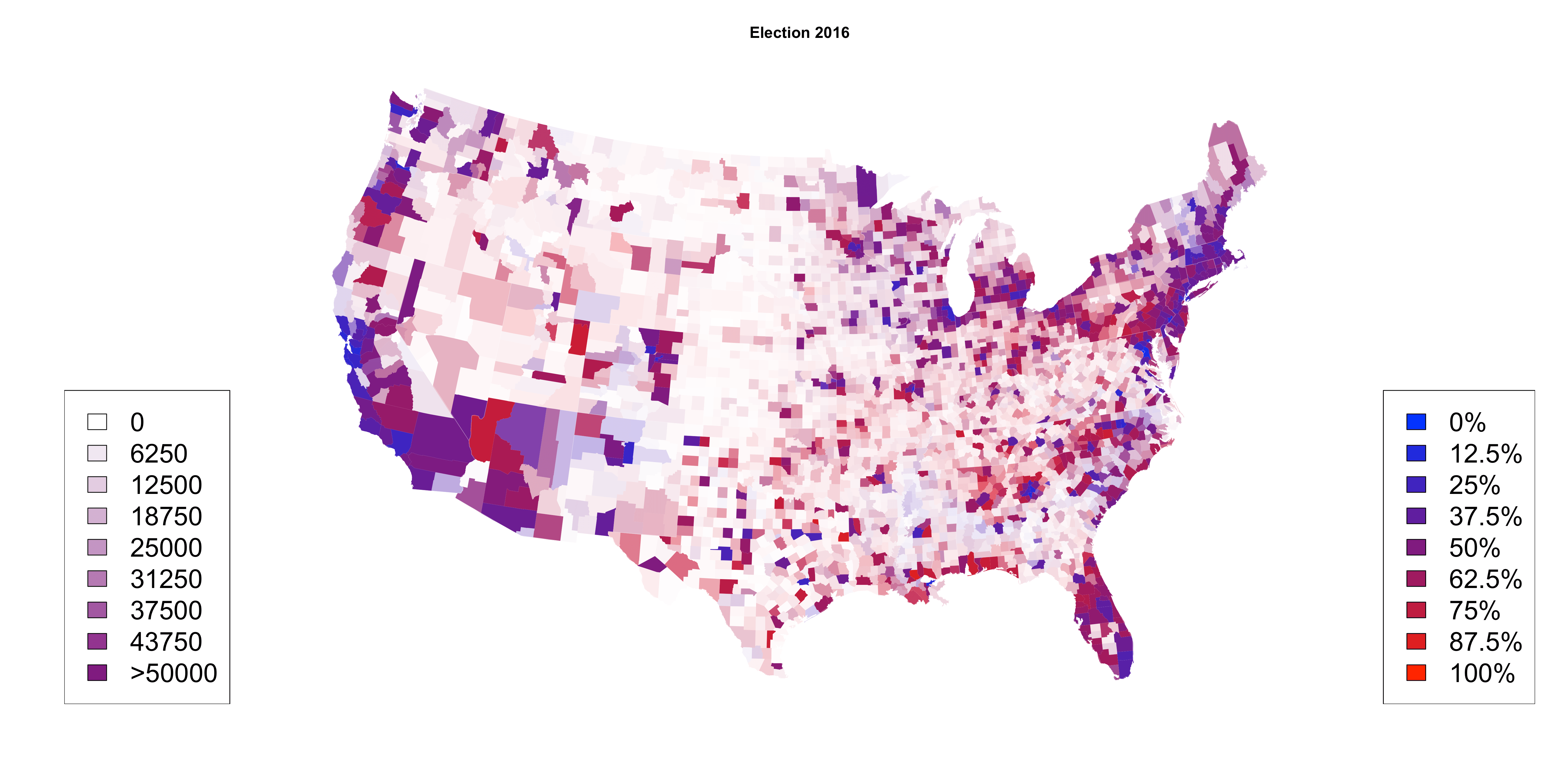
    However, there are problems with this map too as it’s difficult to see the population of these counties as they are all presented as the same.  So in the next plot, I’ve used the opaqueness to show more populated counties and less populated counties are more translucent.  That plot looks like this below.  You can see from this plot not only the percentage of votes in each county, but also the population in those counties.  The most notable aspect of this plot is how much less red there is in this plot.  That’s a result of the red counties having much smaller populations than other counties.  I really, really like this plot.  candidatestwo

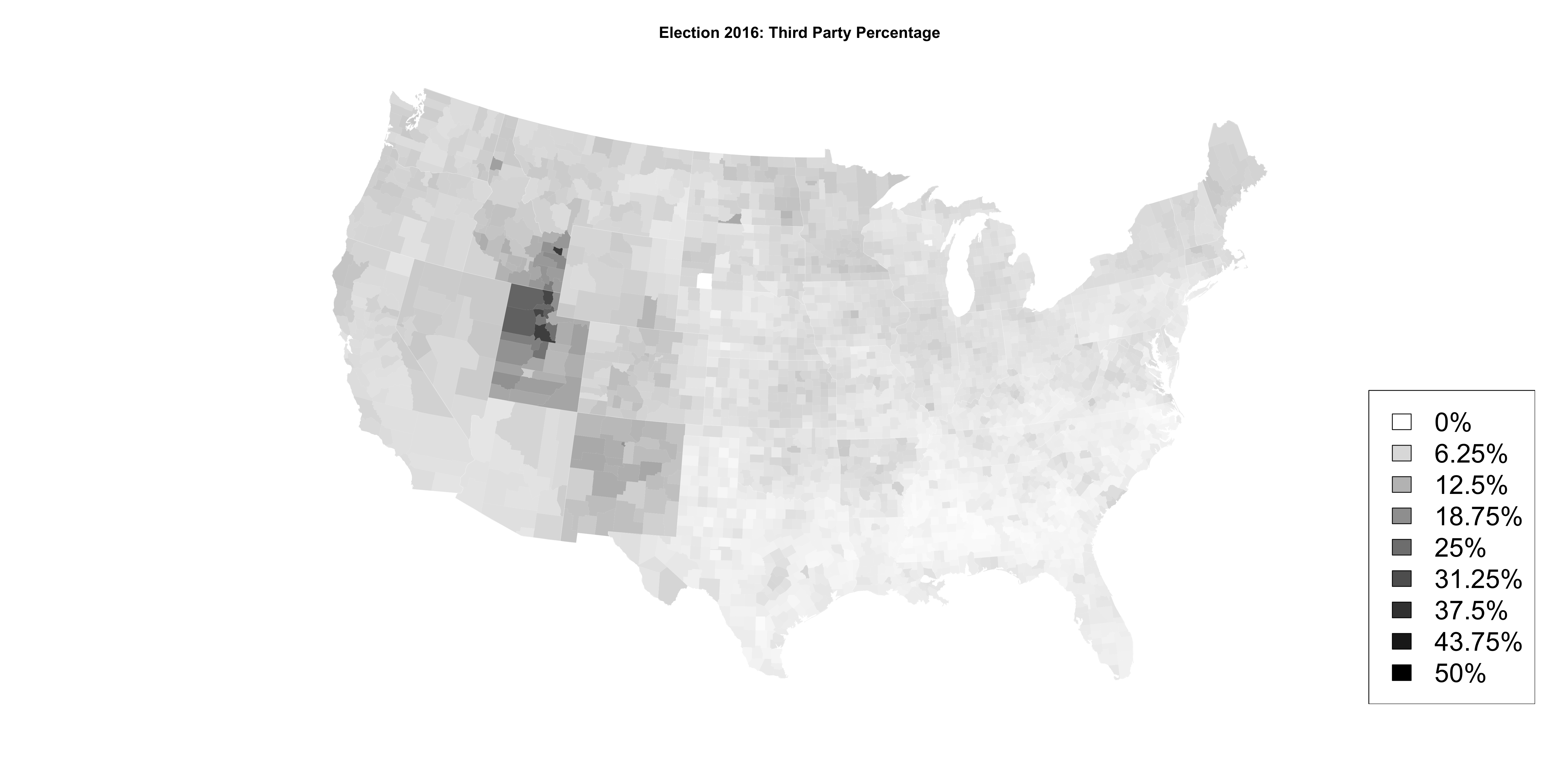
    Next I wanted to look at third party candidates by county and you get this.  You’ll see that Utah was the predominant state that voted for a third party candidate (Evan McMullin) as well as New Mexico (Gary Johnson) and parts of Idaho (McMullin).

    thirdparty

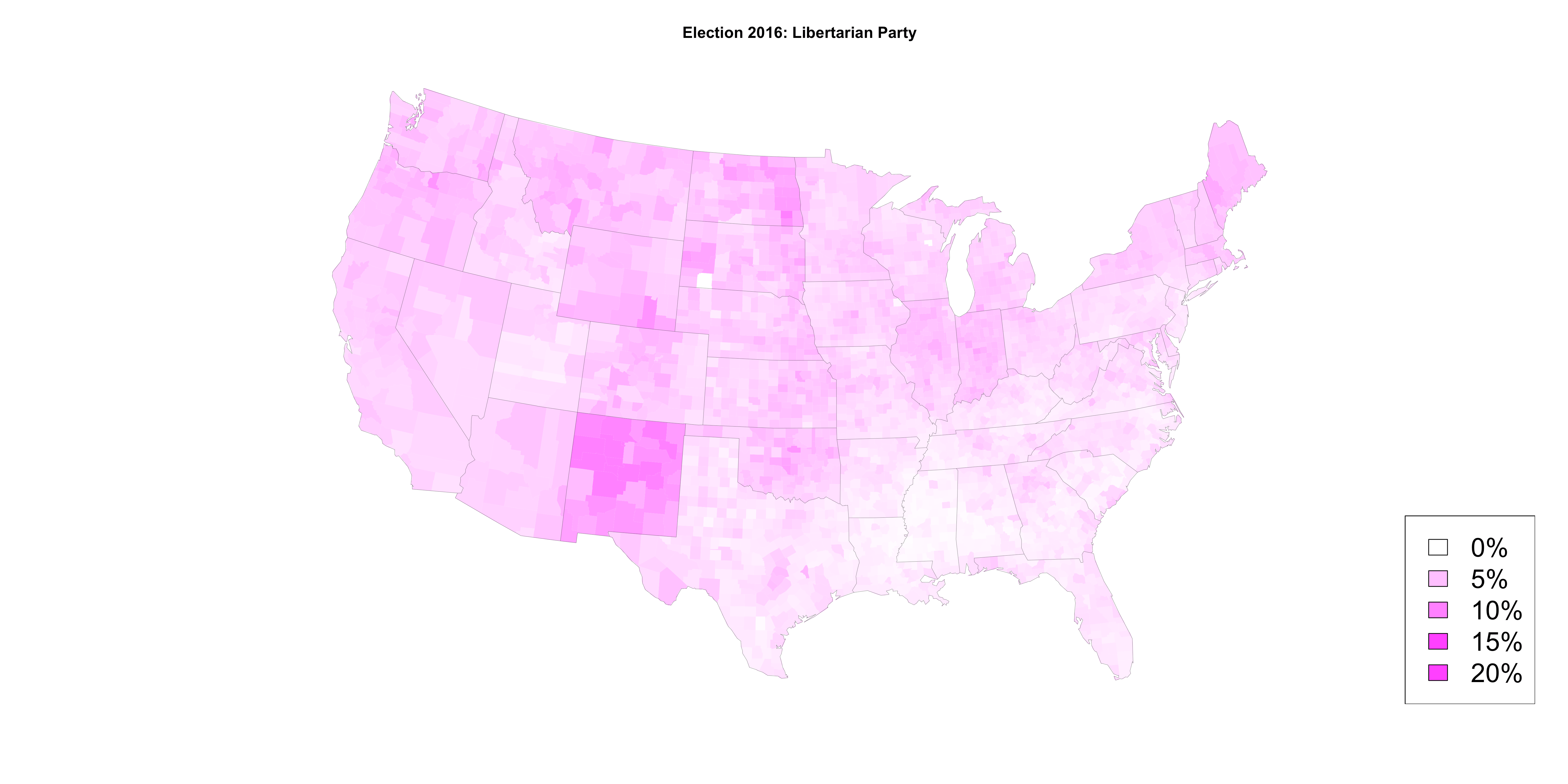
    Drilling down into individual third parties you can wee who was voting for Gary Johnson.  This was primarily centered in New Mexico, where Johnson is a former governor.  Johnson had very little support in the south.

    libertarianparty

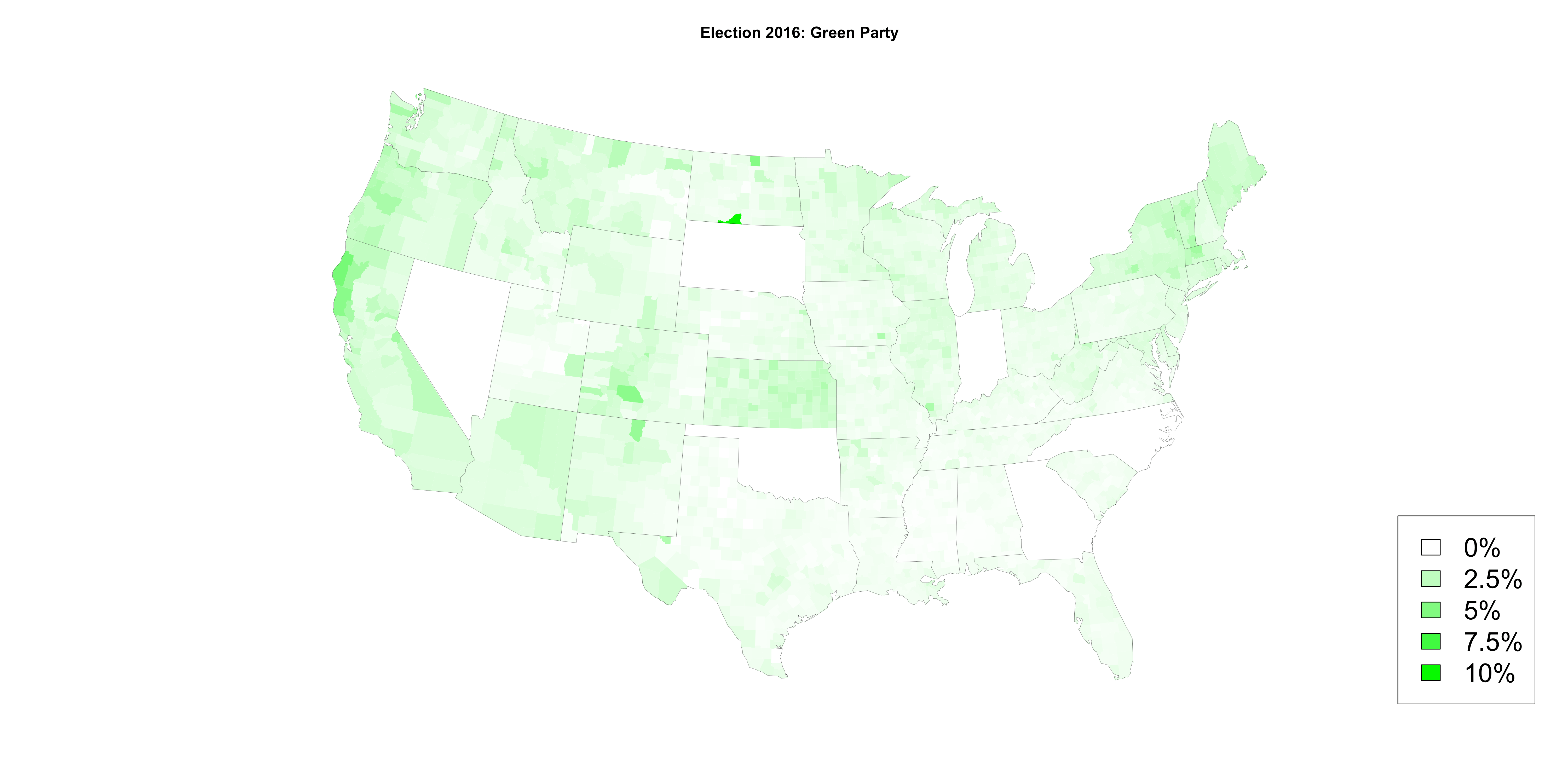
    Jill Stein did well in a few places in the United states, however, she failed to make it on the ballot in all 50 states.  The big pockets of Stein support are the northern coast of California and parts of Colorado.  I really like the juxtaposition of Vermont and New Hampshire next to each other.

    greenparty

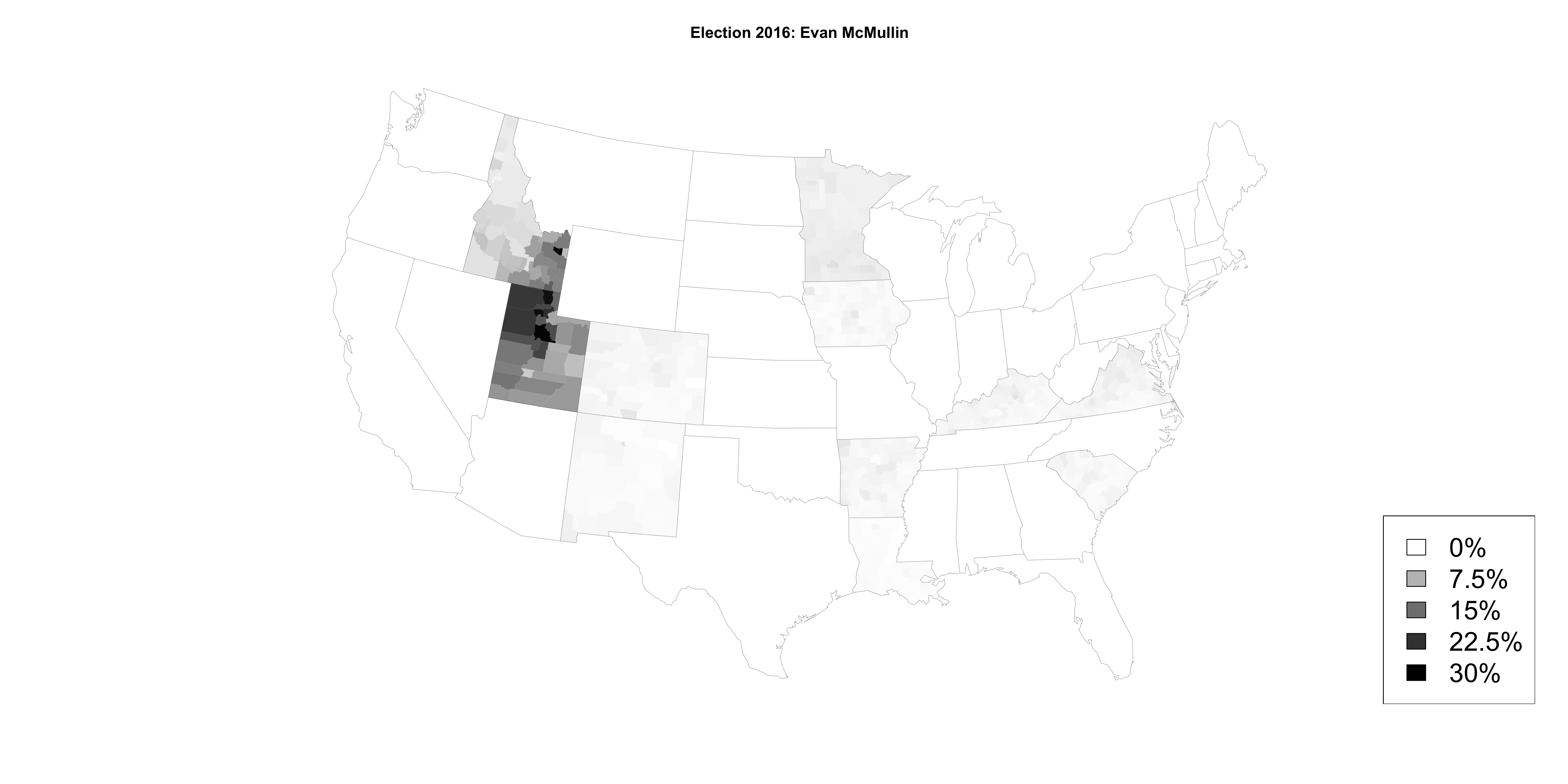
    Finally, here is a plot of McMullin support that was primarily in Utah and southern Idaho, which are heavily Mormon areas of the country.  There also seems to be moderate support for McMullin in Minnesota.

    mcmullin

    If you are interested in the code, you can find it here.  And the data is from here.

    Cheers.

  • I’m still nauseous from the giant screw up America just made electing an entitled, unqualified man baby to be the leader of the free world.  The only thing that settles my stomach is looking at data.  (Or should I say daTUMS. Pun very much intended.)

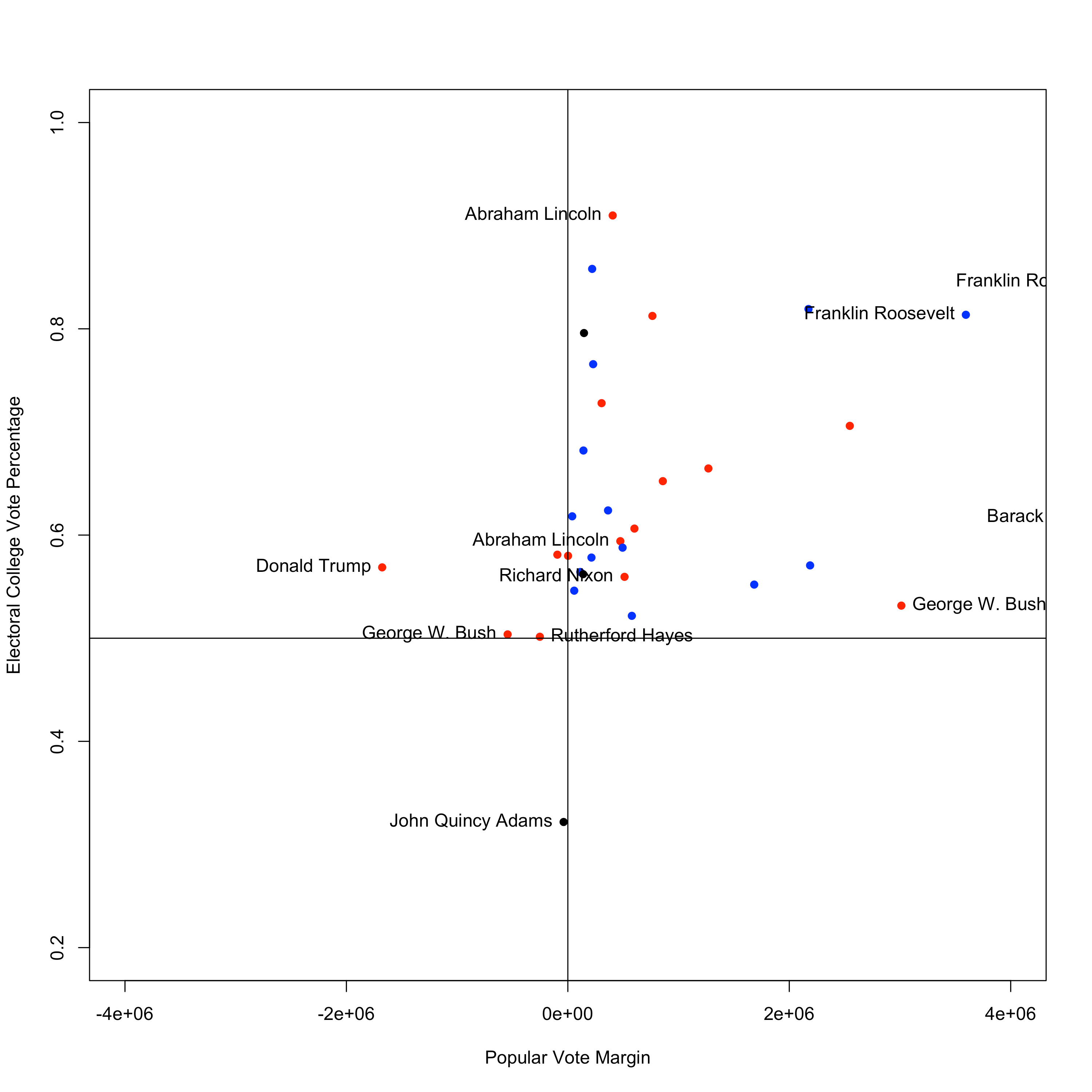
    So what I wanted to look at today was the relationship between the popular vote and the electoral vote.  So I got data from the most reputable source on the internet, Wikipedia.  The plot below shows the popular vote percentage margin of victory for the winner on the x-axis (negative numbers if they lost the popular vote) against the percentage of the electoral college that they received.  Kind of a confusing relationship.  In the past, some ten point victories have garnered only about 60% of the electoral college votes whereas more recently with Reagan a 10 point victory got him about 90% of the electoral votes.  Next, notice Trump on the left of the plot.  Trump got nearly 60% of the electoral college votes and lost by 1.7% (and still growing….).  What’s really alarming about this is that two other presidents have actually lost the popular vote WORSE than Trump and still been elected.  John Quincy Adams actually lost both the popular vote AND got less electoral votes, but since no one got a majority of electoral college votes the decision of who would be president went to the Congress and they chose Adams even though Jackson got about 11% more of the popular vote and 11 more electoral votes than Adams.  How angry would Twitter be if that happened today (Answer: very angry).  In 1876, Hayes lost the popular vote by about 3 percentage points, but squeaked out a 185 to 184 win in the electoral college (with turnout at 81.8%!).  Next in line on the list of presidents who lost the popular vote is none other than Donald Trump, who lost by almost 2% but got a greater percentage of the electoral votes than George W. Bush did in either of his victories.  So we actually have seen presidents who lost the popular vote by more than Trump, but not since the late 1800s.  prespct

    Next I looked at vote margin against the percentage of the electoral college.  No one has ever lost the popular vote my more votes that Trump and it’s not even close.  Of course, it’s not really a fair comparison to compare Trump to Hayes, but when Bush lost the popular vote to Gore, it was at least relatively close.  Trump is going to end up losing the popular vote by possible 2 million votes.  That’s a lot of people.

    presvotesall

    Here is what that plot looks like if you zoom in on the origin.  There is Donald Trump way out to the left by himself nearly 2 million votes behind Clinton.  presvotessmall

    Cheers.

  • Guns are a public health problem.

  • New Orleans at Carolina

    Prediction: Panthers 27-23 (59.7%)

    Pick: Panthers -3.5

    Total: Under 51.5

    Buffalo at Cincinnati

    Prediction: Bengals 23-20 (59.2%)

    Pick: Bengals -3

    Total: Under 47

    Pittsburgh at Cleveland

    Prediction: Steelers 25-21 (60.0%)

    Pick: Browns +9

    Total: Under 49

    Baltimore at Dallas

    Prediction: Cowboys 23-21 (55.7%)

    Pick: Ravens +7

    Total: Under 45

    Jacksonville at Detroit

    Prediction: Lions 25-20 (59.7%)

    Pick: Jaguars +6.5

    Total: Under 47

    Tennessee at Indianapolis

    Prediction: Colts 25-21 (59.7%)

    Pick: Colts -3

    Total: Under 52.5

    Tampa Bay at Kansas City

    Prediction: Chiefs 24-19 (63.1%)

    Pick: Buccaneers +7.5

    Total: Under 44

    Arizona at Minnesota

    Prediction: Cardinals 21-20 (50.1%)

    Pick: Cardinals EVEN

    Total: Over 41

    Chicago at NY Giants

    Prediction: Giants 24-21 (58.2%)

    Pick: Bears +7

    Total: Under 47.5

    Houston at Oakland

    Prediction: Raiders 21-20 (51.3%)

    Pick: Texans +6

    Total: Under 46

    Philadelphia at Seattle

    Prediction: Seahawks 24-19 (64.4%)

    Pick: Eagles +6.5

    Total: Under 44.5

    New England at San Francisco

    Prediction: Patriots 25-21 (60.0%)

    Pick: 49ers +13.5

    Total: Under 51

    Miami at Los Angeles

    Prediction: Rams 21-20 (53.2%)

    Pick: Rams -1

    Total: Over 40.5

    Green Bay at Washington

    Prediction: Packers 25-23 (56.0%)

    Pick: Packers +2.5

    Total: Under 50.5

  •  
    Team WinDivison MakePlayoffs MakeSuperBowl WinSuperBowl
    ARI 17.8 53.0 6.8 2.5
    ATL 62.5 71.7 12.6 6.5
    BAL 8.1 16.1 1.9 1.2
    BUF 19.3 66.1 9.9 4.6
    CAR 19.6 31.3 3.5 2.4
    CHI 0.1 0.5 0.0 0.0
    CIN 19.8 37.9 4.3 1.9
    CLE 0.0 0.0 0.0 0.0
    DAL 86.1 92.7 20.9 9.5
    DEN 67.1 85.7 17.3 9.1
    DET 3.8 11.3 1.2 0.6
    GB 45.1 78.1 10.8 3.7
    HOU 59.2 63.5 7.2 3.3
    IND 21.9 26.3 3.0 1.1
    JAC 2.7 2.9 0.2 0.1
    KC 25.4 58.3 8.4 4.1
    MIA 1.0 5.6 0.2 0.2
    MIN 51.0 80.4 14.4 6.4
    NE 77.8 95.9 26.4 14.8
    NO 16.8 27.4 3.3 2.0
    NYG 3.3 15.5 1.3 0.5
    NYJ 1.9 9.0 0.9 0.3
    OAK 4.1 16.0 2.0 1.1
    PHI 5.8 18.9 2.8 1.9
    PIT 72.1 81.8 15.7 7.8
    SD 3.4 15.2 0.9 0.2
    SEA 81.2 92.7 20.1 12.8
    SF 0.0 0.0 0.0 0.0
    STL 1.0 6.2 0.8 0.5
    TB 1.1 1.6 0.0 0.0
    TEN 16.2 19.7 1.7 0.4
    WAS 4.8 18.7 1.5 0.5


  • I have two rankings systems “Prosp” and “Retro”.  “Prosp” is based on 5 years of data with a very steep weighting curve.  “Retro” is based entirely on the current season and strength of schedule.

     
     Rank Team Prosp Retro PredMargin Change W L
    1 DAL 57 70 0.483  8  1
    2 ATL 52 64 0.184  6  4
    3 DEN 60 63 2.378  7  3
    4 KC 54 61 1.235  7  2
    5 OAK 47 61 -1.149  7  2
    6 PHI 53 61 0.090  5  4
    7 WAS 51 60 -1.115  5.5  3.5
    8 NE 62 60 3.001  7  2
    9 SEA 69 57 3.706  6.5  2.5
    10 SD 50 53 -0.570  4  6
    11 NYG 41 53 -0.445  6  3
    12 BUF 56 52 0.014  4  5
    13 MIN 50 52 0.325 5  4
    14 HOU 52 51 0.041  6  3
    15 NO 57 51 0.535  4  5
    16 TEN 39 51 -2.308  5  5
    17 ARI 54 51 1.969 4.5  4.5
    18 IND 42 49 -0.563  4  5
    19 DET 49 49 -0.375  5  4
    20 MIA 41 48 -1.226  5  4
    21 LA 38 48 -1.753  4  5
    22 BAL 51 48 0.080  5  4
    23 GB 58 47 2.642  4  5
    24 CAR 63 46 2.444  3  6
    25 PIT 57 46 1.651  4  5
    26 CIN 55 43 1.658  3.5  5.5
    27 TB 42 43 -1.795  4  5
    28 NYJ 49 38 -0.413  3  7
    29 JAC 32 37 -3.212  2  7
    30 CHI 46 37 -1.674  2  7
    31 CLE 34 27 -3.594  0 10
    32 SF 42 26 -2.246  1  8


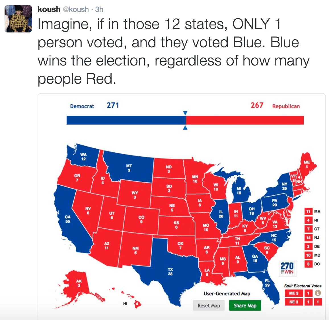
  • How close was Clinton to winning this election?  If 59,886 people in Florida switched from Trump to Clinton, Clinton would be president right now.  If that sounds like a lot of people, remember that over 9 million people in Florida voted for either Trump or Clinton.  And nationally 121,410,869 people voted for either Trump or Clinton.  So those 59,886 people in Florida represent 0.04932507% of the people who voted nationally.  Also, if 59,886 people sounds like a lot, also remember that Clinton got almost ONE MILLION more votes than Trump nationally.  The electoral college is stupid and it needs to be thrown out.  EVEN TRUMP THINKS THIS!!!


  • San Francisco at Arizona

    Prediction: Cardinals 24-18 (66.5%)

    Pick: 49ers +13.5

    Total: Under 47

    Cleveland at Baltimore

    Prediction: Ravens 24-19 (64.9%)

    Pick: Browns +10

    Total: Under 45

    Kansas City at Carolina

    Prediction: Panthers 22-20 (57.5%)

    Pick: Chiefs +3

    Total: Under 44

    Houston at Jacksonville

    Prediction: Texans 22-20 (54.9%)

    Pick: Jaguars +3

    Total: Under 42.5

    Seattle at New England

    Prediction: Patriots 23-22 (52.9%)

    Pick: Seahawks +7.5

    Total: Under 49.5

    Denver at New Orleans

    Prediction: Broncos 25-24 (50.6%)

    Pick: Broncos +3

    Total: Under 50

    Cincinnati at NY Giants

    Prediction: Bengals 24-23 (51.9%)

    Pick: Bengals -1

    Total: Under 47.5

    Los Angeles at NY Jets

    Prediction: Jets 21-18 (58.3%)

    Pick: Jets +1

    Total: Over 38.5

    Atlanta at Philadelphia

    Prediction: Eagles 25-24 (53.7%)

    Pick: Falcons +2

    Total: Under 49.5

    Dallas at Pittsburgh

    Prediction: Steelers 25-22 (57.5%)

    Pick: Steelers -2.5

    Total: Under 50.5

    Miami at San Diego

    Prediction: Chargers 24-21 (57.0%)

    Pick: Dolphins +4.5

    Total: Under 49

    Chicago at Tampa Bay

    Prediction: Buccaneers 23-22 (53.5%)

    Pick: Buccaneers +3

    Total: Under 45.5

    Green Bay at Tennessee

    Prediction: Packers 24-20 (60.4%)

    Pick: Packers -3

    Total: Under 49

    Minnesota at Washington

    Prediction: Vikings 22-21 (50.2%)

    Pick: Vikings +2.5

    Total: Over 42

  • It’s taken me a few days to write this because I’ve been basically unconscious for the last 3 days.  To recap, Hillary Clinton, certainly a weak candidate, but also clearly the most qualified candidate to ever run for president, got hundred of thousands (and when it’s all said and done likely millions) more votes than Donald J. Trump, a racist, sexist, xenophobe, who doesn’t understand the Constitution, but the latter will be the president because we choose presidents based on a system that was created in a time when England had a king, some people owned other people, and before scientific evidence of germs.

    Screen Shot 2016-11-12 at 8.53.52 PM.png

    The silent majority isn’t a majority, it’s just an arbitrarily, geographically well located minority.  I know this makes you want to scream into a pillow or punch a wall, but if you want to do something productive instead, here are some suggestions.

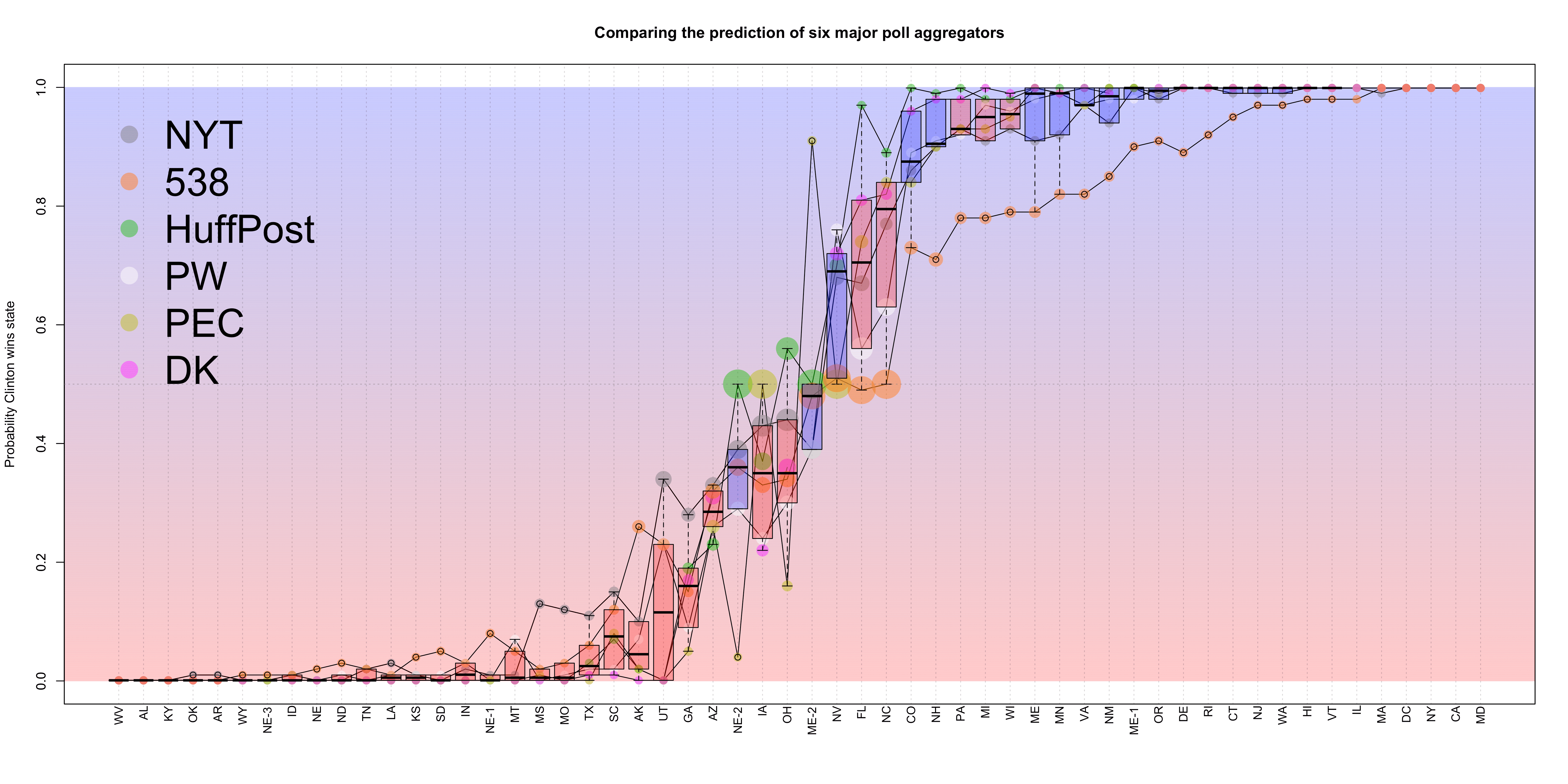
    Anyway, the point of this post is to review the six poll aggregators that made numeric predictions for each state and were compiled on the New York Times The Upshot: New York Times (NYT), FiveThirtyEight (538), Huffington Post (HuffPost), PredictWise (PW), Princeton Election Consortium (PEC), and Daily Kos (DK) (The raw data can be found on my GitHub Page in the repo Statsinthewild).

    Below is a sweet plot that I made comparing the predictions of these six aggregators.  I’ve ordered the states from most red to most blue based on the average of the six predictions from November 5 three days before the election.  Then for each state I plotted a boxplot for the distribution of the 6 predictions and overlaid the individual predictions on top.  The colors of the boxplots are blue if the state (or district) went to Clinton and red if they went to Trump.

    pollaggregatorscomparison

    What immediately stands out for me on this plot is how much lower the Clinton win probabilities were for 538 compared to the other five sets of predictions for states starting and Nevada and moving right on the plot towards bluer states.  Other notable outlying predictions include Huffington Post’s predictions for Florida and North Carolina, which were 97% and 89%, respectively. The New York Times had some outlying probabilities that were high for Clinton in states like Mississippi and Missouri as well as Utah and Georgia.  FiveThirtyEight had many outlying probabilities for the “blue” states, but their most notable outlier for the red states was Alaska, which they gave Clinton a 26% chance of winning.  The next highest probability for Clinton in Alaska was 10%.

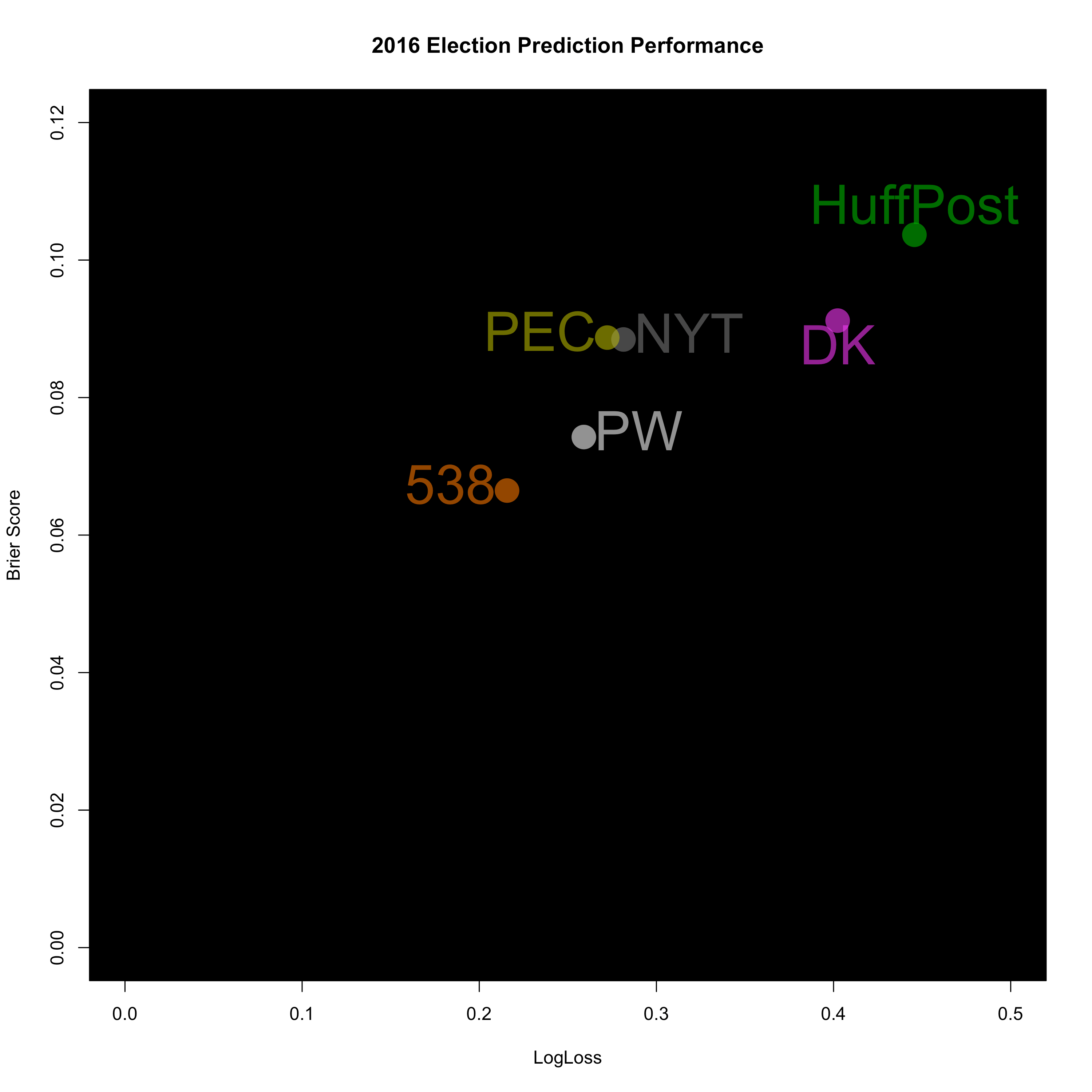
    So now let’s analyze who was the best.  I’m going to do this in two ways: Brier Score and Logarithmic Loss.  I computed results based only on the 50 states and Washington, D.C. ignoring the weird districts in Maine and Nebraska.  Results are below: 

    Average Rank Poll Aggregator Brier Score Log Loss
    1 FiveThirtyEight 0.066 0.216
    2 PredictWise 0.074 0.259
    3.5 New York Times 0.088 0.281
    3.5 Princeton Election Consortium 0.089 0.272
    5 Daily Kos 0.091 0.402
    6 Huffington Post 0.104 0.446

    The worst of the poll aggregators was the Huffington Post.  This looks to be because of their overconfidence in Clinton in several states that Trump won. For example they had Pennsylvania and Wisconsin at >99% and 98% for Clinton, both of which she lost.  Daily Kos comes in 5th with a similar Brier score as Princeton Election Consortium and New York Times, but a much worse Log Loss.  Log loss punishes you heavily for being over confident and wrong, and with predictions like Michigan and Wisconsin at >99% and 99%, respectively, the Daily Kos got crushed by Log Loss.  New up we have Princeton Election Consortium and the New York Times who finished 3rd and 4th, respectively, using Brier score.  However, they flip flop rankings when using Log Loss.  Next up, and claiming the Silver medal is the market site PredictWise with a Brier score of 0.074 and a Log Loss of 0.259.

    So who was the big “winner” of this Election?  Nate Silver.  A few days before the election I said that for him to look good in this election he needed it to be close or have Trump actually win.  Well Trump won and he was the only person who really gave Trump any chance of winning.  On top of that, his state by state predictions outperformed all of the other poll aggregators, and I’m crowning Nate Silver the champion of poll aggregators for the 2016 presidential election.  What Silver did better than any of the other models was when a state was truly a toss up, his model reflected it.  He had North Carolina, for instance, at 50% and Florida at 51% FOR the Republicans on November 5.  The only other set of predictions to get close to those numbers was PredictWise, which had North Carolina at 63% and Florida at 53% for Democrats.

    Finally, here is a plot of the six poll aggregators with their Log Loss score on the x-axis and their Brier score on the y-axis.  Scores that are on the lower left are best and scores on the upper right are the worst.  PollAggregatorsComparisonBrier.png

    P.S. Here is a list of articles critical of Nate Silver before the election from the Huffington Post, Fortune, Vox, the Washington Post, Huffington Post again, Mashable and Wired.  Whoops.

    Cheers.