2016 Presidential Election Maps
Well, the 2016 presidential election is over and Donald Trump is going to be the president of the United States. (How do I feel about that? Here are my open letters to Donald J Trump and the American people.)
You’ve probably seen a map that looks like this a bunch of times showing which candidate won each state. It tells an interesting story about the United States in 2016 in that it is a nice summary of the idea that there are two America’s. One exists largely on the east and west coasts and the other exists basically in the middle of the United States.

What I dislike about this plot is that it is far too simplistic. A better way to look it would be to shade in the state on a scale of red to blue. That would look like this. America isn’t really red and blue, it’s very purple. One problem with this plot is that we don’t get any idea of the population in each of these states.

I added in the population by using the opaqueness and that plot looks like this. Again, America isn’t really red and blue, it’s purple.

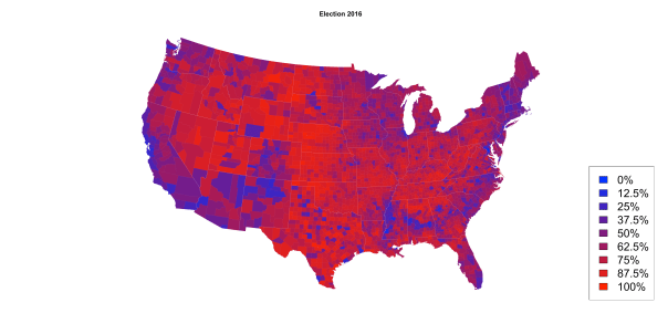
These plots are nice, but I’d like to drill down further. So I downloaded data from Kaggle’s Data sets for the 2016 election at the county level to make this plot. I much prefer this plot with a color scale for percentage of votes in each county, rather than giving each county to one candidate or the other. The percentages here are computed by only considering votes cast for the two major party candidates and then calculating what percentage each of those two candidates received. You’ll notice that the west coast and east coast are not surprisingly mostly blue and the middle of the country is red. Some interesting exceptions are New Mexico, Arizona, and Colorado are much bluer than the other states that surround them. There is also an interesting band of blue in the south that runs from North Carolina west through South Carolina, Georgia, Alabama, and Mississippi. I can’t explain that, but I’d love to hear theories about that. It’s also interesting to see just how purple the upper midwest is in states like Wisconsin, Iowa, and Minnesota.
However, there are problems with this map too as it’s difficult to see the population of these counties as they are all presented as the same. So in the next plot, I’ve used the opaqueness to show more populated counties and less populated counties are more translucent. That plot looks like this below. You can see from this plot not only the percentage of votes in each county, but also the population in those counties. The most notable aspect of this plot is how much less red there is in this plot. That’s a result of the red counties having much smaller populations than other counties. I really, really like this plot. 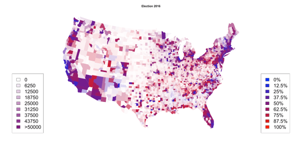
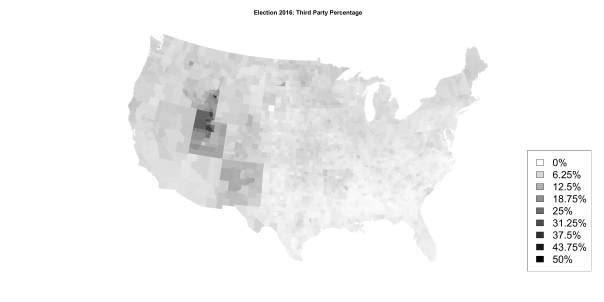
Next I wanted to look at third party candidates by county and you get this. You’ll see that Utah was the predominant state that voted for a third party candidate (Evan McMullin) as well as New Mexico (Gary Johnson) and parts of Idaho (McMullin).
Drilling down into individual third parties you can wee who was voting for Gary Johnson. This was primarily centered in New Mexico, where Johnson is a former governor. Johnson had very little support in the south.

Jill Stein did well in a few places in the United states, however, she failed to make it on the ballot in all 50 states. The big pockets of Stein support are the northern coast of California and parts of Colorado. I really like the juxtaposition of Vermont and New Hampshire next to each other.

Finally, here is a plot of McMullin support that was primarily in Utah and southern Idaho, which are heavily Mormon areas of the country. There also seems to be moderate support for McMullin in Minnesota.

If you are interested in the code, you can find it here. And the data is from here.
Cheers.
Posted on November 25, 2016, in Uncategorized. Bookmark the permalink. Leave a comment.

Leave a comment
Comments 0