 Cheers.
Cheers.
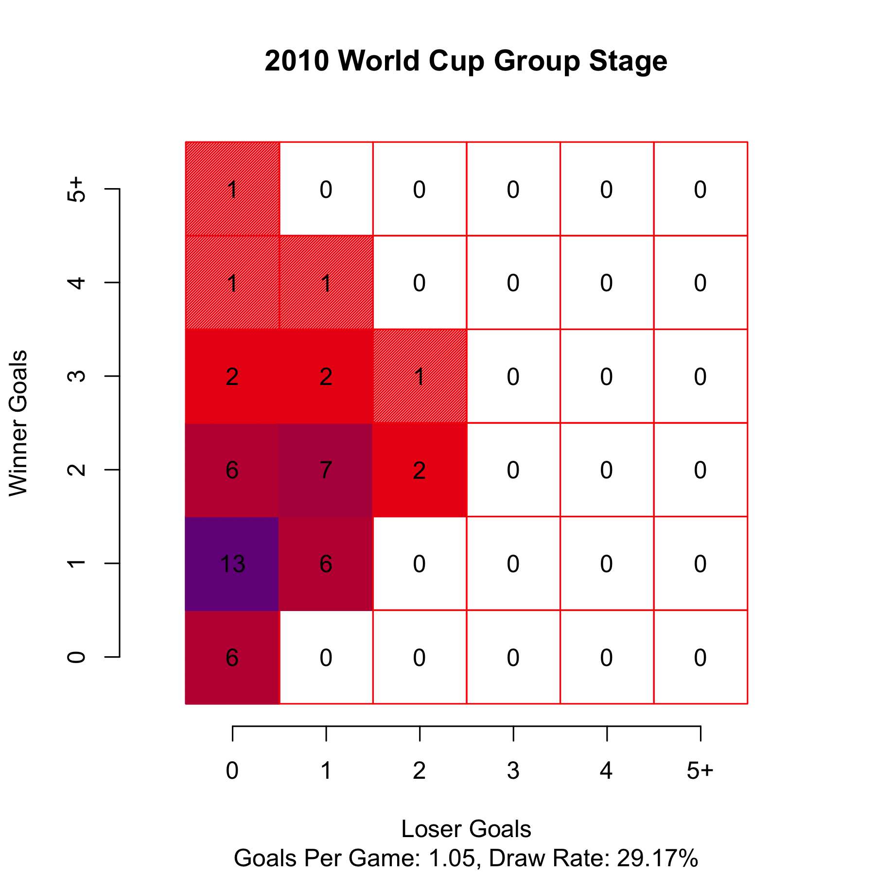
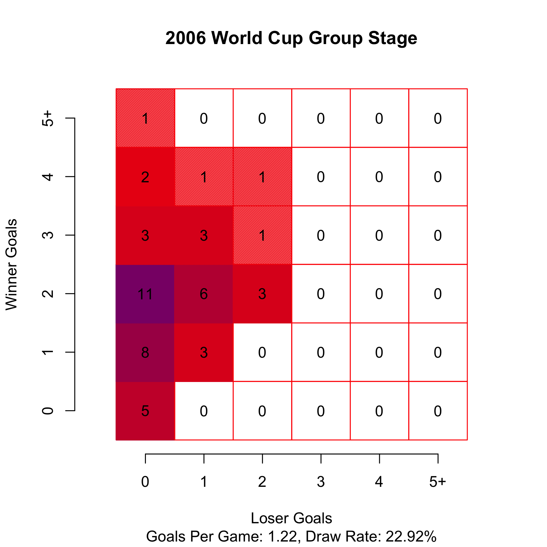
I previously posted about how many goals were being scored in this World Cup, and now I’ve updated it through todays games. I’ve also expanded the grid to 5 x 5 per request.
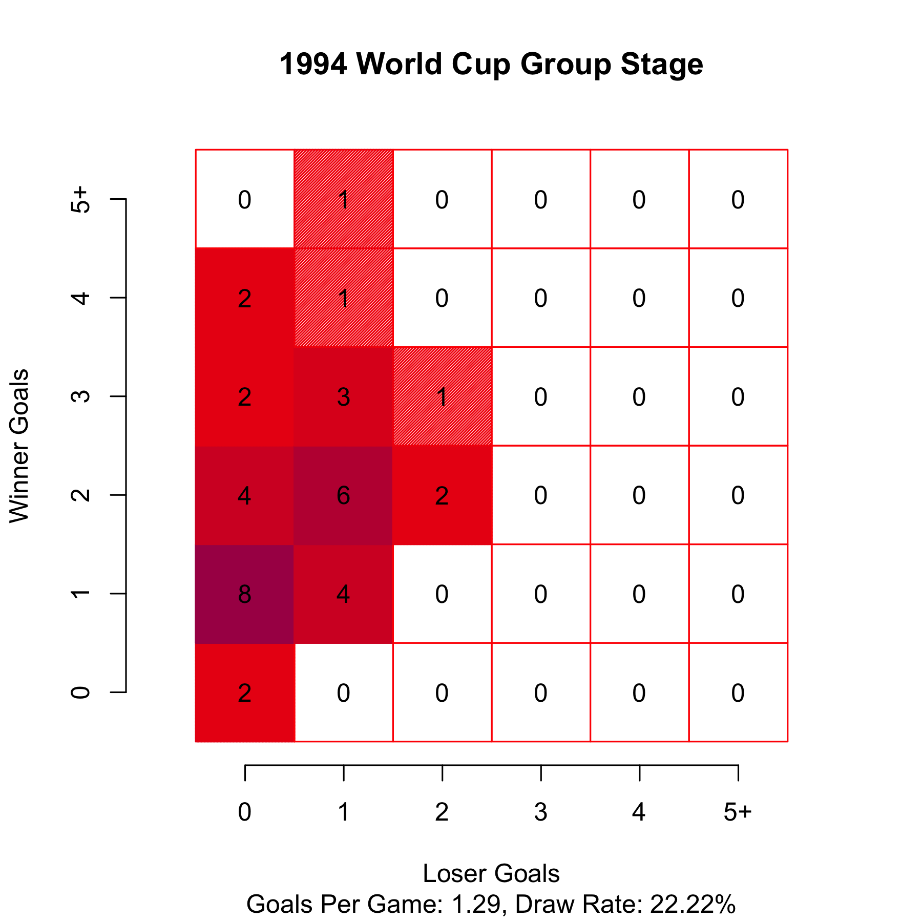
As an American, I can tell you that there are two big complaints that Americans have about soccer: 1) Not enough goals are scored and 2) Every game is a draw. Well fellow Americans those complaints simply don’t work for this World Cup. Since 1994, the group stage has seen a low draw rate of 22.22% in 1994 and a high of 33.33% in 1998. This year however, only 16.67% of games have ended in a draw. (And at least two of those draws were spectacular games.)
As for not scoring goals, teams are averaging 1.43 goals per game in the group stage. Past group stages have produced averages of 1.05, 1.22, 1.31, and 1.29. As a point of reference for American’s, hockey teams averaged 1.37 goals per game this past season. So if you like hockey and hate soccer I don’t want to hear your “they don’t score enough” argument. (Your “all they do is flop and complain” argument is good here though.)
As to why more goals are being score, does anyone have any theories as to why? Is it just a small sample size? Or is there actually something going on here? I’ve heard someone suggest that the ball is different and that the climate may be playing a role. Any thoughts?
Cheers.
I don’t follow soccer/futbol too closely, but I love the World Cup (USA! USA! USA!). I’ve been watching quite a bit of it, and there are two things that are standing out to me.
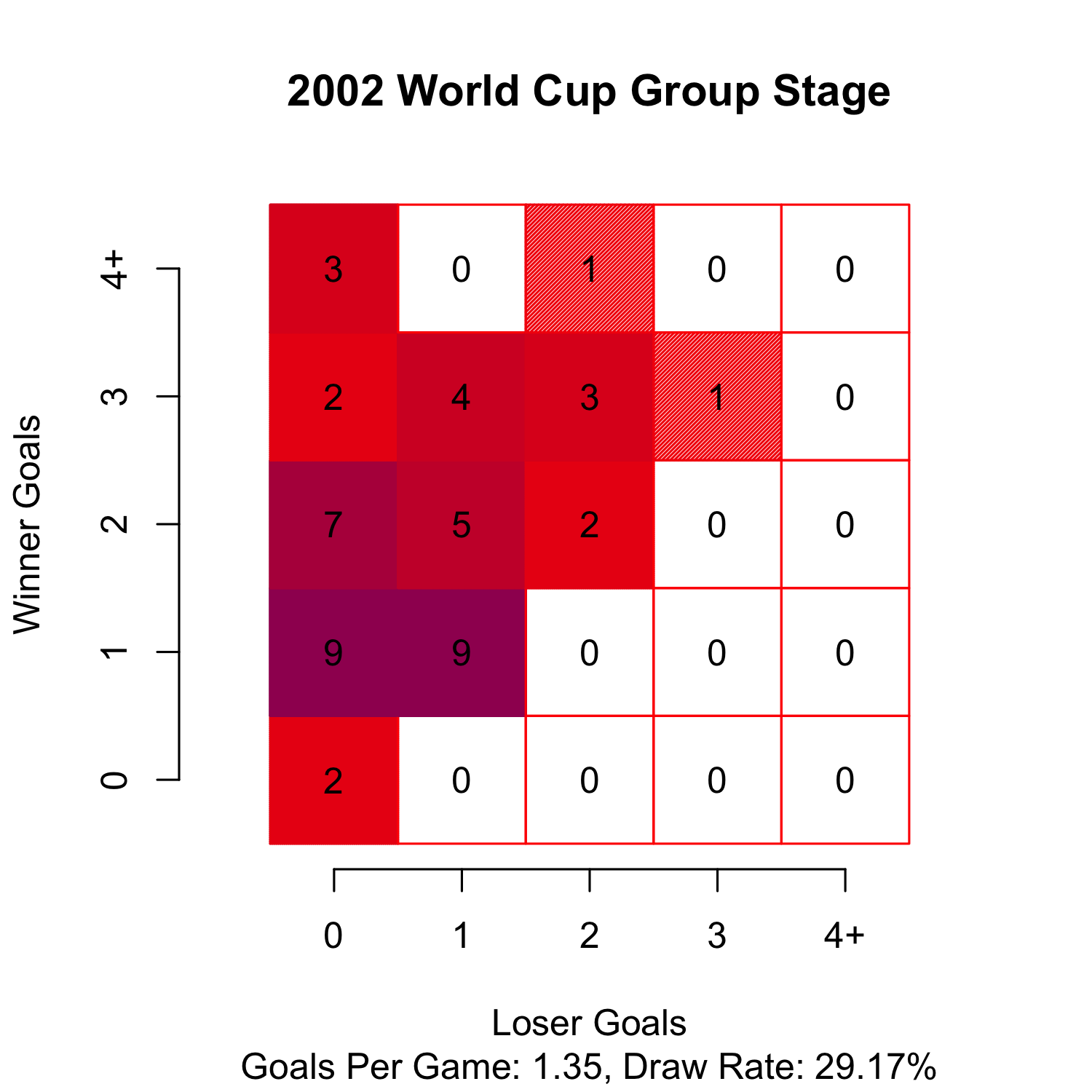
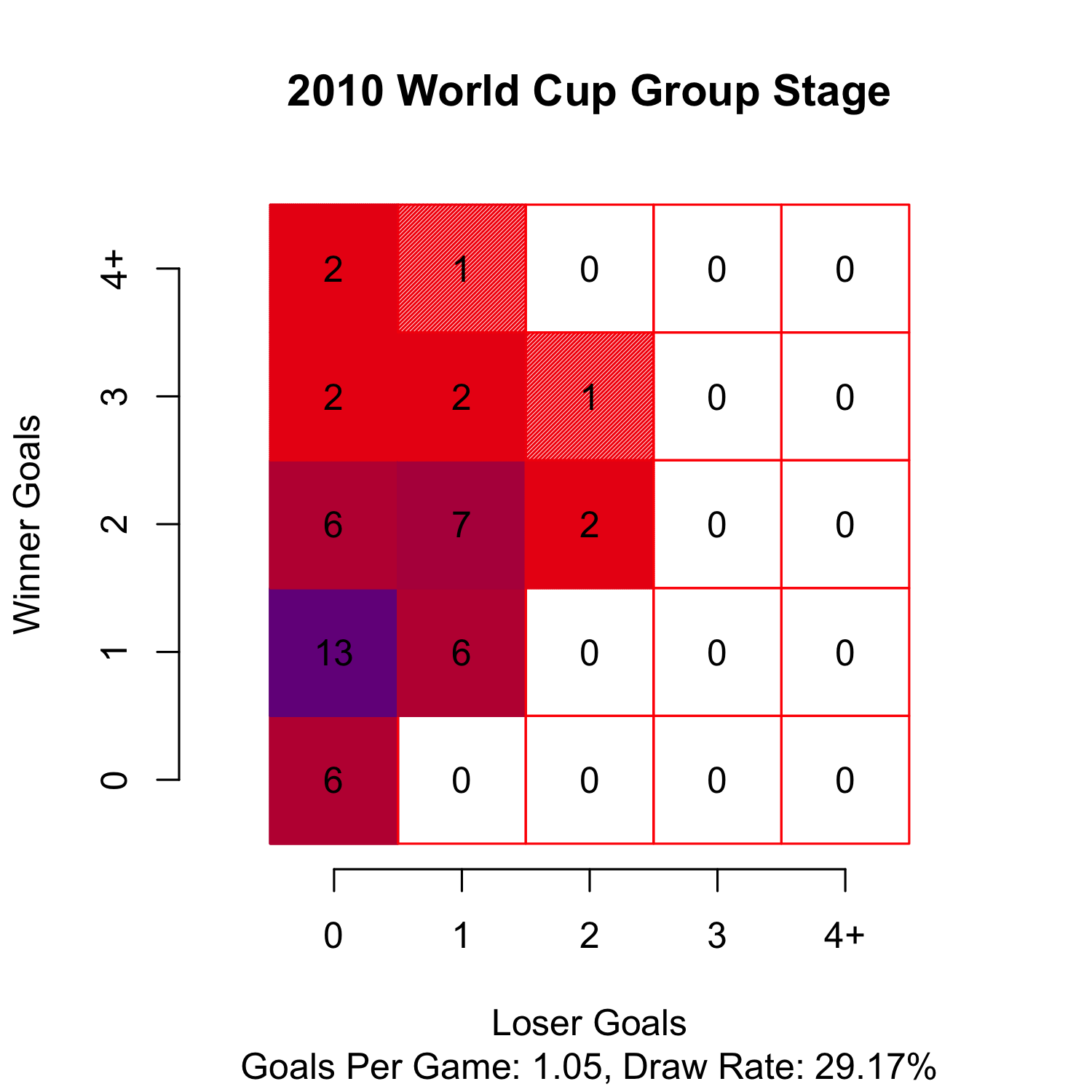
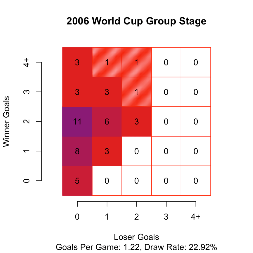
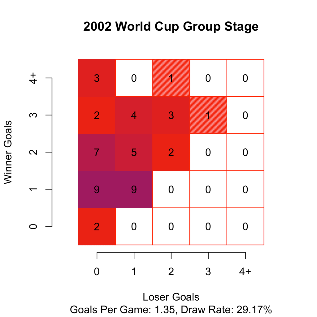
So I went and checked. So far for the 2014 World Cup, the games are averaging 1.57 goals per game and only 7.14% (1 out of 14) of games have ended in a draw. Compare this with the average number of goals scored in the last three World Cups 1.05, 1.22, 1.35 in 2010, 2006, and 2002, respectively. Also compare with the draw rates of 29.17%, 22.92%,29.17% from 2010, 2006, and 2002, respectively.
So, up to this point the summary of the World Cup is tons of goals, very few draws. Even American’s can enjoy that!
Cheers.
Science!
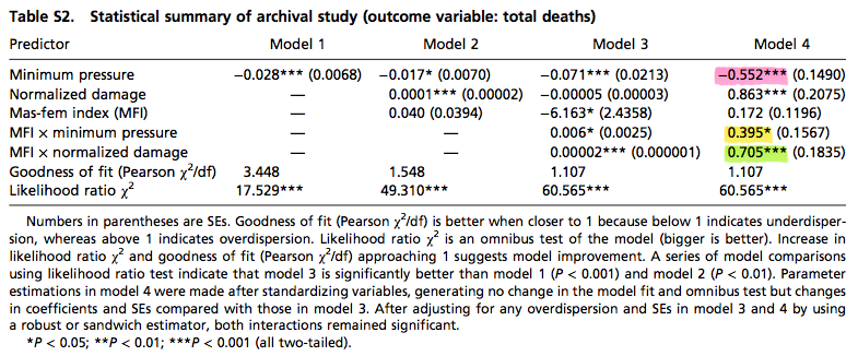
Hurricane Name Study, how I wish I could quit you. But an inquiry prompted me to look some more. Again, you can download the data yourself and replicate their key model, Model 4 above, using the half-tweet’s worth of code I included earlier.
The table isn’t in the paper, only their supplemental materials. Notice there are two significant interaction effects: one for the dollar damage of a hurricane (highlighted in green), and the other for the minimum pressure (highlighted in yellow). Both are severity measures. You might think that because both coefficients have the same sign, they both are consistent with the story that, as hurricanes become more severe, the death rate goes up faster for “female hurricanes” than “male hurricanes.”
Hey, wait! Don’t more severe hurricanes have lower minimum pressure? Why, yes. You can confirm this several ways, but notice how the pink coefficient for the…
View original post 292 more words
 Cheers.

Kirk Goldsberry has attracted a lot of attention with his “geographic” shot charts for NBA players. These are examples of “hexbin” plots. Luckily, the hexbin package for R provides the ability to quickly similar plots. Here, we’ll show how to create a few quick hexbin plots using the MLBAM data.
Carlos Gomez has been in the news recently – let’s focus on him. We’ll start by loading the openWAR data for 2013, and locating Gomez’s MLBAM player ID. [Of course, you can also do this with a web query.]
From this subset, we can compute how many balls Gomez caught while playing CF in 2013. In the MLBAM data, the fielderId field contains the ID of the player who first fielded the ball.
This confirms that Gomez caught each of these 390 balls. Note that we can also calculate statistics when Gomez was playing CF, including the…
View original post 328 more words
 Cheers.
On Tuesday, Slate published the article “You Live in Alabama. Here’s How You’re Going to Die.” that contained some interesting maps. I liked this one the best. Florida and accidents is the least surprising thing I have ever seen.

While this is an interesting map, doing things like this at the state level is not the best. I know it’s probably the simplest way to do things and there are lots of data separated by state, but these maps at the county level would be much more interesting imho.
Cheers.
As of yesterday, Buster Posey, Jacoby Ellsbury, and Ryan Howard were each ranked between 90th and 100th in OPS among all MLB baseball players. That threesome is making $58 million in 2014 alone, with a whopping $338 million owed to them by their teams after this season ends.
Such a trifecta of seemingly awful contracts got me thinking about team performance in the post steroid era. Bad & expensive contracts have always been a part of sports, in particular baseball, but with performance perhaps more variable now than in prior era’s, are general managers with cash to spend having a more difficult time doing so?
Here’s a graph of team payroll and win percentages for each team in the 2004, 2009, and 2014 seasons.
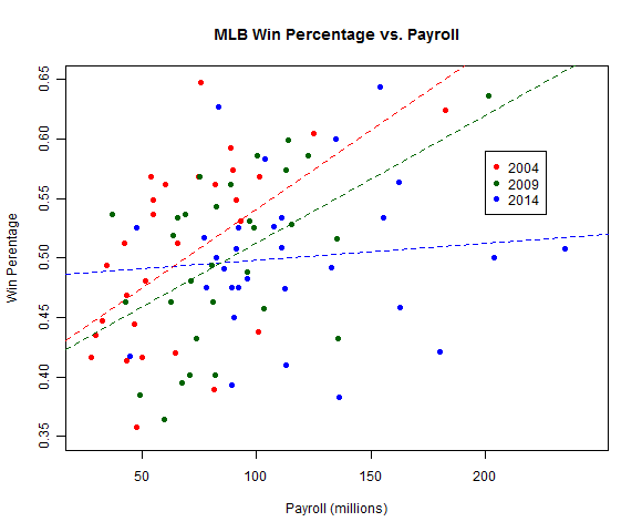 MLB Win percentage by salary
Teams spending money in 2004 posted much higher win percentages, on average, than frugal teams. This association was weaker in 2009, and there is…
View original post 126 more words
I like this quote:
Legislators in Washington state refuse to live in a world where only the wealthy can afford care from poorly trained health care providers who practice unproven medicine.
It’s from the article “Quacking All the Way to the Bank“.
Cheers.