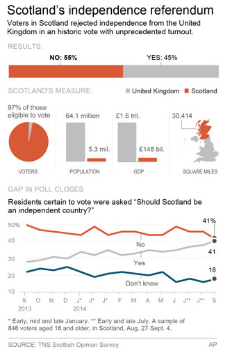
Confusing Scotland pie chart
In the graphic below (from this article), the orange represent Scotland and the gray represents the United Kingdom. So in the result bar this make sense: 55% voted for Scotland to be independent and 45% voted to stay in the United Kingdom.
For population and GDP, I think this also makes sense. For instance, the United Kingdom has a population of 64.1 million and Scotland has a mere 5.3 million.
The map of the UK get’s a little bit more confusing. The way this is colored Scotland is clearly the orange here, but it looks like to United Kingdom is only the gray part when, in fact, the UK is both the gray and the orange. I would have made Scotland orange and gray striped to indicate that Scotland is both Scotland AND part of the UK.
Finally, the pie chart. This is a puzzle to me. I’m not really sure what they are trying to say here. Maybe I’m missing something, but it looks like what this is saying is that Scotland, who has a small fraction of the total population of the United Kingdom has a full 97% of the eligible voters and the United Kingdom has only 3%. That’s clearly not true. So what is that pie chart trying to say exactly? I really have no idea. (Please let me know if you know what it is trying to say. I really have no idea.)
But no matter what the answer is, can’t we all agree we shouldn’t be using pie charts at all?
Cheers.
Posted on September 19, 2014, in Uncategorized. Bookmark the permalink. 2 Comments.

I couldn’t swear to it, but I think they’ve abandoned the whole UK/ Scotland thing for that pie chart. I think they mean that 97% of the population of Scotland who could vote actually registered to vote. I don’t know what the point of that statistic is really, and why they’ve used the same colour scheme as the UK/ Scotland bit, but that’s really the only thing I can think of that gives you the right number.
If that’s what they are trying to convey, they have done a very poor job of it. But that explanation seems to make sense. I’m not sure how else you could get to 97%.