What will the electoral map look like according to PredictIt markets?
Based on @predictit markets of each state right now (noon on November 5, 2016) Clinton has a 78.77% chance of winning assuming state vote outcomes are independent, which is not a reasonable assumption. Accounting for correlation between the states in their voting patterns and using the derived prices from the market, Clinton has a 66.98% chance to win the election. Below you can see how these probabilities have evolved over time since August and below that you can see a plot of the distribution of electoral votes for each candidate predicted by the markets based on different assumptions about the correlation between states.


Based on these distribution of electoral votes, let’s take a look at some electoral maps that this model is predicting are the most likely.
But first, let’s talk about correlation between states voting habits so that these maps will make a bit more sense when we look at them. As mentioned before, the assumption of independence between the states is not a reasonable assumption. Below is a corrplot of the percentages of Democratic vote for each state going back to the 1972 presidential election. You can see that states’ vote percentages are highly correlated with each other:

If we look only at swing states we get this: 
States like Arizona, Nevada, Colorado and New Hampshire are highly correlated with each other as are Florida and Ohio. Generally, as you get a higher percentage in Florida, you get a higher percentage in Ohio. Based on these correlation matrices, I thought it would be interesting to look at a principal component analysis of this correlation matrix. Below is the plot of the loadings for each of the 50 states. It appears that the first dimension is explained by blue vs red state where you have states like California, Vermont, and Connecticut to the far left and states like West Virginia, Kentucky, and Alaska on the far right. The second dimension is less clear to me, but I’m going to say that it has to do with regional differences. States that show up large on the second component are states like South Dakota, North Dakota, Montana, Utah, Idaho, Wyoming, Nebraska, and Alabama. Most of these states, with the exception of Alabama are sort of the northern red states. The other side of the second components contains states like Mississippi, South Carolina, Georgia, Florida, Virginia, Maryland, Tennessee, and Alaska. With the exception of Alaska, these are all southern mostly red states.

What all of this means is that the assumption of independence between states is very unreasonable and that winning one state like Florida makes it more likely to win a state like Ohio. So I’m going to look at the most likely maps based on my correlation model. (I should not that I’m not dealing with the nuances of Maine or Nebraska. I’m assuming whoever wins the states gets all the electoral votes, which isn’t the case.)
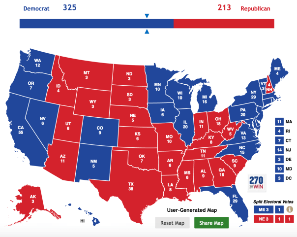
The most likely map according to the PredictIt markets and my model gives Clinton 358 electoral votes and has about a 7.13% chance of occurring. That map looks like this: 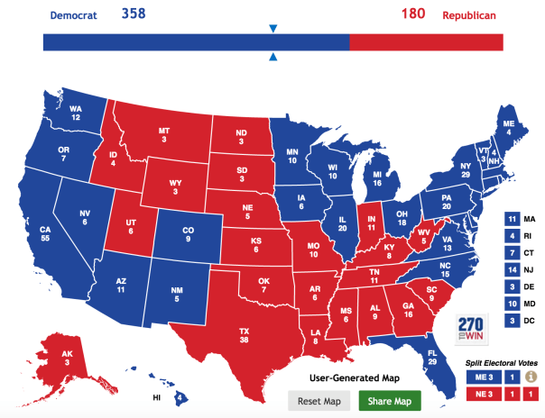
Now you might say, “Wait a second Greg, Trump is winning in Ohio.” And I would agree with that. However, Ohio is solidly in the category of swing state and is highly correlated with places like Pennsylvania and Florida which Clinton is winning and (probably) winning. Basically in a generic race (which this is not), a candidate who gets Pennsylvania and Florida will likely also get Ohio. Let’s keep going and look at a whole bunch of other plausible maps that my model predicts as the most likely.
This next map has about a 5.55% chance of happening. This map is the same as before, except that Clinton loses Arizona and Ohio and gets to 323 electoral votes.

The next most likely map gets Clinton to 352 electoral votes and has about a 3.16% chance of occurring. Here are two different ways for Clinton to get to 352 electoral votes with the second map being a bit more plausible:


After this you get a map with 279 electoral votes for Clinton which has about a 2.8% chance of occurring. In this scenario, Clinton loses Ohio, Florida, AND North Carolina and STILL WINS. This map is a really good illustration of how Trump can basically have a ton go right for him on election day and still lose this election.

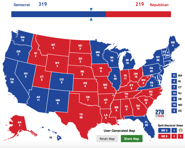
Next we have a map with 319 electoral votes for Clinton which has a 2.24% chance of occurring. That looks like this:
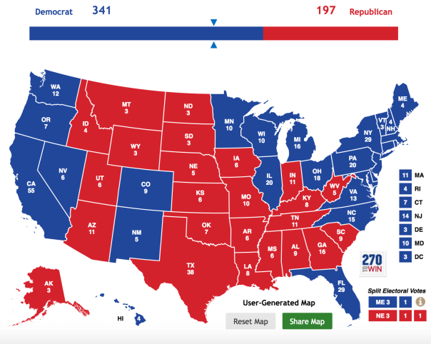
The next most plausible map at about 1.94% is with Clinton at 341 electoral votes. That would look like this:
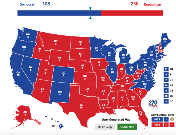
The next three most likely maps have Clinton at 308, 329, and 325 with a 1.86%, 1.56%, and 1.31% chance of occurring, respectively. Those maps look like this.

There is about a 27.6% chance that one of these vote totals hit according to my model and the PredictIt markets. The next most plausible map get’s Clinton to only 259 electoral votes and is the most likely path to a Trump victory. This map has about a 1.31% chance of occurring. In this scenario, Trump wins Ohio, Florida, North Carolina, AND Pennsylvania. This seems unlikely at this point, but it’s still a real possibility. That map looks like this:

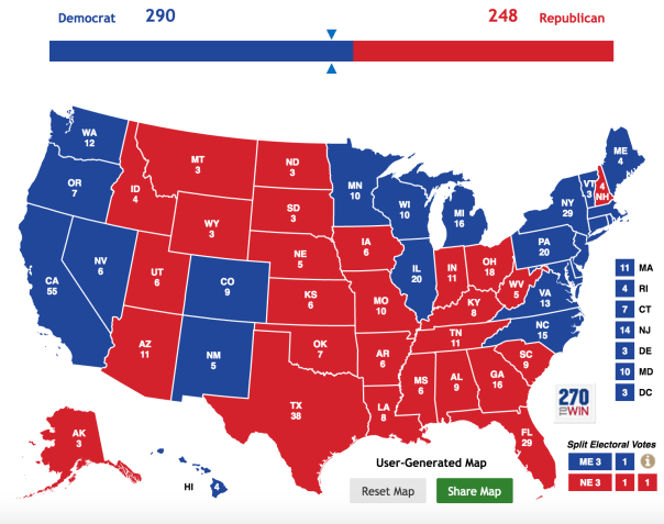
Let’s look at 3 more plausible maps. The next two most likely would look like this with Clinton getting 290 and 343 electoral votes, respectively.

The next most likely vote total has Clinton at 182, good for a Trump win, with about 1.19% chance of occurring. This map represents Trumps best chance at a blowout win where he wins Florida, North Carolina, Ohio, Virginia, Pennsylvania, New Hampshire, Wisconsin, Minnesota, Michigan, Nevada, Arizona, and, just for the sake of it, Maine, too. While this map does seem unlikely, if Trump does manage to win one of Michigan ,Wisconsin, or Minnesota, those states tend to vote similarly and he could end up winning or losing all of them together. That map would look like this:

So far we have looked at 14 of the most plausible electoral vote totals. If we add up these probabilities we see that there is about a 32.67% chance that one of these vote totals is correct.
To end this, I wanted to look at some totally implausible maps that still occurred in my simulations. I simulated the election 50,000 times and these maps occurred exactly once in the simulation:


Cheers.
Posted on November 5, 2016, in Uncategorized. Bookmark the permalink. Leave a comment.

Leave a comment
Comments 0