ggplot2 vs base R graphics: An example
It took me a while to make the switch over to ggplot2 because I learned how to do things in R mostly with base R. But I’m glad I finally made the switch. ggplot2 is so much better in so many ways, and here is an example of how much easier it is to code and how much better the output looks. (Side note: When I make art in R, I exclusively use base R.)
So anyway, on Tuesday I talked to our incoming graduate students about R, and presented some basics of data input and data visualization. I gave a simple example of base R vs ggplot2 using a histogram and then a scatter plot. After the talk, a colleague of mine sent me the following code for an example plot that he had made, and wanted to know how to do it in ggplot2. Take a look at all this code!
summary(CO2)

str(CO2)

head(CO2, 20)

CO2.QC <- subset(CO2, Type == "Quebec" & Treatment == "chilled")

CO2.QN <- subset(CO2, Type == "Quebec" & Treatment == "nonchilled")

CO2.MC <- subset(CO2, Type == "Mississippi" & Treatment == "chilled")

CO2.MN <- subset(CO2, Type == "Mississippi" & Treatment == "nonchilled")

xrange <- range(CO2$conc)

yrange<-range(CO2$uptake)

png("/Users/gregorymatthews/Dropbox/StatsInTheWild/baseRplot.png",res = 300, units = "in", h = 5, w = 10)

par(mfrow = c(1, 2))

plot(CO2.QC$uptake ~ CO2.QC$conc, pch = 19, lty = 2, lwd = 3, cex = 1.5, las = 1,

ylim = yrange, xlim = xrange, col = "purple", xlab = "Concentration",

ylab = "Uptake")

par(new=T)

plot(CO2.QN$uptake ~ CO2.QN$conc, pch = 20, lty = 2, lwd = 3, cex = 1.5, las = 1,

ylim = yrange, xlim = xrange, col = "lightblue", main = "Quebec", xlab = "",

ylab = "")

legend("bottomright", title = "Treatment", c("Chilled", "Nonchilled"),

pch = c(19, 20), col = c("purple", "lightblue"))

plot(CO2.MC$uptake ~ CO2.MC$conc, pch = 19, lty = 2, lwd = 3, cex = 1.5, las = 1,

ylim = yrange, xlim = xrange, col = "orange", xlab = "Concentration",

ylab = "Uptake")

par(new=T)

plot(CO2.MN$uptake ~ CO2.MN$conc, pch = 20, lty = 2, lwd = 3, cex = 1.5,

ylim = yrange, las = 1,

xlim = xrange, col = "red", main = "Mississippi", xlab = "", ylab = "")

legend("topleft", title = "Treatment", c("Chilled", "Nonchilled"), pch = c(19,20),

col = c("orange", "red"))

par(mfrow = c(1, 1), las = 1)

dev.off()
All that code produces the following plot:
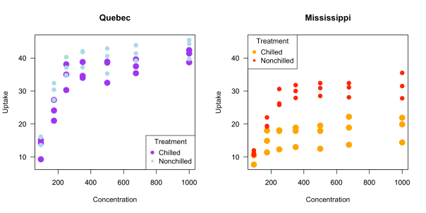
These are fine looking graphs, but you have to manually choose the x and y limits, the legends look weird and they have to be manually added to each plot, and it would be nice to have some grid lines in the plots, which can be added, but that addition must be done manually. (As a fun exercise, try to recreate the plot above using ggplot2. Don’t cheat!)
Now take a look at how easy this is to do in ggplot2!
library(ggplot2)

png("/Users/gregorymatthews/Dropbox/StatsInTheWild/ggplot2plot.png",res = 300, units = "in", h = 5, w = 10)

ggplot(aes(x = conc, y = uptake, color = Treatment), data = CO2) + geom_point() + facet_grid( ~ Type) + xlab("Concentration") + ylab("Uptake") + labs(color = "Trt") + scale_color_manual(values = c("purple","blue"))

dev.off()
The code is so much more concise, it’s easier to read, the x and y limits were chosen automatically, and the output looks so much nicer!

What I’m trying to say is that in almost every situation ggplot2 > base R.
Cheers.
Posted on August 22, 2019, in Uncategorized. Bookmark the permalink. 7 Comments.

Must disagree with your conclusions. The base graphs look much more presentable. While the ggplot graphs are a good first go, they definitely need more work.
Really? I think the ggplot default look is cleaner than base R. And if you don’t like the defaults, you can change the theme. ggplot2 is always WAY easier to code. Look at the difference in how much code has to be written in base vs ggplot. It’s much more concise in ggplot.
I will say that ALL of the art that I make, I use base R code for. But almost all of the plots for my papers I use ggplot for.
Then why not compare the code to make the plots look the same? The base plot is much more presentable.
I agree Matthew, I’m tired of people throwing up a load of ggplot2 vomit and saying “look how much better it is than base r as well!”. ggplot2 is a meme and even though it occasionally manages to look better it’s because there’s a bit more to it, the exact opposite of being “cleaner”, base R is always “cleaner”. I hate those shaded grids.
I mean, I totally disagree. I was all about base R until I learned ggplot, and I just think ggplot is so much easier to make really high quality graphs. In my example, I do that same thing in ggplot that i did in base R with like 1/3 of the code. That’s way “cleaner”.
The default background is definitely not popular, but then you just add a theme_bw() and that gets rid of the shaded grids.
To each his own.
I like what you did a lot and want to use it to show new ggplot2 users why ggplot is great. One thing I did was modify your code a bit to make it very similar to the base R graphics:
library(ggplot2)
png(“/Users/gregorymatthews/Dropbox/StatsInTheWild/ggplot2plot.png”,res = 300, units = “in”, h = 5, w = 10)
ggplot(aes(x = conc, y = uptake, color = Treatment), data = CO2) + geom_point() + facet_grid( ~ Type) +
scale_x_continuous(name=”Concentration”, breaks=c(200, 400, 600, 800), limits=c(0, 1000)) + scale_color_manual(breaks = rev(levels(CO2$Treatment)), values = c(“purple”,”lightblue”),labels=c(“Chilled”, “Nonchilled”)) +
ylab(“Uptake”) + labs(color = “Treatment”) + theme_bw()
dev.off()
The only things I think this modified plot needs are a completely clean background and darker axes lines and text. I know one can do it by tweeking the theme, but do you know if a theme already exists to make ggplot2 plots look like base R graphics plots? If so then I think it would be an easy sell to have people use ggplot2, because unfortunately they are use to the base R graphics looking plots in their journals.
I think this is a good way to do it:
theme_set(theme_bw())
theme_update(text = element_text(size=12),
panel.grid.major = element_blank(),
panel.grid.minor = element_blank(),
strip.background = element_blank()
)
This just strips the defaults away from ggplot.
blog post: https://dannagifford.com/2017/10/26/how-to-make-ggplot-look-like-base-r-graphics/