Holy Shit. Holy Shit. Holy Shit. Coronavirus.
Ok. So Coronavirus. On February 1, I tweeted something to the effect of “Why are we panicking about this, the seasonal flu kills X number of people per year”. Whoops! Let’s look at the data and see just how wrong I was and how much of a dip shit I am.
I went and got some data from a github page associated with Johns Hopkins University. Below is a plot of the number of confirmed cases in the United States versus date. Since March 1, we’ve gone from basically nothing to around 3500 cases. (CONFIRMED cases. So who knows how many actual cases there are….)

I wanted to see if this was actually following exponential growth. So I took a log of the total number of cases and plotting that vs date. I get the following plot:
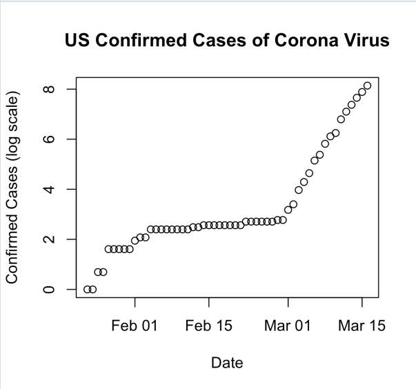
From January through the end of February there is no indication of exponential growth. Then on February 29, this starts to look VERY linear. On the log scale. Indicating exponential growth.
If we focus only on the period from February 29 through today the plot looks like this:

And here is what it looks like on the log scale:
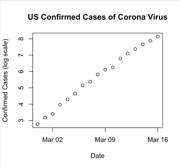
Super linear.
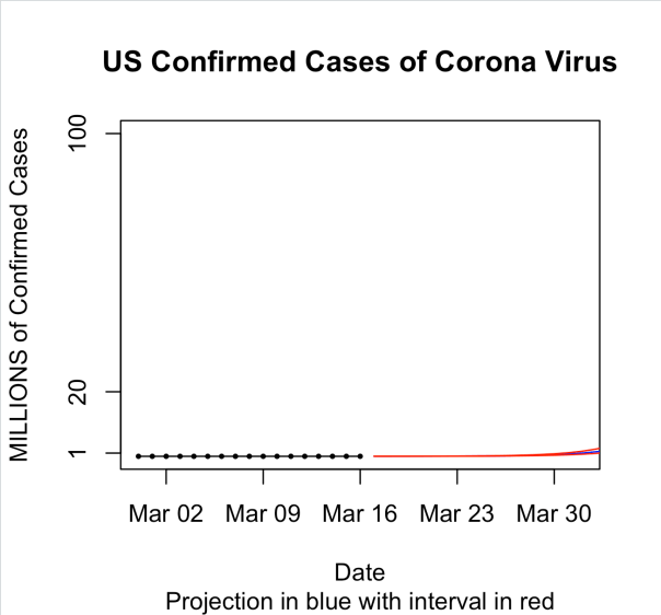
So let’s fit a simple linear regression model with log(cases) as response and days as the predictor. That model gives us an intercept of 2.574184 and a slope of 0.340881. This means that the predicted number of cases on a given day is exp(2.57)*exp(.340881*day_number). Computing the numbers gives us exp(2.57) = 13.12061 and exp(.340881) = 1.406186. If you think about this in terms of money, this is like starting with about $13 in your bank account on day 1. And you get 40.6% interest PER DAY. After a week you have a little over $142 in your account. In two weeks you are now at a bit over $1,550. By the time a month has gone by you are now sitting on $362439.9. After 45 days, you can retire a very wealthy person with $60,238,907. By the end of 60 DAYS (previous version said MONTHS. Thanks Hammers for pointing this out), you have over 10 billion dollars.
Here is what this looks like in a plot for the first 30 days:
And then for the first 60 days. The blue line is the predicted mean and the red lines are prediction intervals.
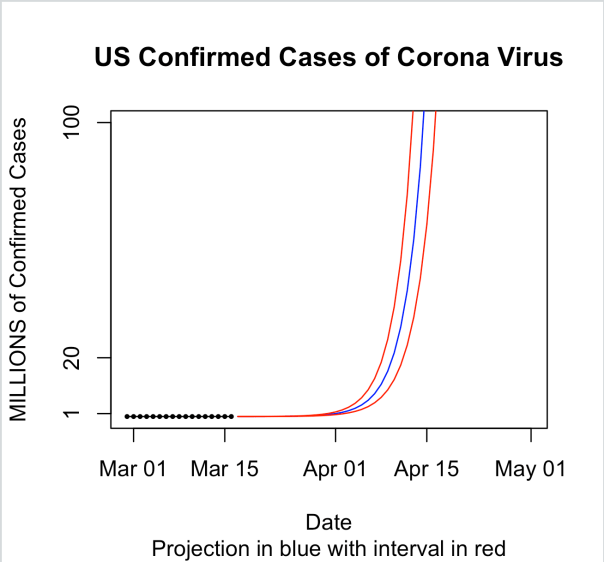
So obviously, this is extrapolation once we get to day 60 since there aren’t even 10 billion people on earth and the curve at some point has to level off once it’s infected enough people. But what I wanted to show here is just how fast this thing can get out of control given out current path. It’s easy to ignore an exponential curve in the beginning. I mean just look at the data. On March 1 there were only 6 confirmed cases in the US. Fifteen days later there were only 772. That’s still basically nothing though in a country of 330 million people. However, while the first 15 days of March only saw an increase of 766 cases, given the current exponential growth rate of 40% per day, we’ll be over a million cases by April 1. And by tax day, we would be at 119 million. Now imagine a 2% mortality rate! These numbers are staggering.
Staggering enough to cancel the NBA, NHL, major golf tournaments, and MLB opening day. Staggering enough for Chicago to cancel their St. Patricks Day parade. Staggering enough for colleges and universities to send their students home. Staggering enough for California, Ohio, Illinois, Massachusetts, and Washington to shut down bars and restaurants.
So the reason we are social distancing is to make that 40% growth rate per day drop. We have to make that go down.
____________________________________________________________________________________________
As always you can find my code on github.
Code for this post is here.
Also check out some SIR modeling that I did last night here (based on this tutorial).
And finally watch me code on Twitch: https://www.twitch.tv/statsinthewild.
Cheers.
Posted on March 16, 2020, in Uncategorized. Bookmark the permalink. Leave a comment.

Leave a comment
Comments 0