Author Archives: statsinthewild
NCAA men’s tournament probabilities 2026
It just keeps getting worse:
After 100 games:

The cream has dropped:
After 72 games:

The cream keeps rising……….
Through 48 games.

Through 24 games:

Through 20 games:

Through 12 games:

My probabilities to my Kaggle March Madness contest:
March 19, 2026
Men
Ohio State over TCU: 59.36% (Loss: 0.352361)
Nebraska over Troy: 86.92% (Loss: 0.01710864)
Louisville over South Florida: 66.41% (Loss: 0.1128288)
Wisconsin over High Point: 83.07% (Loss: 0.6900625)
Duke over Siena: 100% (Loss: 0)
Vanderbilt over McNeese St: 85.10% (Loss: 0.022201)
Michigan St over North Dakota State: 92.41% (Loss: 0.00576081)
Arkansas over Hawaii: 91.28% (loss: 0.00760384)
North Carolina over VCU: 59.36% (Loss: 0.352361)
Michigan over Howard: 100% (Loss: 0)
BYU over Texas: 59.36% (Loss: 0.352361)
St. Mary’s CA over Texas A&M: 62.95% (Loss: 0.3962702)
Illinois over Penn: 97.94% (Loss: 0.00042436)
Georgia over St Louis: 59.36% (Loss: 0.352361)
Gonzaga over Kennesaw: 96.29% (Loss: 0.00137641)
Houston over Idaho: 97.24% (Loss: 0.00076176)
March 20, 2026
Men
Kentucky over Santa Clara: 62.95% (Loss: 0.1372703)
Texas Tech over Akron: 75.70% (Loss: 0.059049)
Arizona over LIU: 100% (Loss: 0)
Virginia over Wright State: 94.28% (Loss: 0.00327184)
Iowa State over Tennessee State: 97.61% (Loss: 0.00057121)
Alabama over Hofstra: 85.10% (Loss: 0.022201)
Utah State over Villanova: 55.66% (Loss: 0.1966036)
Iowa over Clemson: 59.36% (Loss: 0.165161)
St. John’s over Northern Iowa: 80.83% (Loss: 0.03674889)
Tennessee over Miami OH: 83.07% (Loss: 0.02866249)
UCLA over UCF: 69.70% (Loss: 0.091809)
Purdue over Queens: 100% (Loss: 0)
Florida over Prairie View: 100% (Loss: 0)
Kansas over Cal Baptist: 89.99% (Loss: 0.01002001)
UConn over Furman: 100% (Loss: 0)
Miami over Missouri: 55.66% (Loss: 0.1966036)
Women
Duke over College of Charleston: 100% (Loss: 0)
TCU over UC San Diego: 100% (Loss: 0)
Oregon over Virginia Tech: 62.95% (Loss: 0.1372703)
Nebraska over Baylor: 50.29% (Loss: 0.2529084)
Washington over San Diego State: 97.24% (Loss: 0.00076176)
Maryland over Murray State: 100% (Loss: 0)
Ole Miss over Gonzaga: 88.55% (Loss: 0.01311025)
Texas over Missouri State: 99.97% (Loss: 0)
Michigan over Holy Cross: 100% (Loss: 0)
North Carolina over Western Illinois: 100% (Loss: 0)
LSU over Jacksonville: 100% (Loss: 0)
Minnesota over WI Green Bay: 100% (Loss: 0)
Michigan State over Colorado State: 94.28% (Loss: 0.00327184)
NC State over Tennessee: 55.66% (Loss: 0.1966036
Texas Tech over Villanova: 55.66% (Loss: 0.1966036)
Oklahoma over Idaho: 100% (Loss: 0)
March 21, 2026
Men
Michigan over St Louis: 98.08% (Loss: 0.00036864)
Michigan State over Louisville: 81.41% (Loss: 0.03455881)
Duke over TCU: 96.65%
Houston over Texas A&M: 83.53%
Gonzaga over Texas: 75.36%
Illinois over VCU: 51.07%
Vanderbilt over Nebraska: 65.59%
Arkansas over High Point: 86.92%
Women
Ohio State over Howard: 100% (Loss: 0)
Louisville over Vermont: 100% (Loss: 0)
South Carolina over Southern: 99.99% (Loss: 0.00000001)
Georgia over Virginia: 83.12% (Loss: 0.6908934)
Notre Dame over Fairfield: 80.83% (Loss: 0.03674889)
Kentucky over James Madison: 90.00% (Loss: 0.01)
Alabama over Rhode Island: 80.83% (Loss: 0.03674889)
UConn over UTSA: 100% (Loss: 0)
USC over Clemson: 69.70% (Loss: 0.091809)
Iowa over Fairleigh Dickinson: 100% (Loss: 0)
West Virginia over Miami OH: 100% (Loss: 0)
Iowa St over Syracuse: 75.70% (Loss: 0.573049)
Vanderbilt over High Point: 100% (Loss: 0)
Oklahoma St over Princeton: 72.80% (Loss: 0.073984)
Illinois over Colorado: 62.95% (Loss: 0.1372703)
UCLA over Cal Baptist: 100% (Loss: 0)
March 22
Men
Purdue over Miami FL: 80.81%
Iowa State over Kentucky: 68.10%
St John’s over Kansas: 64.47%
Virginia over Tennessee: 88.55%
Florida over Iowa: 89.54%
Arizona over Utah State: 96.69%
UConn over UCLA: 68.60%
Texas Tech over Alabama: 52.23%
Women
North Carolina over Maryland: 58.35%
Michigan over NC State: 96.23%
Minnesota over Ole Miss: 74.41%
LSU over Texas Tech: 98.18%
Duke over Baylor: 86.28%
Texas over Oregon: 98.52%
Oklahoma over Michigan State: 85.08%
TCU over Washington: 58.57%
March 26, 2026
Houston over Illinois: 74.29%
Arizona over Arkansas: 78.53%
Nebraska over Iowa: 63.56%
Purdue over Texas: 87.83%
March 26, 2026
Men’s
Duke over St. John’s: 93.75%
Michigan over Alabama: 91.14%
Iowa State over Tennessee: 72.37%
UConn over Michigan State: 74.95%
Women’s
Vanderbilt over Notre Dame: 81.44%
UConn over North Carolina: 99.999%
UCLA over Minnesota: 99.992%
LSU over Duke: 86.66%
Cheers.
King Cake Baby
I was in New Orleans last week at Tulane for Love Data Week 2026 where I gave my Data Art talk. But that’s not important. While I was there, I learned all about Mardi Gras traditions that I was completely unaware of, specifically: King Cakes. For some reason, these lunatics in New Orleans hide a plastic baby in these cakes and if you get the piece with the plastic baby you have to buy the next king cake. But even this doesn’t really matter. Here is what matters: during Mardi Gras some sporting events have this baby show up as a mascot. I now present to you King Cake Baby (sent to me by Lisa Dilks). It’s glorious and I love it with all my heart.

Cheers.
Home advantage
This plot is awesome.
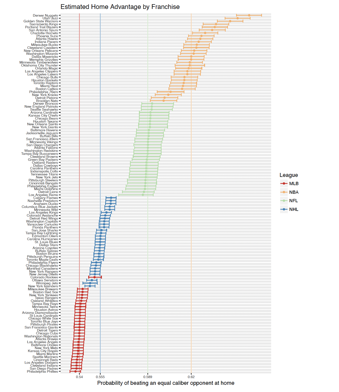
Read the full paper: https://projecteuclid.org/journals/annals-of-applied-statistics/volume-12/issue-4/How-often-does-the-best-team-win-A-unified-approach/10.1214/18-AOAS1165.full
Cheers.
Lies, Damn Lies, and Trump Stats
The White House just posted this tweet:
The “readers added context” gets this correct as a misrepresentation. It’s actually only a 1.2% increase. The issue is a truncated y-axis. Don’t do this with bar charts!
Preserved here if this ever gets taken down:


Boy, this Donald Trump fellow sure does seem dishonest.
This reminds me of the famous Fox News graph “If the Bush Tax Cuts Expire”.
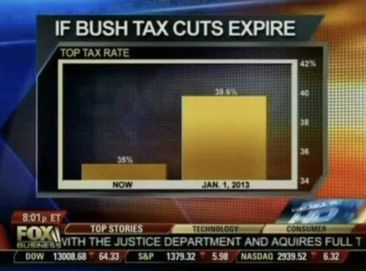
Man, it’s almost like all this dishonesty is coming from one side and they are doing it on purpose……
Cheers.
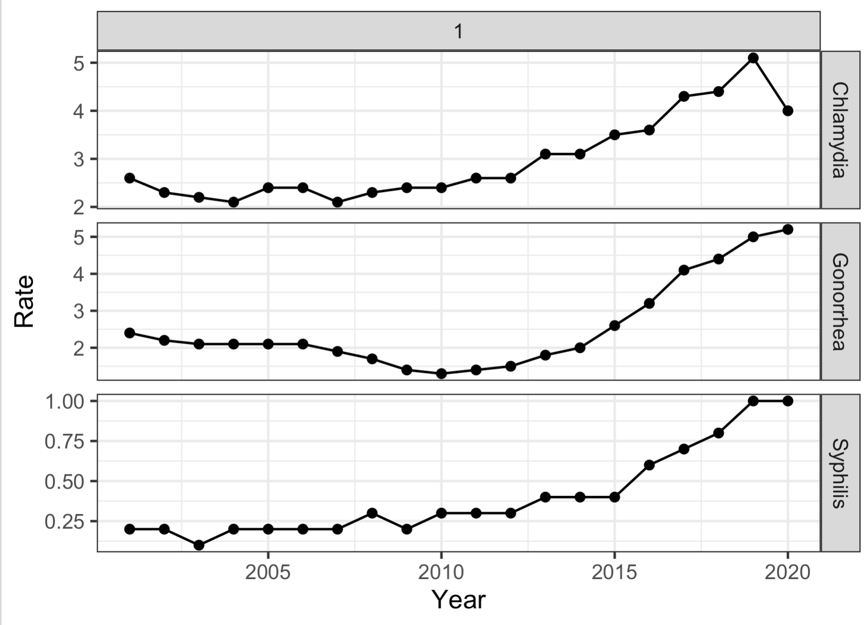
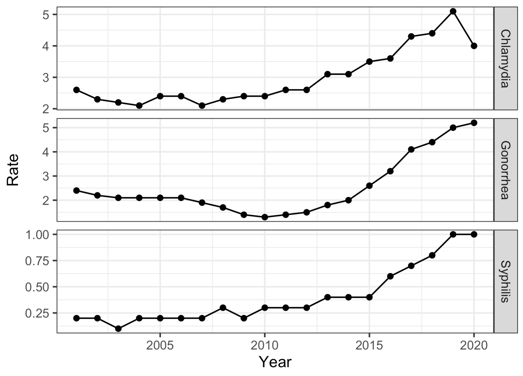
TIL: facet_grid edition
Today I learned how to get rid of the pesky “1” on the top of a ggplot facet_grid if I want to stack the plots vertically. Use facet_grid(rows = vars(group)). See my example below:
#Ugh. Why is there a 1?rbind(PSold %>% filter(Age == "65+") %>% mutate(STI = "Syphilis"), GCold %>% filter(Age == "65+") %>% mutate(STI = "Gonorrhea"), CTold %>% filter(Age == "65+") %>% mutate(STI = "Chlamydia")) %>% ggplot(aes(x = Year, y = Rate)) + geom_point() + geom_line() + theme_bw() + facet_grid(STI~1, scale = "free_y") #Get rid of the pesky 1 rbind(PSold %>% filter(Age == "65+") %>% mutate(STI = "Syphilis"), GCold %>% filter(Age == "65+") %>% mutate(STI = "Gonorrhea"), CTold %>% filter(Age == "65+") %>% mutate(STI = "Chlamydia")) %>% ggplot(aes(x = Year, y = Rate)) + geom_point() + geom_line() + theme_bw() + facet_grid(rows = vars(STI), scale = "free_y")
Cheers.
The University of Nebraska Board of Regents is a dumpster fire
When I was a kid, I used to think that if someone was in a high up position that they must be really smart and competent. Now that I’m in my 40s, it seems like it’s almost the opposite. Most of the people I meet or read about who are in positions of leadership, I’m wildly unimpressed by. But I could not possibly imagine the level of incompetence of the Board of Regents for the University of Nebraska.
They recently cut their statistics program along with a few others based on metrics showing these program were underperforming, but there really weren’t many details of what these metrics were or how they were computed. However, AMSTAT News recently published an interview with two professors from the University of Nebraska-Lincoln on what happened (You can read the full article here). In that article, they detail some of the flaws in the calculation of these metrics, but one of these flaws stands out above all the others as the peak of dip shittery.
So, one of the metrics the Board of Regents used in their calculation was graduation rate. Graduation rate is the number of graduates divided by number of majors. Simple enough. Now for the statistics department, this number was 0%. Why? Because the department hadn’t yet existed for 4 years.

Here is the relevant paragraph from the AMSTAT article:
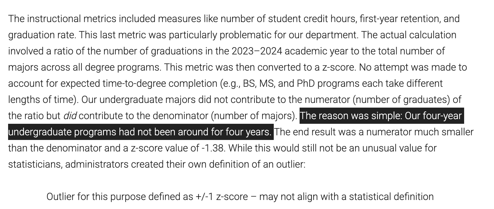
And just as a nice added middle-finger to the statistics department, the Board of Regents decided to make their own definition of what an outlier is.

There is no nice way to say this: these people are world class unimpressive.
Cheers.
AI fails again
I was trying to fit a mixed effects model and I waned to compare the model with the same fixed effects with and without a random intercept in an ANOVA. So I wasn’t sure how to do this using lmer from the lme4 package. So I googled it:

It gave me the following answer with code:

# Example data
data <- data.frame(
  response = rnorm(100),
  fixed_effect_1 = rnorm(100),
  fixed_effect_2 = rnorm(100)
)

# Fit a linear mixed model with no random effects
model <- lmer(response ~ fixed_effect_1 + fixed_effect_2, data = data)

# Display the model summary
summary(model)
I was pretty sure this wouldn't work, but I tried it anyway. And it doesn't work. You can't fit an lmer model without specifying random effects. 
For the record, I’m not sure my question even makes sense. I think I should be comparing these models with AIC rather than ANOVA, now that I think about it for more than a second.
Anyway,
Cheers.
However bad you think the Rockies are, they are worse. Even worse than the White Sox last year (so far).
Update: They swept the Marlins and are now on a 3 game winning streak and sit at 12-50. They are 25 games out of first place with 100 games to play.
Update: They won last night and are now 10-50 as of noon on June 3.
The Rockies are 9-50. That’s 50 losses in 59 games. A winning percentage of .153. That’s the fastest any team has gotten to 50 losses since 1901. But didn’t we just get a new worst ever team last year in the Chicago White Sox? Yup! The Chicago White Sox lost 121 games last year, the most ever. And the Rockies are currently on pace to shat. ter. the White Sox loss record from last year. They are currently on pace to go 25-137. How bad is this? At this point in the season, the White sox were 15-44. SIX games ahead of where the Rockies are right now. To see this, let’s look at some data viz that I made.
Below is a plot of game number versus cumulative wins. Up until about game 30 the Rockies were merely just as bad as the White Sox. Since then they have really stepped down their game thanks to multiple 8 game losing streaks. Speaking of streaks, let’s take a look at that.

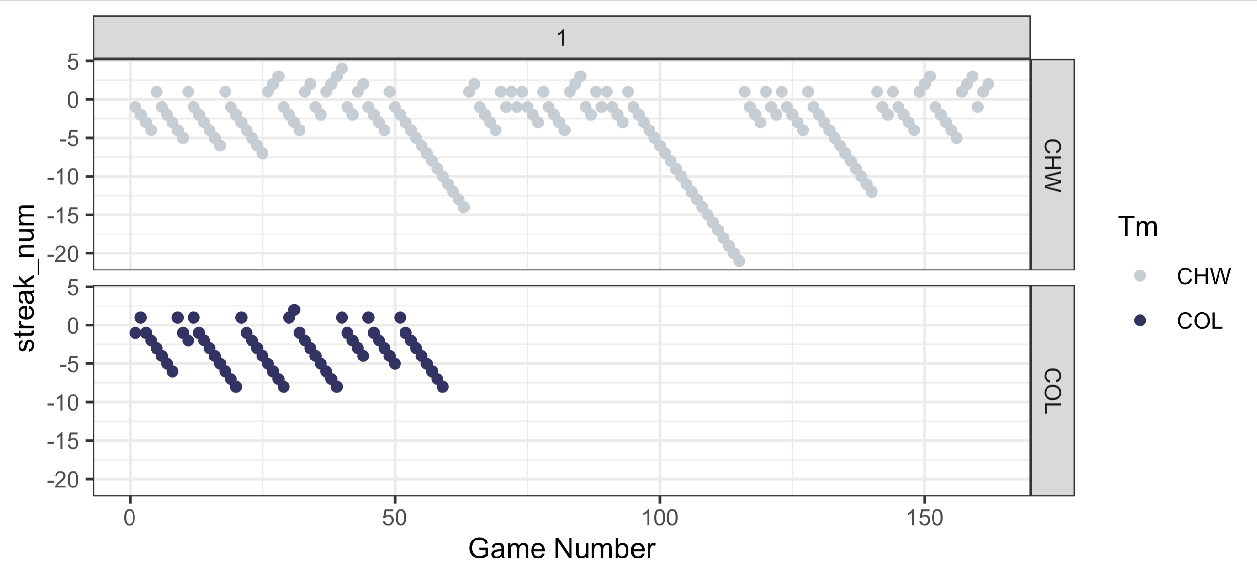
Below, you’ll find a plot of game number on the x axis and the win/loss streak on the y-axis. Positive numbers are winning streaks and negative numbers are losing streaks. You can see that the Rockies have already had FOUR 8 game losing streaks. But even more impressive than that is that they’ve only won back to back games a single time this season. Let me repeat this: Their largest win streak of the season is 2 games and it’s happened exactly once. The White Sox last year has winning streak of 2 or more 9 times total and 4 up to this point in the season,. They even had a nifty little 4 game winning streak (They also had losing streaks of 12, 14, and 21(!!!) games).
Now let’s take a look at scoring for the Rockies. Below is a 2d contour plot of for the runs for and runs against for every game from the White Sox 2024 season in the left panel and every game of the current Rockies season. The horizontal and vertical lines are the mean number of runs for and against and the diagonal lines shows whether the game was won or lost by the respective team (above the line is a loss, below the line if a win). What’s really interesting about this is that in the entire season last year, the White Sox only score 10 or more runs TWICE. The Rockies have already done this 3 times. Also, the most runs that the White Sox gave up all season was 14 runes. The Rockies have given up more than 14 runs twice already. (a 17-2 loss to the Brewers and a 21-0 loss to the Padres).
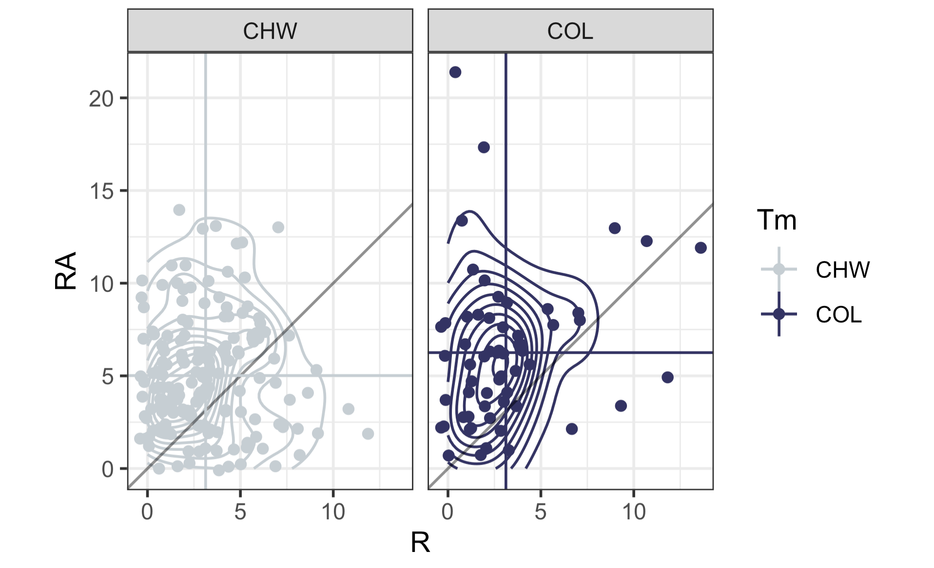
Here is what these plots look like on top of one another. What you’ll notice is that it’s hard to see the vertical line for the White Sox (i.e. their mean number of runs) because it’s nearly identical to the Rockies. The White Sox average 3.13 runs per game last year and the Rockies are just slightly below that at 3.12 runs per game. But where Colorado really “shines” is their defense. While the White Sox gave up an average of just over 5 runs per game (5.02, to be exact), the Rockies are currently allowing, and I can’t believe this is true, 6.25 runs per game. That 1.23 more runs per game on average than the worst team in the modern history of baseball. Incredible work.
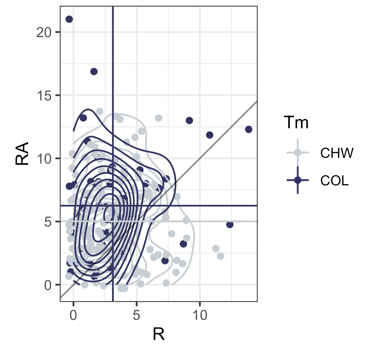
If you’re a median type of person, I computed those two. The White Sox last year scored a median of 3 runs and allowed a median of 5 runs. For the Rockies this year, they are scoring a median of 2 runs and allowing a median of 6 runs.
Anyway, the point is that the Rockies are [really]+ bad.
My code is below.
Cheers.
rock <- read.csv("/Users/gregorymatthews/Dropbox/statsinthewild/rockies2025_20250602.csv")
ws <- read.csv("/Users/gregorymatthews/Dropbox/statsinthewild/whitesox2024.csv")

names(rock)[1] <- names(ws)[1] <- "gameno"
rock$streak_num <- as.numeric(paste0(substring(rock$Streak,1,1),nchar(rock$Streak)))
rock$W <- as.numeric(unlist(lapply(strsplit(rock$W.L.1,"-"),function(x){x[1]})))
rock$L <- as.numeric(unlist(lapply(strsplit(rock$W.L.1,"-"),function(x){x[2]})))

ws$streak_num <- as.numeric(paste0(substring(ws$Streak,1,1),nchar(ws$Streak)))
ws$W <- as.numeric(unlist(lapply(strsplit(ws$W.L.1,"-"),function(x){x[1]})))
ws$L <- as.numeric(unlist(lapply(strsplit(ws$W.L.1,"-"),function(x){x[2]})))
both <- rbind(rock,ws)

library(tidyverse)
library(teamcolors)
small <- teamcolors %>% filter(name %in% c("Chicago White Sox","Colorado Rockies"))
ggplot(aes(x = gameno, y = W,color = Tm), data =both) +
  geom_path() +
  theme_bw() +
  scale_color_manual(values = c(small$secondary[1],small$primary[2])) +
  xlab("Game Number")

ggplot(aes(x = gameno, y = streak_num, col = Tm), data = both) + geom_point() + theme_bw() + facet_grid(Tm~1) + scale_color_manual(values = c(small$secondary[1],small$primary[2])) + xlab("Game Number")

ggplot(aes(x = R, y = RA, color = Tm), data = both) +
  geom_jitter() +
  geom_density2d() +
  scale_color_manual(values = c(small$secondary[1],small$primary[2])) +
  theme_bw() + geom_abline(slope = 1, color = rgb(0,0,0,.5)) +
  geom_vline(aes(xintercept = R, color = Tm), data = both %>% group_by(Tm) %>% summarise(R = mean(R),RA = mean(RA))) +
  geom_hline(aes(yintercept = RA, color = Tm), data = both %>% group_by(Tm) %>% summarise(R = mean(R),RA = mean(RA))) + coord_fixed() +

both %>% group_by(Tm) %>% summarise(median(R),median(RA))
both %>% group_by(Tm) %>% summarise(mean(R),mean(RA))

both %>% filter(Tm == "COL") %>% pull(R) %>% table()
both %>% filter(Tm == "CHW") %>% pull(R) %>% table()
Live blogging the 2024 presidential election
2:54am Central Time:
So, uh, what went wrong in that Selzer poll?
10:32pm Central Time:
Just got back from my run. What are we doing America? What the fuck are we doing? The next four years are going to be so bad. So much worse than you can even imagine. It’s just. so. stupid. Good night. I’m gonna go watch a documentary about aliens and then smash my face through a window.
9:24pm Central Time:
I still haven’t gone running. But I haven’t checked the race in a while. It looks much worse than it did before. What the fuck are we doing America? You think this guy is gonna save the economy? Jesus. Christ.
8:27pm Central Time:
I’m going running.
8:18pm Central Time:
It’s just past quarter past 8. Nothing terribly surprising has happened so far. NYT gives Trump a 66% chance to win.

7:54pm Central Time:
Is there ANY other election in the world where the person with the most votes can lose the election? Or is it only the election to pick the most powerful person in the world?
7:44pm Central Time:
The NYT gives Trump a 53% chance to win Pennsylvania. But that prediction right now is based only on pre-election polls and their “model”. Nothing to do with actual results yet. Why even report this?

7:42pm Central Time:
I still think Harris is gonna win Pennsylvania. But it’s gonna be really, really close.
7:36pm Central Time:
Sometimes I reflect on how stupid it is that a few thousand people in Pennsylvania who probably can’t find Canada on a map get to decide who the most powerful person in the world is. Everything is so stupid.
7:35pm Central Time:
Virginia looks to be much closer than it was in 2020. That’s a good sign for Trump. How wild would it be if just everyone got this race completely wrong and Trump wins a place like Virginia and Harris wins something like Iowa or Ohio?
7:27pm Central Time:
In 2023, the Census estimates that about 44000 people from Georgia moved to Florida, around 26000 Michiganders moved to Florida, and about 28000 Pennsylvanians moved to Florida. And something like 9000 people from Wisconsin moved to Florida. Again, based on nothing, I’m guessing thats a vast majority of these people were right leaning. Would it make sense then that all these states get slightly bluer and Texas and Florida get slightly redder?
7:16pm Central Time:
Crazy theory based on nothing: Enough right leaning voters moved to Texas and Florida from swing states in the last 4 years that Trump’s margin in Florida and Texas will beat his margin’s in those states relative to 2020. But all those people leaving give Harris safe wins in swing states like Pennsylvania, Michigan, and Wisconsin (and Iowa?).
7:08pm Central Time:
New York Times has a much better data presentation than NBC News for election results. Great work NYT.
6:55pm Central Time:
Florida — already America’s inner thigh — continues to get redder and redder. And also it’s shifted further right. (“How the pandemic turned Florida red”)
6:44pm Central Time:
I’m seeing the same thing in Georgia as I saw in Indiana: Substantial shifts towards Harris in the suburbs.
For reference, Harris won Douglas County by 25.1% in 2020 and Rockdale by 40.77%. That’s about +7 and +11 with about 70% reporting. Trump in 2020 won Houston, Bartow, Oconee, and Troup by 12.42%, 50.67%, 33.47%, and 21.84%, respectively. That’s shifts of about 1, 0 , -2, and -5 for Trump. He’s about the same in counties he won last time in Georgia, but there are pretty big shifts in the Atlanta suburbs.

6:33pm Central Time:
Trump up 23-3. Kentucky, Indiana, and West Virginia for Trump; Vermont for Kamala. (Can we stop and think about how fucking weird Vermont is for a second?)
6:28pm Central Time:
Going back to Hamilton and Boone County. In 2016, Trump won Boone county by 29.12% and Hamilton by 19.32%. (Note: Boone has 91% of counties reported and Hamilton has 65%). But Trumps support in the Indianapolis suburbs has absolutely cratered since 2016.

6:18pm Central Time:
And…..they’ve called Vermont. Harris is on the board with 3 points. Trump leads 19-3.
6:16pm Central Time:
The north suburbs of Indianapolis are shifting about 8ish points towards Harris so far. That feels like a big deal to me.
- Boone County 2020: Trump by 18.38%
- Boone County 2024 (91% reporting): Trump by 10%
- Hamilton County 2020: Trump by 6.78%
- Hamilton County 2024 (65% reporting): HARRIS by 1.2%
