Coronavirus and Exponential Growth
I’m continuing to marvel at just how well an exponential model fits the number of confirmed cases of coronavirus. The plot below shows the real number of confirmed cases (on a log10 scale) for Italy, US, Spain, and France to the left of the black vertical line. It’s nearly perfectly linear! To the right of the vertical black line we have the projections should this exponential growth continue. I’ve also provided some basic output from the models for each country, including estimated regression coefficients, R^2 (i.e. how close to exponential is it), and when each country is expect to hit certain number of cases if the current trend were to continue.

Here is what is looks like on the raw scale:
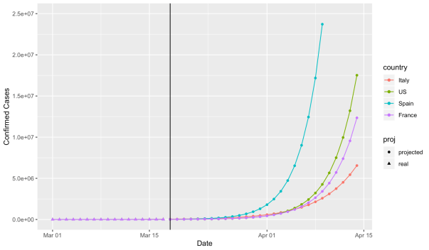
All models are simple linear regression with log(confirmed cases) as the response and time since March 1 as a predictor (i.e. March 1 is 1, March 2 is 2, etc.). Projections are based on the assumption that exponential growth continues as current rates (hopefully this turns out to be a bad assumption!)
United States
Current number of confirmed cases (as of March 17): 6,421
beta = .283 (.275, .290)
growth rate = exp(.283) = 1.327 (1.317, 1.336)
R^2 = .9978 (!!! That’s so exponential!!!!)
Expected to be at X cases:
X = 10,000: March 19
X = 100,000: March 27
X = 1,000,000: April 4
X = 10,000,000: April 13
France
Current number of confirmed cases (as of March 17): 7,699
beta = .257 (.239, .275)
growth rate = exp(.257) = 1.293 (1.270, 1.316)
R^2 = .9846
Expected to be at X cases:
X = 10,000: March 18
X = 100,000: March 27
X = 1,000,000: April 5
X = 10,000,000: April 14
Spain
Current number of confirmed cases (as of March 17): 11,748
beta = .322 (.308, .337)
growth rate = exp(.322) = 1.380 (1.360, 1.401)
R^2 = .9931
Expected (or actual date) to be at X cases:
X = 10,000: March 17 (Actual Date)
X = 100,000: March 24
X = 1,000,000: March 31
X = 10,000,000: April 7
Italy
Current number of confirmed cases (as of March 17): 31,506
beta = .186 (.178, .194)
growth rate = exp(.186) = 1.204 (1.195, 1.214)
R^2 = .9939
Expected to be at X cases:
X = 10,000: March 10 (Actual Date)
X = 100,000: March 23
X = 1,000,000: April 4
X = 10,000,000: April 17
________________________________________________________________
Code can be found here.
Follow me coding on Twitch here.
________________________________________________________________
Cheers!
Holy Shit. Holy Shit. Holy Shit. Coronavirus.
Ok. So Coronavirus. On February 1, I tweeted something to the effect of “Why are we panicking about this, the seasonal flu kills X number of people per year”. Whoops! Let’s look at the data and see just how wrong I was and how much of a dip shit I am.
I went and got some data from a github page associated with Johns Hopkins University. Below is a plot of the number of confirmed cases in the United States versus date. Since March 1, we’ve gone from basically nothing to around 3500 cases. (CONFIRMED cases. So who knows how many actual cases there are….)

I wanted to see if this was actually following exponential growth. So I took a log of the total number of cases and plotting that vs date. I get the following plot:
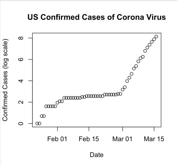
From January through the end of February there is no indication of exponential growth. Then on February 29, this starts to look VERY linear. On the log scale. Indicating exponential growth.
If we focus only on the period from February 29 through today the plot looks like this:

And here is what it looks like on the log scale:
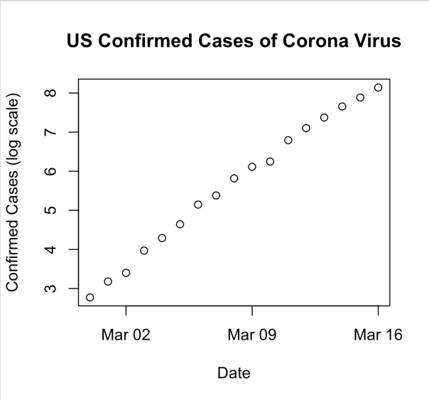
Super linear.
So let’s fit a simple linear regression model with log(cases) as response and days as the predictor. That model gives us an intercept of 2.574184 and a slope of 0.340881. This means that the predicted number of cases on a given day is exp(2.57)*exp(.340881*day_number). Computing the numbers gives us exp(2.57) = 13.12061 and exp(.340881) = 1.406186. If you think about this in terms of money, this is like starting with about $13 in your bank account on day 1. And you get 40.6% interest PER DAY. After a week you have a little over $142 in your account. In two weeks you are now at a bit over $1,550. By the time a month has gone by you are now sitting on $362439.9. After 45 days, you can retire a very wealthy person with $60,238,907. By the end of 60 DAYS (previous version said MONTHS. Thanks Hammers for pointing this out), you have over 10 billion dollars.
Here is what this looks like in a plot for the first 30 days:
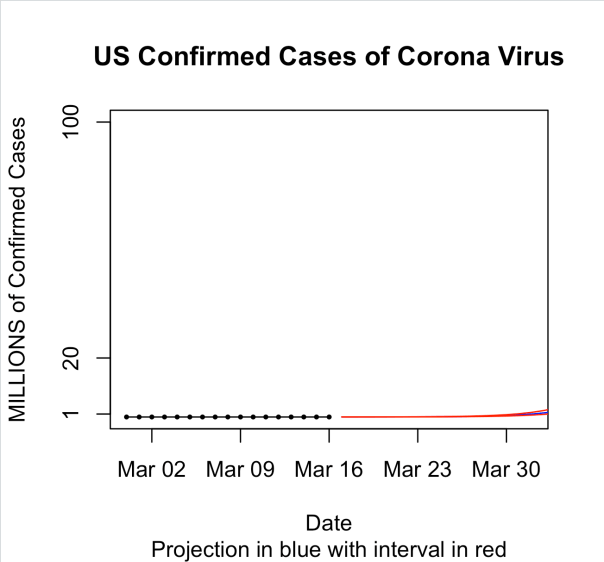
And then for the first 60 days. The blue line is the predicted mean and the red lines are prediction intervals.
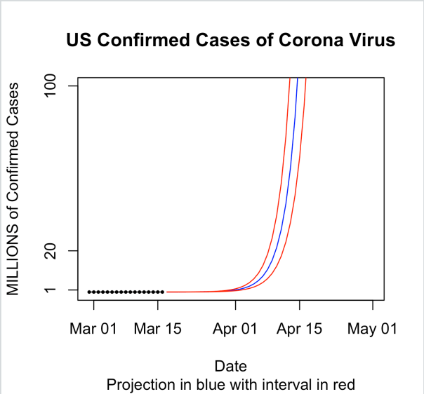
So obviously, this is extrapolation once we get to day 60 since there aren’t even 10 billion people on earth and the curve at some point has to level off once it’s infected enough people. But what I wanted to show here is just how fast this thing can get out of control given out current path. It’s easy to ignore an exponential curve in the beginning. I mean just look at the data. On March 1 there were only 6 confirmed cases in the US. Fifteen days later there were only 772. That’s still basically nothing though in a country of 330 million people. However, while the first 15 days of March only saw an increase of 766 cases, given the current exponential growth rate of 40% per day, we’ll be over a million cases by April 1. And by tax day, we would be at 119 million. Now imagine a 2% mortality rate! These numbers are staggering.
Staggering enough to cancel the NBA, NHL, major golf tournaments, and MLB opening day. Staggering enough for Chicago to cancel their St. Patricks Day parade. Staggering enough for colleges and universities to send their students home. Staggering enough for California, Ohio, Illinois, Massachusetts, and Washington to shut down bars and restaurants.
So the reason we are social distancing is to make that 40% growth rate per day drop. We have to make that go down.
____________________________________________________________________________________________
As always you can find my code on github.
Code for this post is here.
Also check out some SIR modeling that I did last night here (based on this tutorial).
And finally watch me code on Twitch: https://www.twitch.tv/statsinthewild.
Cheers.
Lisa Goldberg and the Hot Hand in Basketball
So Lisa Goldberg gave a talk at Loyola Chicago on Monday afternoon about the hot hand in basketball where she presented a paper where she shows that there is no statistical evidence that the hot hand exists. While we didn’t film her talk, this numerphile video is basically the same as what she presented on Monday:
The basic argument in the paper is that the probability of making the next shot given you made the previous shot is not statistically different than the probability of making the next shot given you missed the previous shot. So I have a lot of thoughts on this, but first let’s talk about the really interesting history of this topic.
In 1985, what can very accurately be called the seminal paper from Gilovich, Vallone, and Tversky, which defined the hot hand and concluded there there was no statistical evidence for it. For years this was considered orthodoxy in most of the sports statistics world, even though almost everyone in basketball feels that the effect is real.
Years after that paper was original published, in 2015, Jason Miller and Adam Sanjuro published a paper where they pointed out that the way that Gilovich et. al. (1985) went about looking for the hot hand was slightly flawed in that their were unaccounted for biases that are introduced in the streaks that were not accounted for when the streak length that is considered is small.
What they pointed out in this paper is really, really interesting. So let me talk about it for a second. Let’s say you have a finite string of coin flips from a fair coin. Call 0 a tails an 1 a heads. So you might have a string of flips like this: 001101001. Now, for a fixed number of flips, what is the proportion of 1’s occurring after a 1 in a finite sequence? It’s 50% right? Right?!?! It has to be 50%!
Turns out, it’s not 50%. Andrew Gelman has an excellent explanation of the issue here.
Following the Miller and Sanjuro paper in 2017, Daks, Desai, and Goldberg published a paper where they updated Gilovich’s original paper using permutation testing to account for the bias that Miller and Sanjuro pointed out in their paper. In Daks et. al. they find that even when using the permutation tests and accounting for the bias, they still find no evidence of a hot hand.
This paper led to that numerphile video about the hot hand up at the beginning of this post, though Miller and Sanjuro don’t agree with the findings in that paper.
So what are my thoughts on this? I don’t think that any of these paper are looking for the hot hand in the correct way. I think you need to look at building some sort of mixture model or a hidden Markov model with two states representing hot and regular. Once you fit that model you can look to see if there is a significant difference between the states and compare this model to a one state model and see which one gives you a better fit. I’ve written about this type of thing before in baseball with Rob Arthur.
I also think, specifically in basketball, you absolutely cannot be viewing the data as a string of 0’s and 1’s. If you only are looking at makes and misses you are ignoring so many other factors such as shot distance, game situation, distance to nearest defender, etc. that affect the probability of making a shot that need to be controlled for. What’s nice about studying the hot hand idea in baseball for pitchers is that there are relatively few factors that need to be controlled for when looking at pitchers (runners on base, score, pitch type, etc.). And it’s also easier to look at pitchers because there are no opposing players who are trying to hinder the pitchers ability to do what they are doing and the pitch is always coming from the same distance away (This is why I think bowling would be a nice place to look for the hot hand. Someone get me the data!) In basketball, everything is different from shot to shot.
So am I convinced that the hot hand exists? My answer is really, truly, I don’t know. I haven’t seen anything that convinces me it does or does not exists. And also, it depends. It depends on exactly how you define the hot hand.
Anyway……..
After Dr. Goldberg’s talk, I was lucky enough to get invited to dinner with her because, dammit, I’m important……….(Also, at the dinner were John and Sue Dewan and Lisa Goldberg’s Daughter)
While at dinner our department head introduced me as the director of our Data Science program and Dr. Goldberg asked me this following question: What are the three things you want students to take away from your program.
I stalled for a bit, and then just straight up said I’m going to avoid answering that, but I’ll tell you want to I think a Data Science student should know how to do.
Towards the end of dinner, I just had to ask Dr. Goldberg the same question she asked me. What did she think the three most important things were (I hope i remember these at least somewhat accurately):
- Statistics does better with more data and but more data is harder for computers. Dealing with this issue is fundamental to doing data science.
- Remove your personal biases from the analysis.
- Design your experiment before hand.
Pretty good answers. But I’ve now been thinking about this question for a few days now. So what are the three most important things that I want our Data Science students to know?
After thinking about this for a while here are my answers (in no particular order):
- Always try to do the thing you are trying to do. (For example, if you just want to build the best classifier model, you aren’t that interested in interpreting parameters.)
- Data Science consists of two major parts: managing the data and analyzing the data. Neither part is more or less important.
- You can manipulate statistics to say many different things. Be ethical. (Present data to others the way you want others would present data to you.)
And of course, I want all of my students to know that the answer to virtually every single question in statistics is “It Depends”.
Ok. Good night.
Cheers.
NFL Super Bowl Squares Distribution
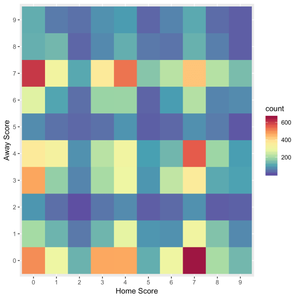
Here is the distribution of the last digits of the final scores of NFL games all-time:
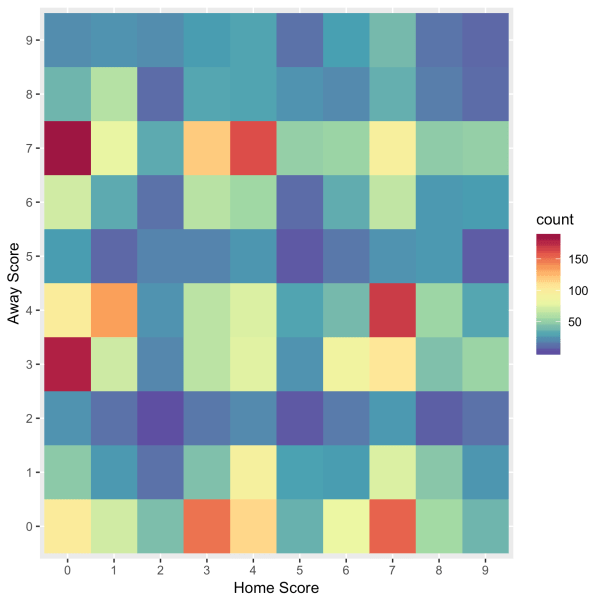
And here is the distribution for recent games, which I believe I defined as since 2000.
Go bears.
Cheers.
Statsinthewild Official Super Bowl Prediction
Prediction: 49ers , 26-25
Spread: 49ers +1
OU: Under 52.5
NFL Playoff Predictions – Divisional Round
Divisional Round
Ravens (51.84%) over Titans, 23-22
Chiefs (75.8%) over Texans, 33-18
Packers (52.41%) over Seahawks, 26-24
49ers (60.57%) over Eagles, 26-21
The tentative syllabus for my “radical” redesign of Intro Stat
Here is my tentative syllabus for my radical redesign. The structure of the course follows roughly the 9 goals put forth in the GAISE report. Please comment.
Oh also this: I’m getting rid of slides. I’ll have a marker for board work and a computer to do the analysis and simulations. But no slides!
- Week 1-1: Intro class. Go over syllabus. Discuss the 9 goals put forth in the GAISE report. Talk about ethics (IRB, informed consent, etc.)
- Week 1-2: Software: Introduction to R. Syntax. Getting data in/out of R. Basic structures (e.g. data.frames, matrices, vectors, etc.), etc. Reproducible documents (i.e. R Markdown)
- Week 2-1: Critical consumers: Assign students to read this paper over the weekend. Spend a full day of class discussing pros and cons.
- Week 2-2: Collecting data activity. I am going to make rectangular cards whose length, width, area, labels, and colors have statistical properties that I design. I’m going to hand them to the class and make them decide what questions we should ask and what we should measure. We will come back to this data many times throughout the semester.
- Week 3-1: Graphical Displays and Numerical Summaries:
- Types of data
- continuous
- categorical
- time-to-event data
- Univariate summaries for continuous data:
- mean
- median
- variance
- IQR range
- percentiles
- Tables for categorical data
- Univariate dataviz
- histograms
- boxplots
- barplots
- violin plots
- maps!
- Types of data
- Week 3-2: Graphical Displays and Numerical Summaries:
- Bivariate summaries for continuous data
- correlation
- pearson
- spearman
- kendall contingency
- simple linear regression
- two-way tables
- odds
- odds ratio
- correlation
- Bivariate dataviz
- scatter plots
- mosaic plots
- stacked bar plots
- side by side boxplots
- side by side histograms
- Bivariate summaries for continuous data
(Example data: Hospital General Information.csv https://data.medicare.gov/data/hospital-compare)
- Week 4-1: Variability:
- Intro to probability
- Describing Distributions (shape, center, variability, outliers)
- Expectation and Variance
- Week 4-2: Variability
- Bayes Theorem
- Specific Distributions
- normal
- binomial
- Week 5-1: Variability
- Sampling Distributions
- Lot’s of simulations!
- Emphasize the difference between data distribution and sampling distribution
- Bootstrapping
- Sampling Distributions
- Week 5-2: Variability
- Central limit theorem (CLT)
- Lot’s of simulations
- Central limit theorem (CLT)
- Week 6-1: Randomness
- Sampling
- Discuss famous cases where sampling was poorly done (e.g. Dewey defeats Truman)
- Talk about the Census!
- Selection bias
- Discuss sampling strategies (probability vs probability sampling)
- SRS
- Stratified
- Cluster
- Discuss population vs sample
- Sampling
- Week 6-2: Statistical Models:
- Simpsons paradox
- Very simple models (i.e. X ~ N(mu, sigma))
- Simple Linear Regression (no inference…..yet)
- Week 7-1: Exam 1
- Week 7-2: Statistical Inference
- What is statistical inference?
- Ideas of point and interval estimation
- Explain correct interpretation of confidence intervals!
- Idea of hypothesis testing
- Type I and Type II errors
- Multiple testing problems (FWER and FDR)
- Week 8-1: Statistical Inference
- Hypothesis testing of one mean.
- parametric tests (Z and t-test)
- non-parametric test (sign test, permutation test)
- Hypothesis testing of one mean.
- Week 8-2: Statistical Inference
- Interval estimation of one mean
- parametric (Z and t-interval)
- non-parametric (bootstrap intervals)
- Interval estimation of one mean
- Weel 9-1: Statistical Inference
- Two dependent samples hypothesis testing
- parametric (Z and t-test)
- non-parametric (Wilcoxon signed rank test, permutation test)
- Interval estimation
- parametric (Z and t-intervals)
- non-parametric (bootstrap intervals)
- Two dependent samples hypothesis testing
- Week 9-2: Statistical Inference
- Two independent samples hypothesis testing
- parametric (Z and t-test, Welch’s test, pooled variance)
- non-parametric (Wilcoxon Rank Sum/Mann Whitney U, permutation test)
- Interval Estimation
- parametric (Z and t-intervals)
- non-parametric (bootstrap intervals)
- Two independent samples hypothesis testing
- Week 10-1: Statistical Inference
- Simple Linear Regression
- parametric (t-tests)
- Simple Linear Regression
- Week 10-2: Statistical Inference
- k-sample problems
- parametric (ANOVA) (It’s just regression with categorical predictors!!!!!)
- non-parametric (Kruskal-Wallis)
- k-sample problems
- Week 11-1: Statistical Inference/Statistical Models
- Multipel Regression
- Week 11-2: Statistical Inference/Statistical Models
- Multiple Regression
- Week 12-1: Statistical Inference
- Categorical Data
- Inference for proportions
- parametric (using CLT)
- non-parametric (permutation test)
- Chi-square tests
- parametric (using CLT)
- non-parametric (permutation test)
- Inference for proportions
- Categorical Data
- Week 12-2: Statistical Inference/Statistical Models
- Simple Logistic Regression
- Week 13-1: Statistical Models
- Survival Analysis
- Motivate with example why we can’t just use mortality rates (in 100 years everyone is dead!)
- Censoring
- Truncation
- K-M Curves (comparing two K-M curves)
- Survival Analysis
- Week 13-2: Statistical Inference
- Intro to Missing Data
- Examples where ignoring missing data is bad
- Why is the data missing?
- Missingness mechanisms
- Really simple multiple imputation?
- Intro to Missing Data
- Week 14-1: Statistical Inference
- Introduction to Bayesian statistics
- Motivate Why?
- Define prior, likelihood, posterior
- Estimating a proportion example
- Credible Intervals
- Introduction to Bayesian statistics
- Week 14-2: Statistical Inference
- Introduction to Bayesian statistics (continued)
- Bayesian Hypothesis testing
- Bayes Factor
- Introduction to Bayesian statistics (continued)
- Week 15-1: Case study
- Case study from start to finish.
- We are going to start with this data set and analyze it from start to finish.
- We are going to do it “Data Fest Style”: There is no specific question. We are just looking for interesting stories to tell from the data.
- Week 15-2: Case Study
- Case study continued
Week 16: Final Exam
More thoughts on my “radical redesign” of Intro Stats (part 2)
Here are my first set of thoughts on my “radical redesign”.
More thoughts:
- I think we need to introduce non-parametric statistics in intro stats. I basically had no idea about non-parametric statistics until I taught a course called non-parametric statistics in my first semester as a professor at Loyola. I’m totally sold on them. I think we do a disservice teaching all these parametric procedures, which were useful 50 years ago (I mean they are still useful) because the extra assumptions were greatly simplifying. But we have computers and don’t really need that extra level of simplification all the time now.
- I think we should mention the t-test as basically an after thought. My plan is to introduce hypothesis testing using simulation and directly examine the distribution of the test statistic with this simulation. Once you do that the fact that it’s a t-distribution (or whatever distribution it is) doesn’t even really matter as long as you have the distribution. Students get way too hung up on using t-tests like they are the end all be all of hypothesis testing. It should be presented as ONE test among many.
- I’m going to completely get rid of slides. I’m going to go into every class with a plan and a data set. All theory will be written on the board while trying to get students involved as much as possible. I will write simulations on the spot to show students examples of code. (I will keep the simulations simple). I will then do all data analysis on the spot. NO SLIDES.
- Something that I am on the fence about that I read in the GAISE report: dropping probability theory. In the section with a list of topics to potentially drop they include this. The more I think about it though, the more it makes sense. We already have other classes that will cover probability in much more detail and we don’t need much probability to actually do a lot of data analysis (we do need some though).
- Another note the GAISE report makes that I have been screaming about for years is getting rid of the F@#$ing tables. Students in my class aren’t allowed to use Z/T/whatever tables to look up probability. It’s an antiquated skill and it has been for like 30 years. Yet it’s still taught in so many intro stat classes. If I see students using a table, I reserve the write to rip up the table on the spot and throw the pieces into the air while yelling about how it’s 2020 not 1920.
