Blog Archives
The University of Nebraska Board of Regents is a dumpster fire
When I was a kid, I used to think that if someone was in a high up position that they must be really smart and competent. Now that I’m in my 40s, it seems like it’s almost the opposite. Most of the people I meet or read about who are in positions of leadership, I’m wildly unimpressed by. But I could not possibly imagine the level of incompetence of the Board of Regents for the University of Nebraska.
They recently cut their statistics program along with a few others based on metrics showing these program were underperforming, but there really weren’t many details of what these metrics were or how they were computed. However, AMSTAT News recently published an interview with two professors from the University of Nebraska-Lincoln on what happened (You can read the full article here). In that article, they detail some of the flaws in the calculation of these metrics, but one of these flaws stands out above all the others as the peak of dip shittery.
So, one of the metrics the Board of Regents used in their calculation was graduation rate. Graduation rate is the number of graduates divided by number of majors. Simple enough. Now for the statistics department, this number was 0%. Why? Because the department hadn’t yet existed for 4 years.

Here is the relevant paragraph from the AMSTAT article:
And just as a nice added middle-finger to the statistics department, the Board of Regents decided to make their own definition of what an outlier is.

There is no nice way to say this: these people are world class unimpressive.
Cheers.
Some thoughts on this election and the polls.
So someone pointed me to this article, “Weaponized Polling Is More Dangerous Than Ever” where the author argues that right leaning pollsters (or “pollsters”) are conducting polls that intentionally make Trump look like he’s in a stronger position than he is. (The author goes on to offer what I consider to be compelling reasons why they are doing this.)
But I wanted to check this for myself. So, I went and got the poll data from fivethirtyeight.com (Click here to download the latest polling data from fivethirtyeight as a .csv file). Fivethrityeight also includes grades for each of the pollsters based on past performance.
The lowest rated polls in fivethirtyeight are:
- McLaughlin – 0.5
- Peak Insights – 0.6
- Research America – 0.7
- The Political Matrix/The Listener Group – 07.
- Trafalgar Group – 0.7
- Hendrix College – 0.9
- Tulchin Research – 0.9
On the other end of the spectrum, fivethirtyeight gives only 8 pollsters their top grade of 3: ABC/Washington Post, Marquette Law School, McCourtney Institute/YouGov, Siena/NYT, The Washington Post, YouGov, and YouGov Blue. Many of the top University polls have just slightly lower ratings like Emerson, Marist, Suffolks, UMass – Lowell (all 2.9 out of 3). In total, there are 158 polls with 80 of them rated 2.0 or higher.
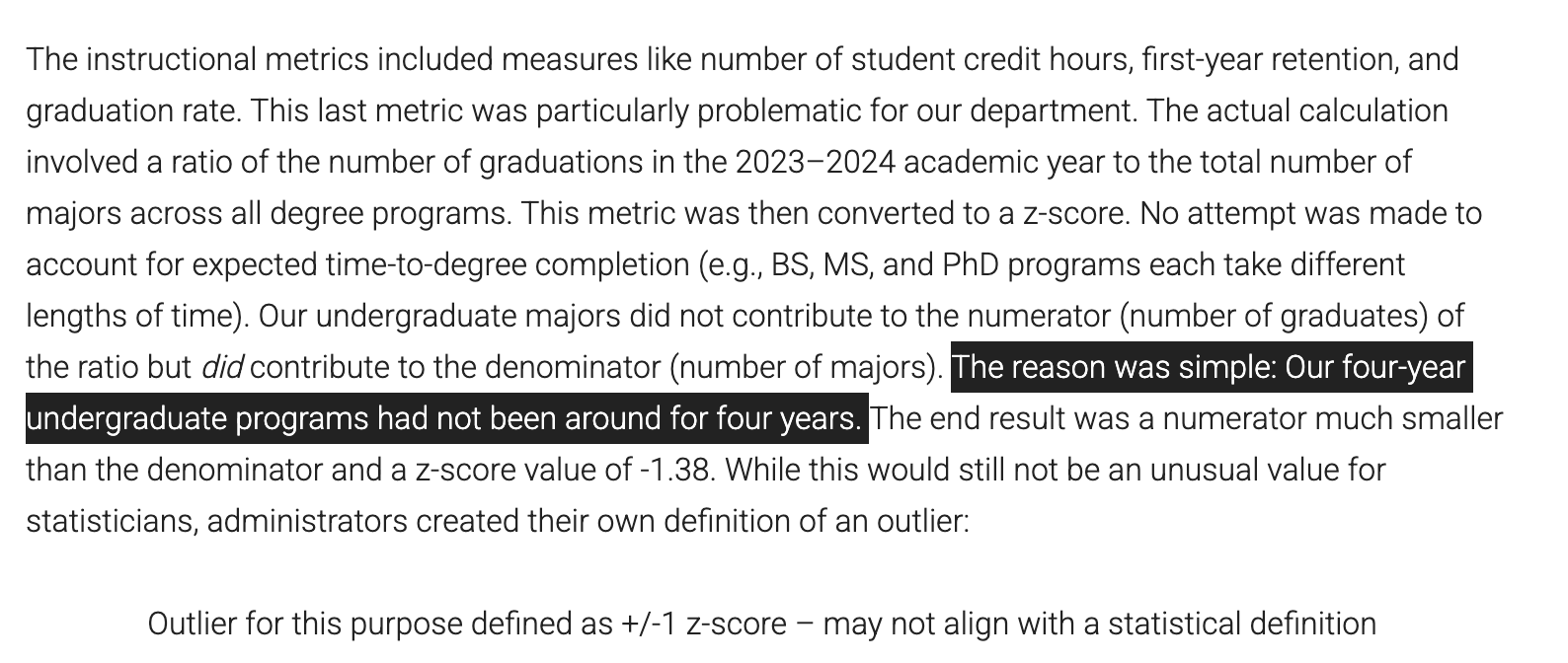
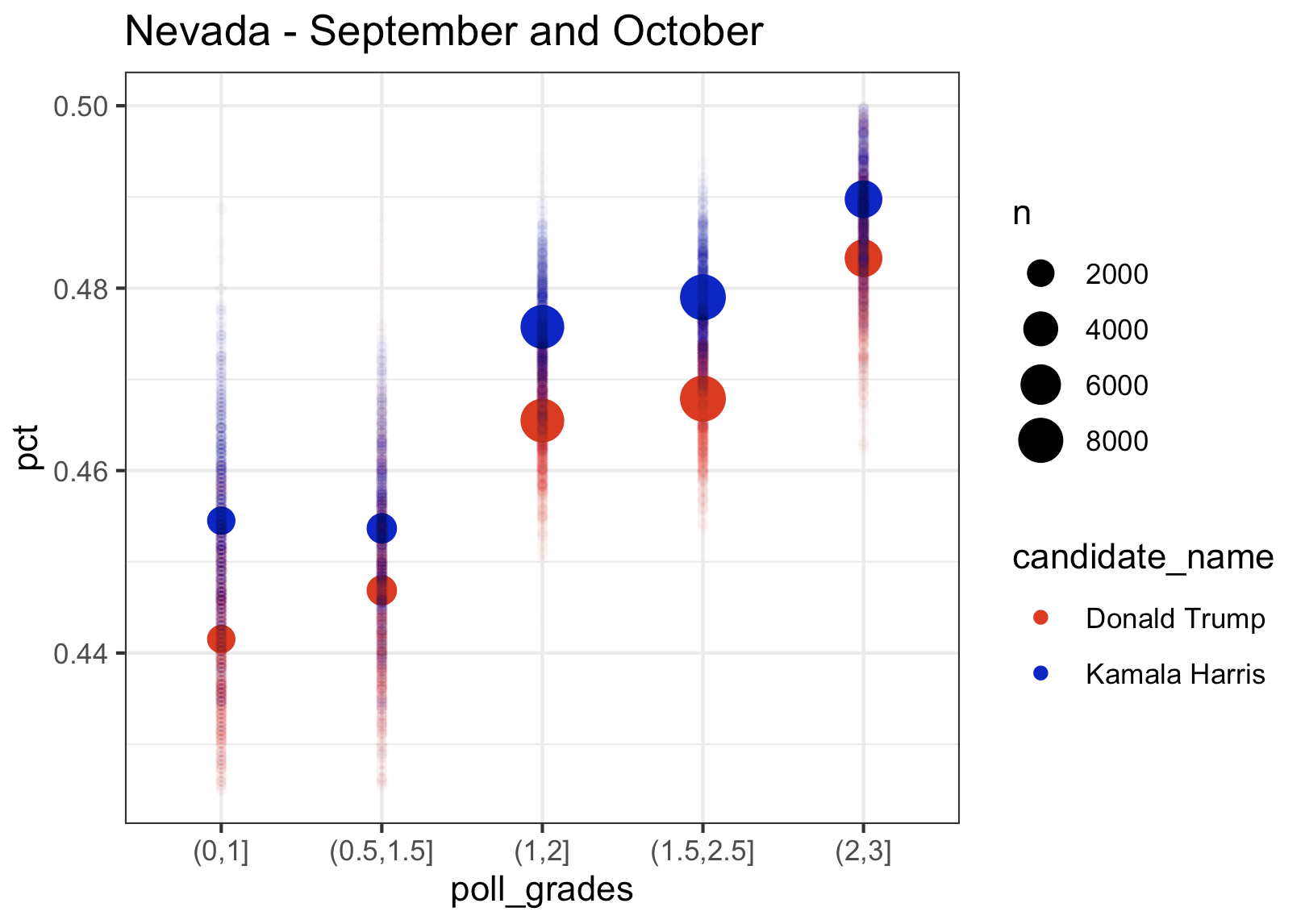
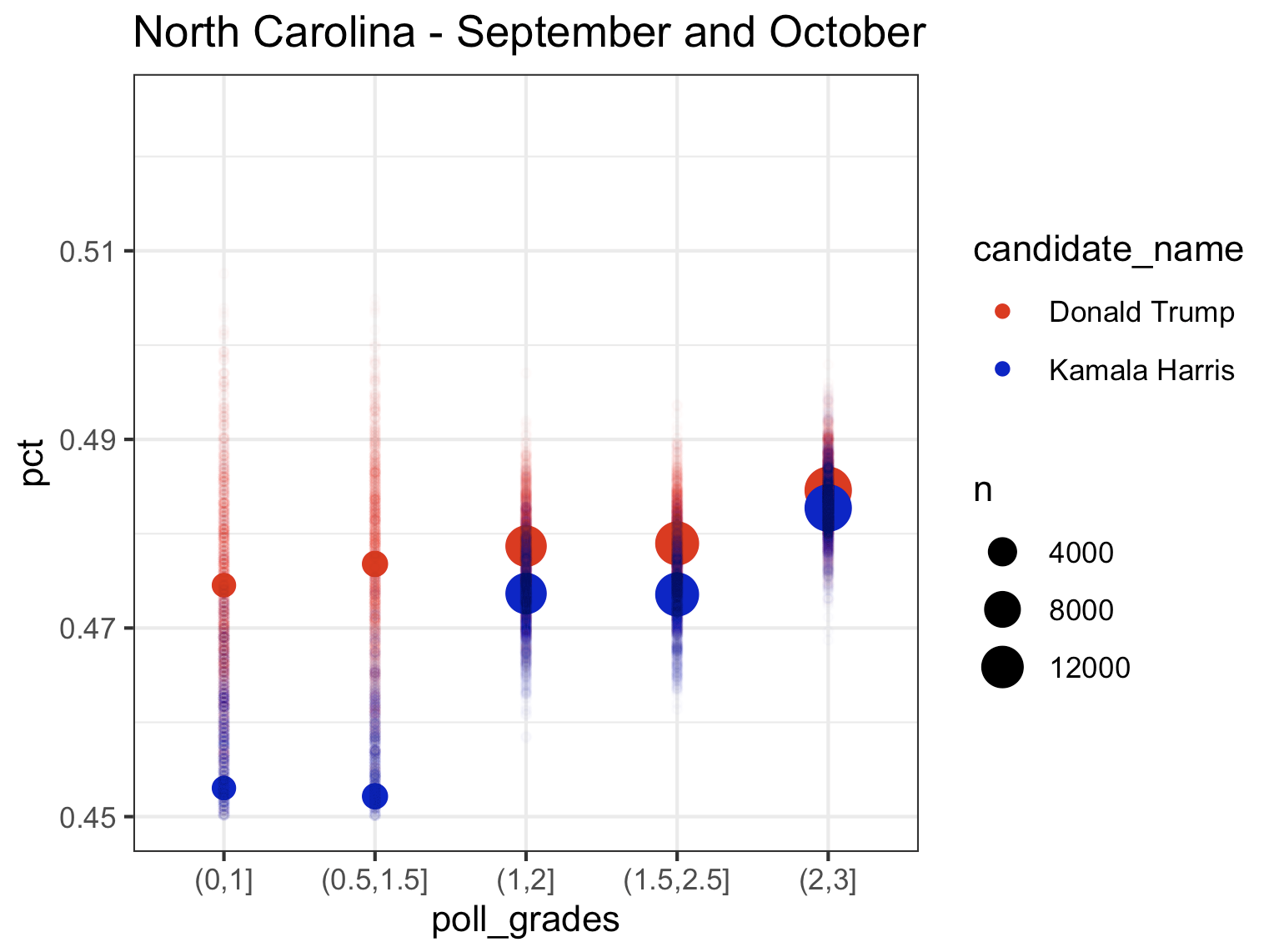
So what I want to look at is how the polls of different quality score the race right now. So here is what I did (with Pennsylvania as an example): I took all the polling data and and removed “duplicate” polls (I don’t quite understand why 538 seems to have these duplicates in their file, but there are records in the data that look exactly the same to me except for the percentage. So, I included only one of these records when there were multiple. If anyone can explain the difference in these records to me, I’m all ears). I then only kept polls consisting of “likely voters”. I then took all those polls over a certain period of time and combined all the polls over these period of time to come up with one single estimate for each candidate (basically mini meta-analysis). I then computed these estimates by filtering on a range of polling grades (i.e. 0.5-1.5, 1-2, 1.5-2.5, 2-3) and I plotted these estimates (with fun little error tails), on a plot. Here is Pennsylvania for August, September, and October, and then September and October pooled together at the end:
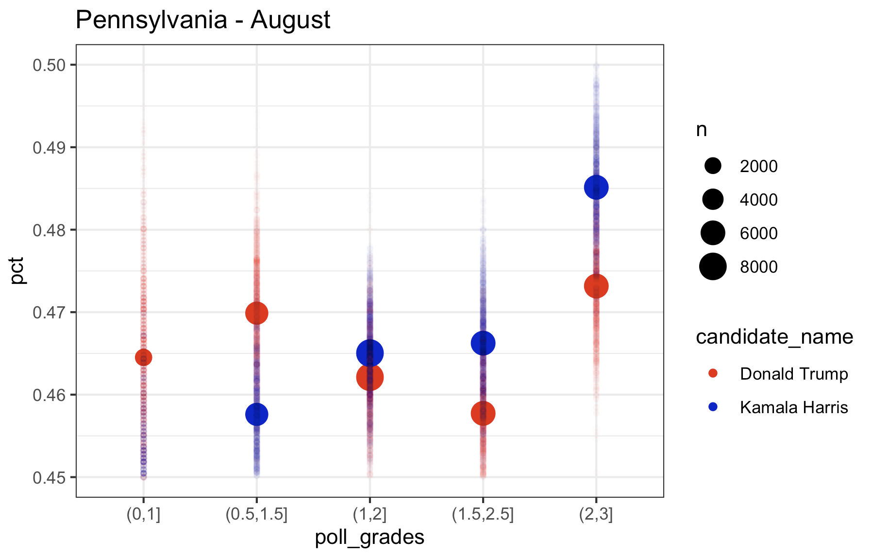
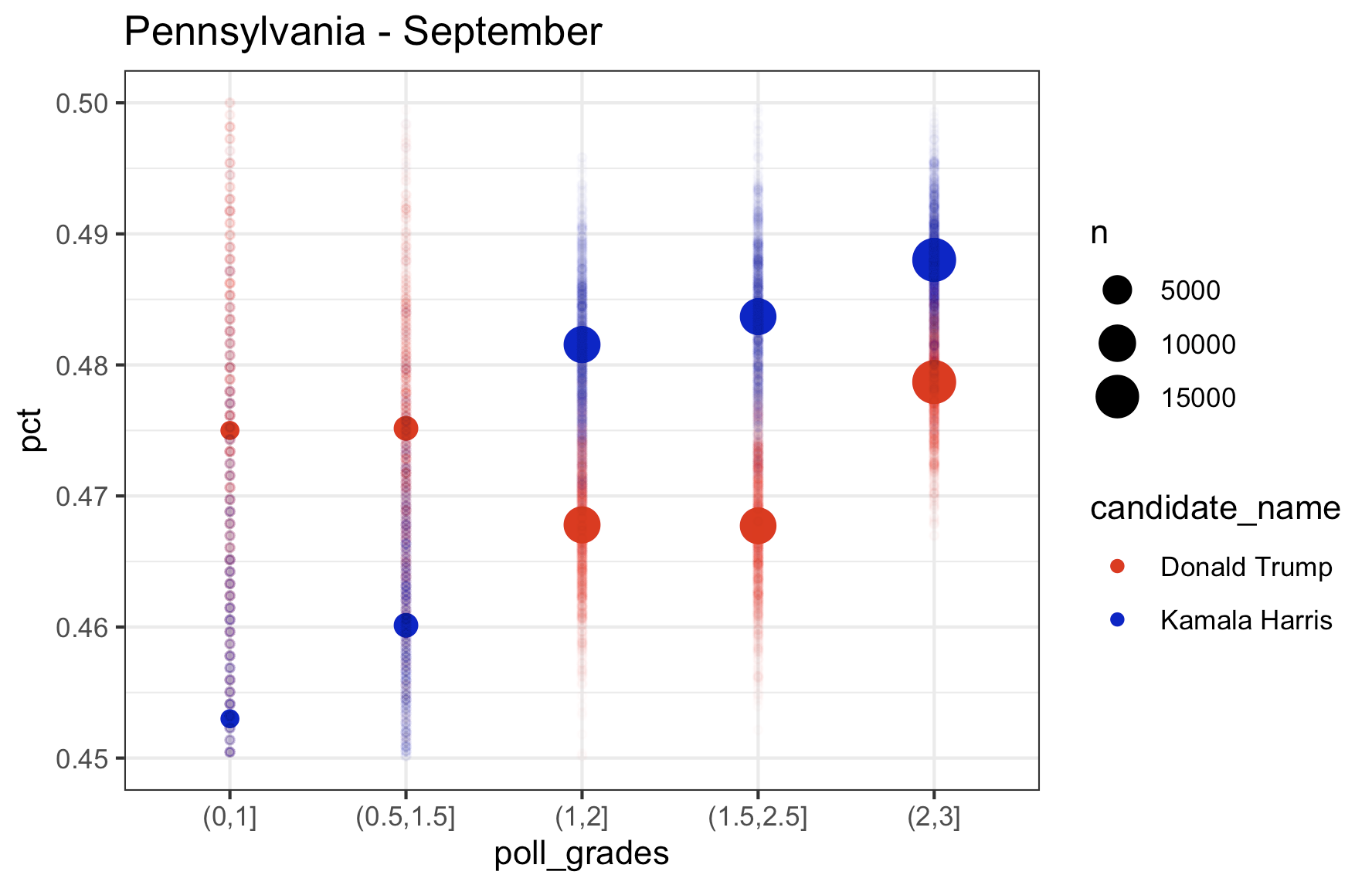
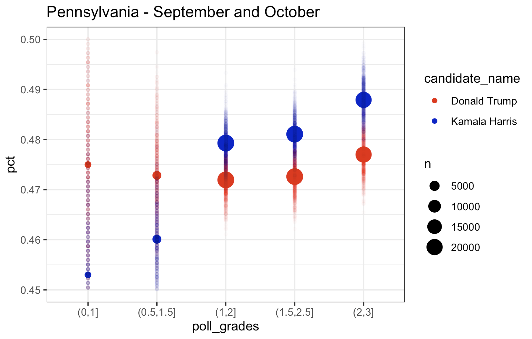
What you’ll notice is that the higher the rating on the filter of which polls to include, the higher the estimate is for Kamala, while Trump remains relatively consistent across polls. If you look at the last plot (September and October pooled together), the lowest rated polls have Kamala trailing in Pennsylvania by almost 2 points. The top rated polls have Kamala leading by a point. So, based on this it looks to me like…..Pennsylvania isn’t actually that close. Kamala is consistently leading in the top rated polls and and the polls in 2022 were, according to 538, “historically accurate“. So this is good news for Kamala. But there also appears to be some not so great news for Kamala, too. Let’s look at the other swing states, which I consider to be Michigan, Wisconsin, Georgia, Arizona, Nevada, and North Carolina (North Carolina is a swing state. Fight me.) Let’s start with the rest of the Midwest (Pennsylvania is Midwest. Fight me.)
Wisconsin
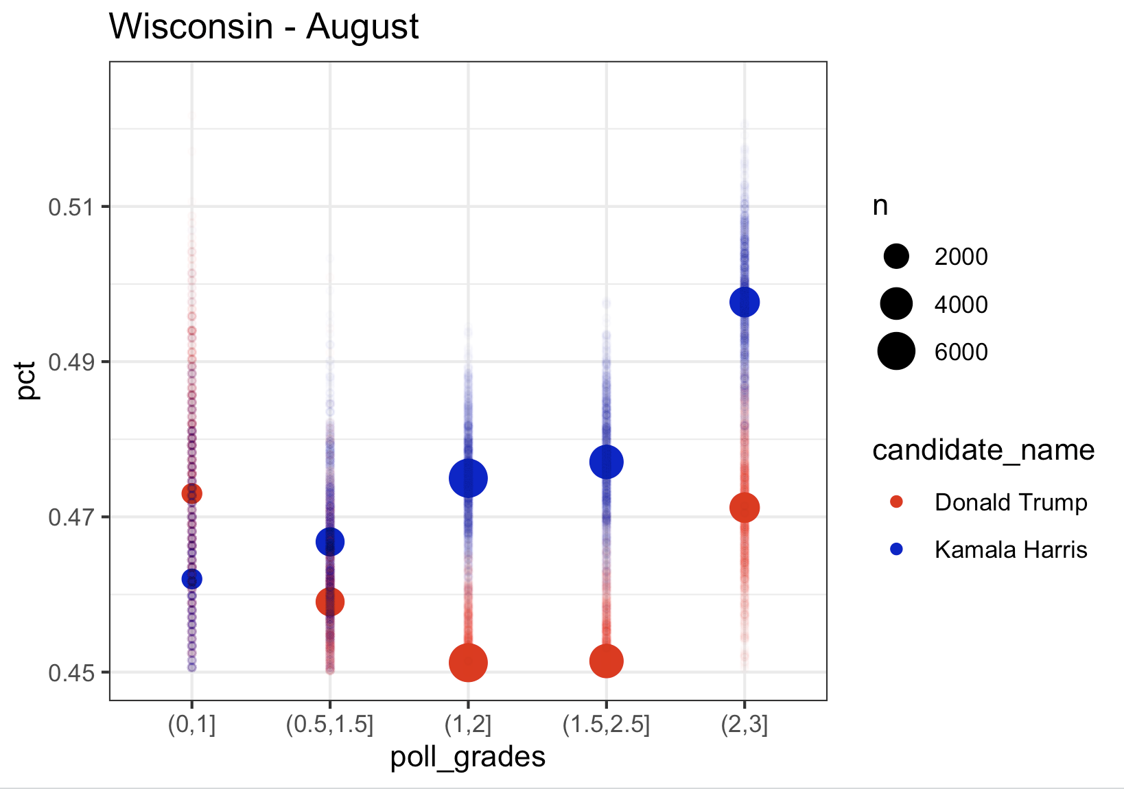
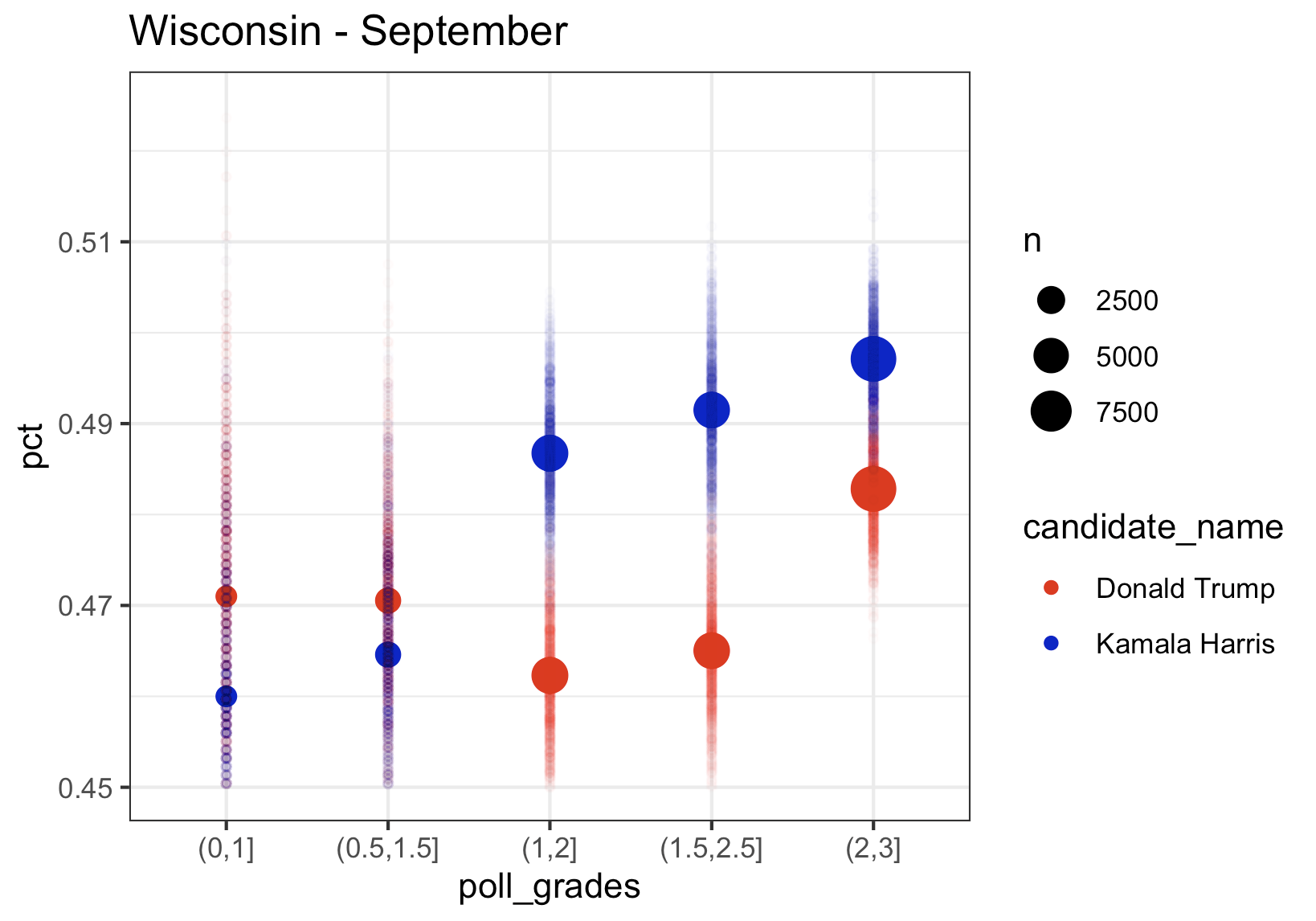
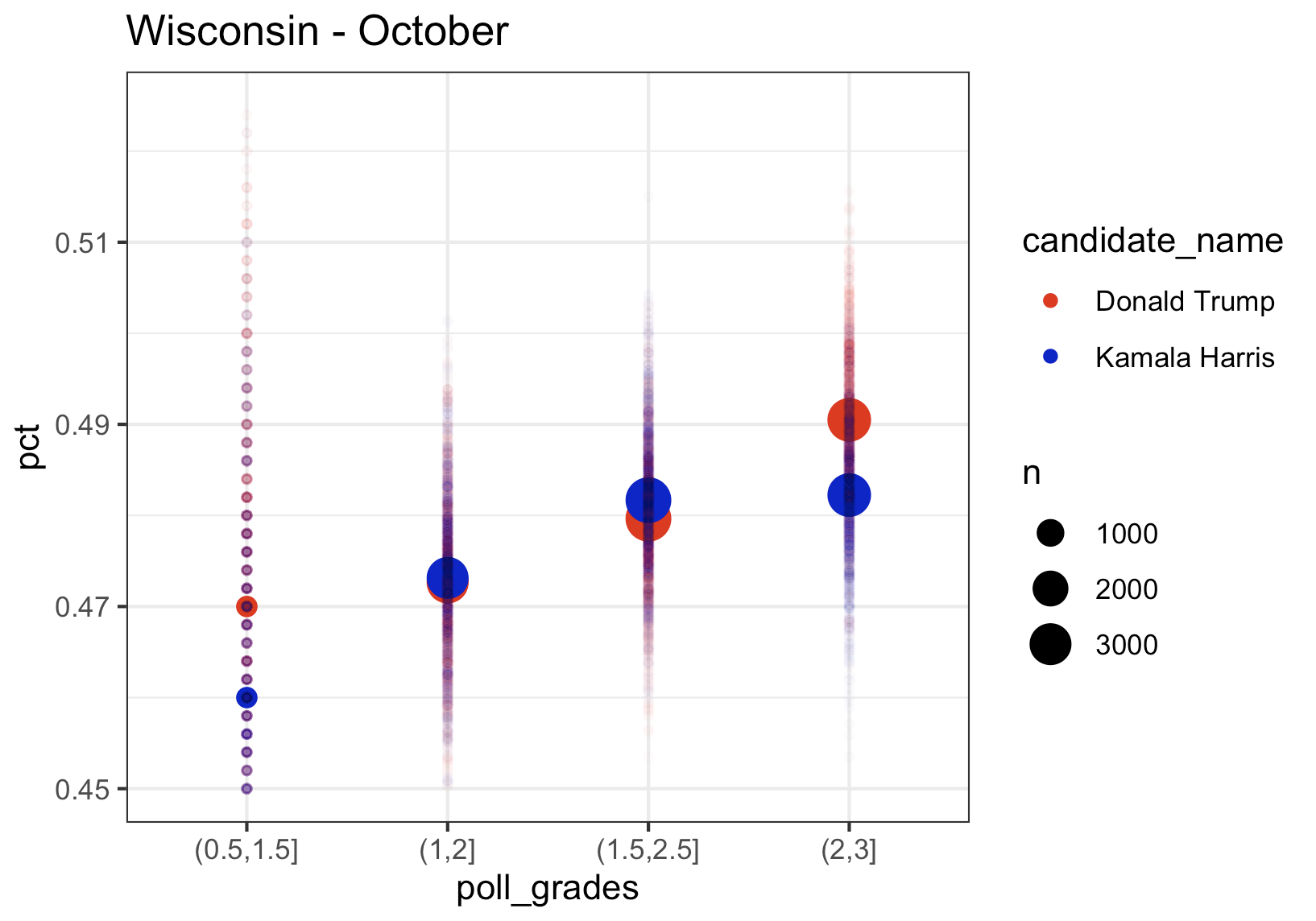
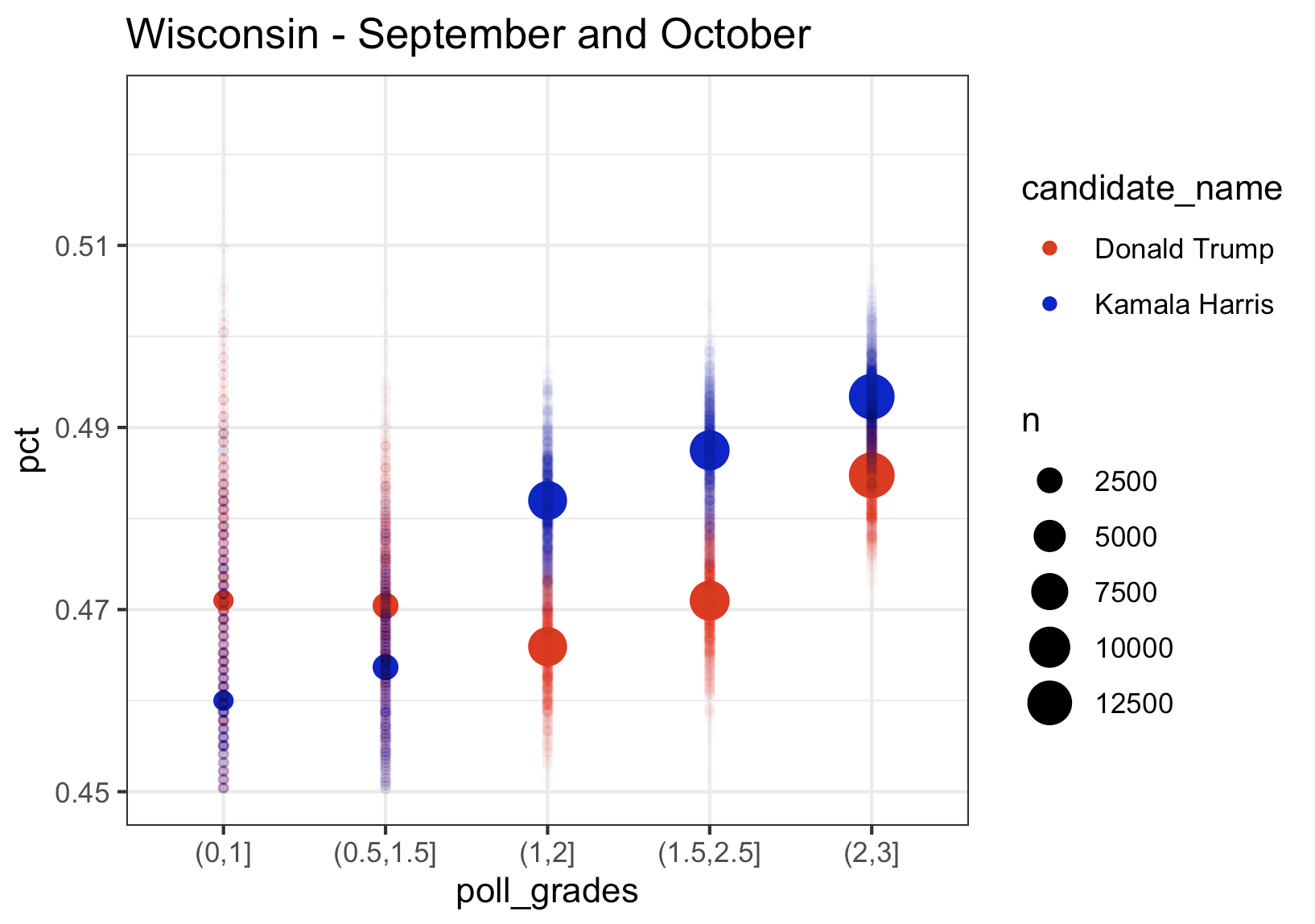
We again see the same pattern where higher rated pollsters have Kamala at a higher percentage, exactly like we saw in Pennsylvania. The bad news for Kamala in Michigan is that her lead using only August data was about 1.5, in September it was down to 1, and with the limited data in October, she is trailing in Wisconsin by about 0.5. And we see the same thing in Michigan.
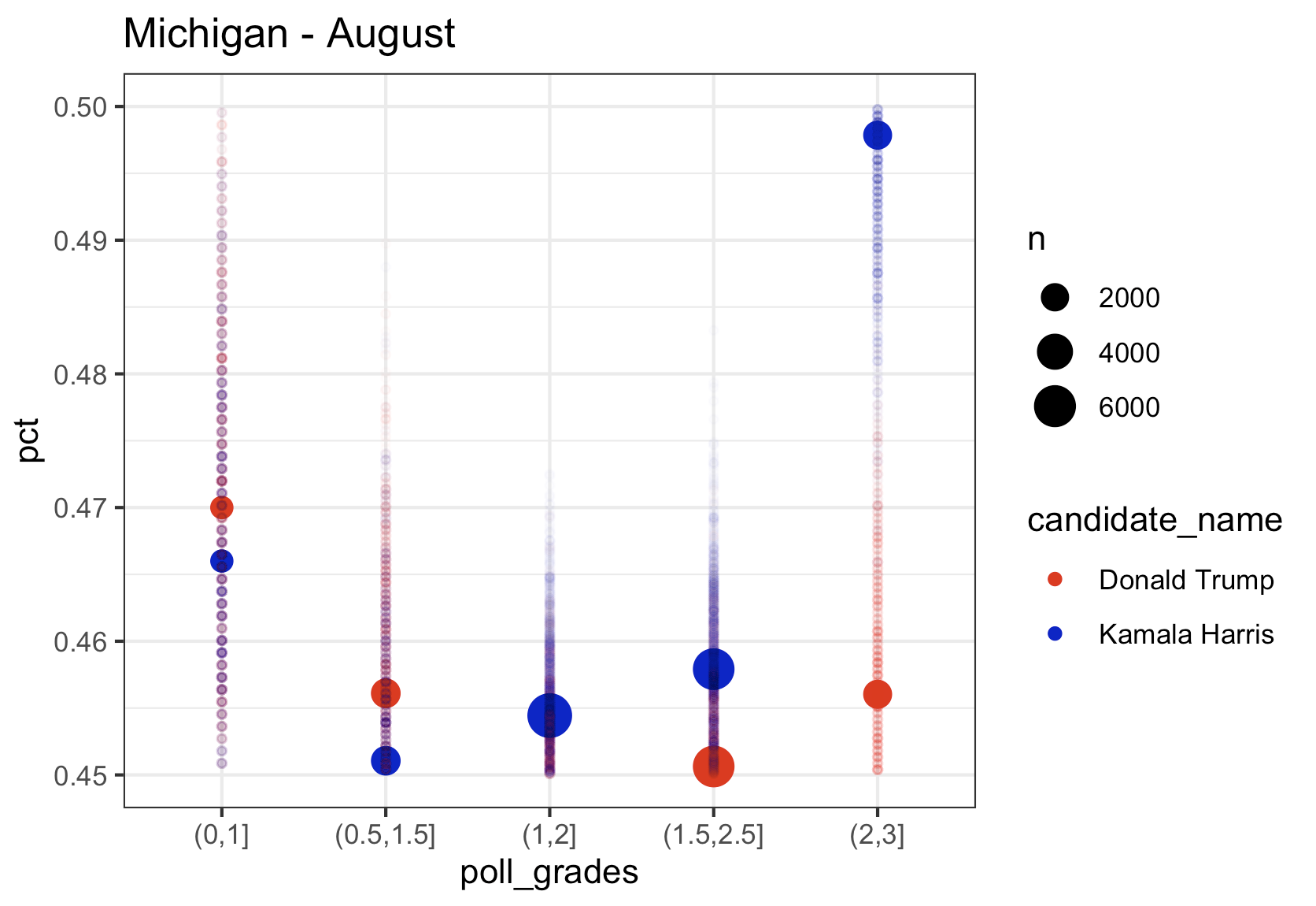
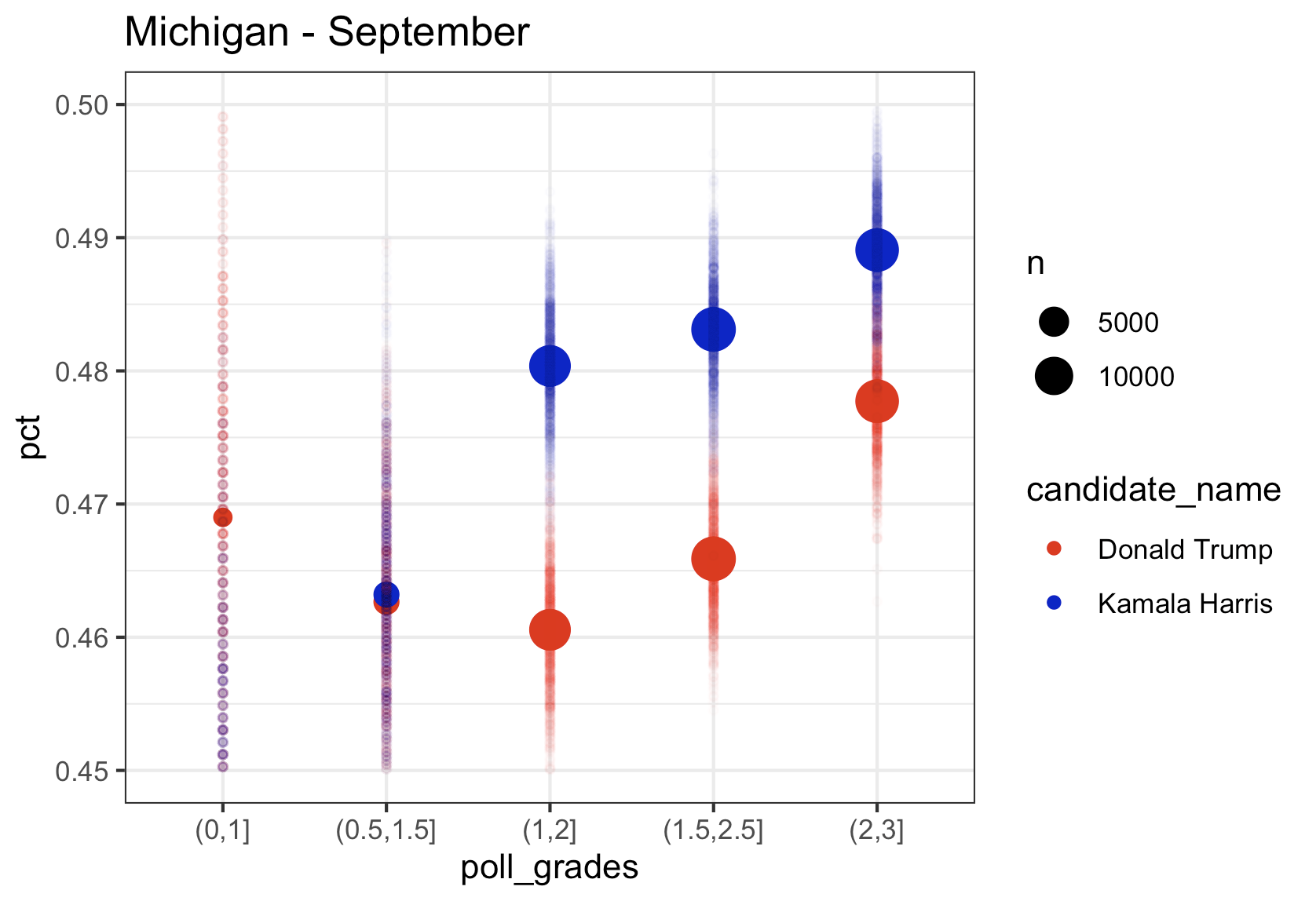
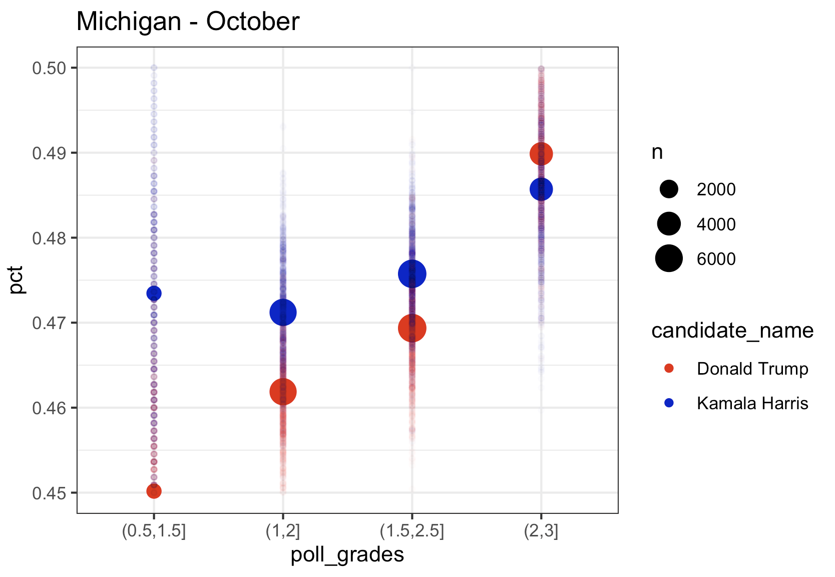
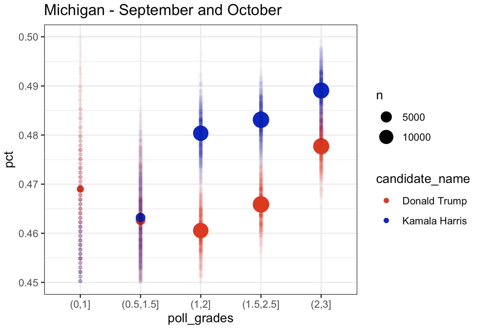
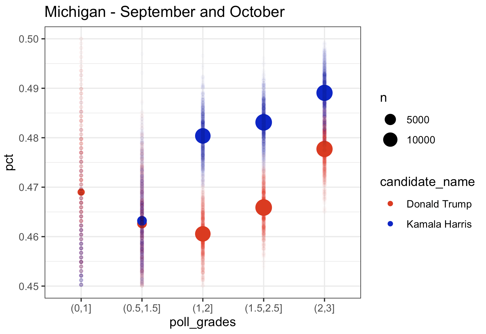
Michigan
Kamala’s lead in Michigan in the top rated polls in August was over 4 points, in September it was down to 1 point, and using only October data from the top pollsters, just like in Wisconsin, she is trailing by 0.5 points. The aggregate of September and October, still has her in the lead, but the trend has to be scary to the Harris campaign. Note that once again we see the lower rated pollsters with Kamala much lower than the highest rated pollsters.
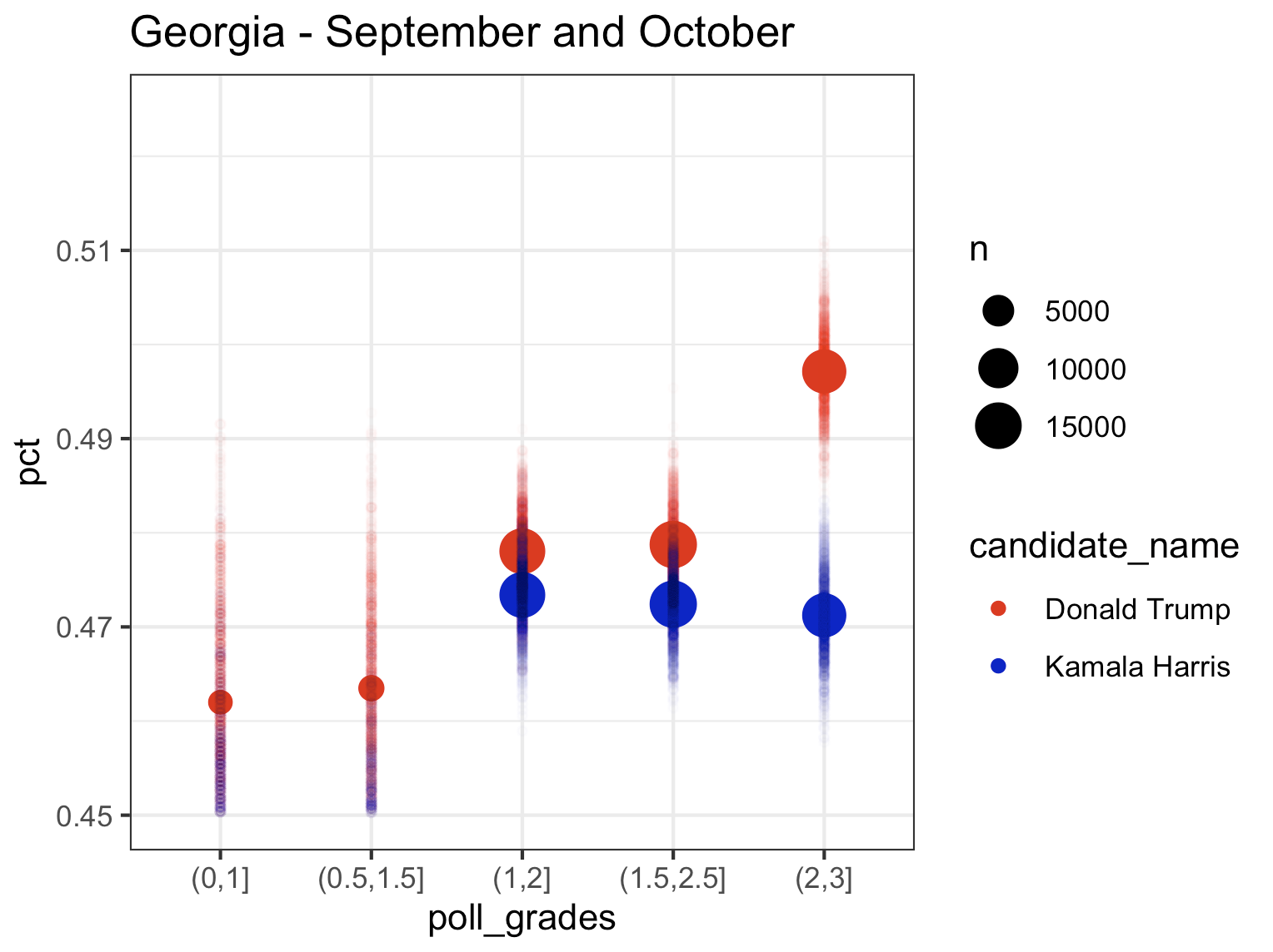
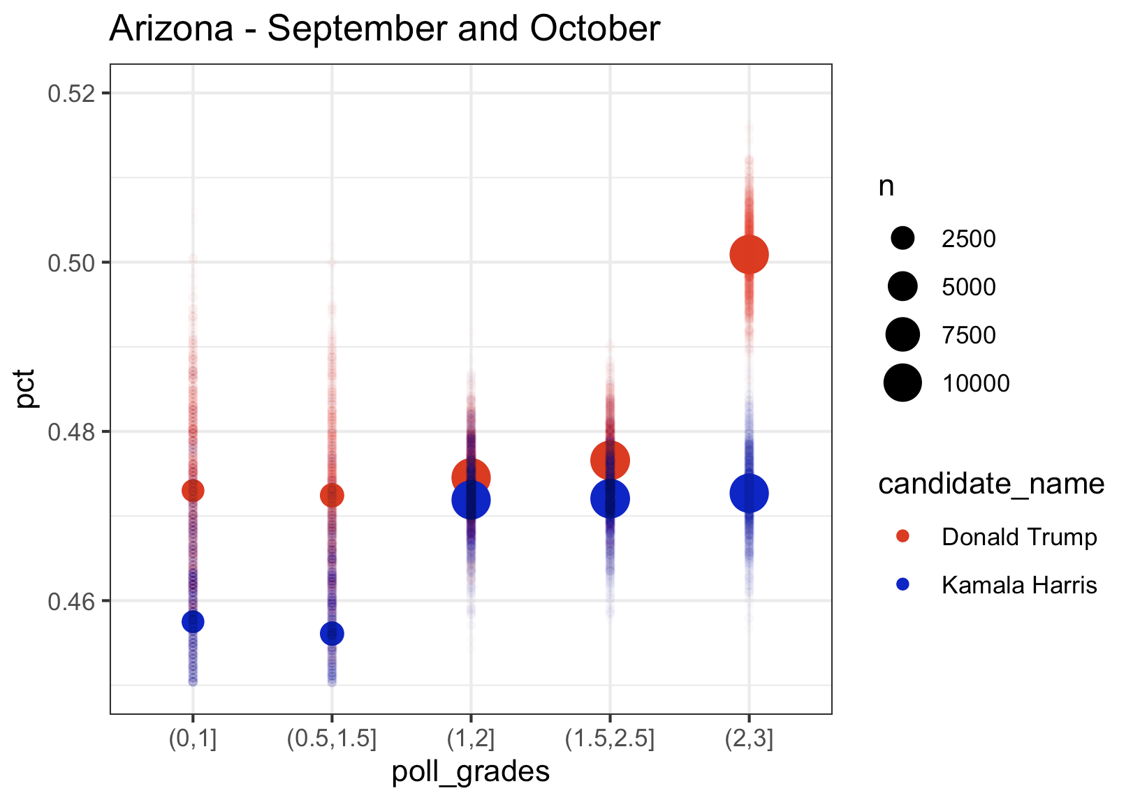
Finally, let’s look at the last 4 swing states. What’s interesting in Georgia is that the top rated polls give Trump more of a lead than the lower rated polls, while Kamala’s percentage remains largely the same across pollster rating groups. Nevada and North Carolina follow the pattern that we saw in the Midwest with higher rated polls giving Kamala a higher percentage. Based on the top rated pollsters, Kamala is slightly leading in Nevada and just barely trailing in North Carolina (which I think Dems can win given the absolute lunatic running for governor).
Georgia
Arizona
Nevada
North Carolina
All this said, I give you an electoral map that I think is totally plausible based on this polling data that I guarantee you will not see anywhere else. Behold:
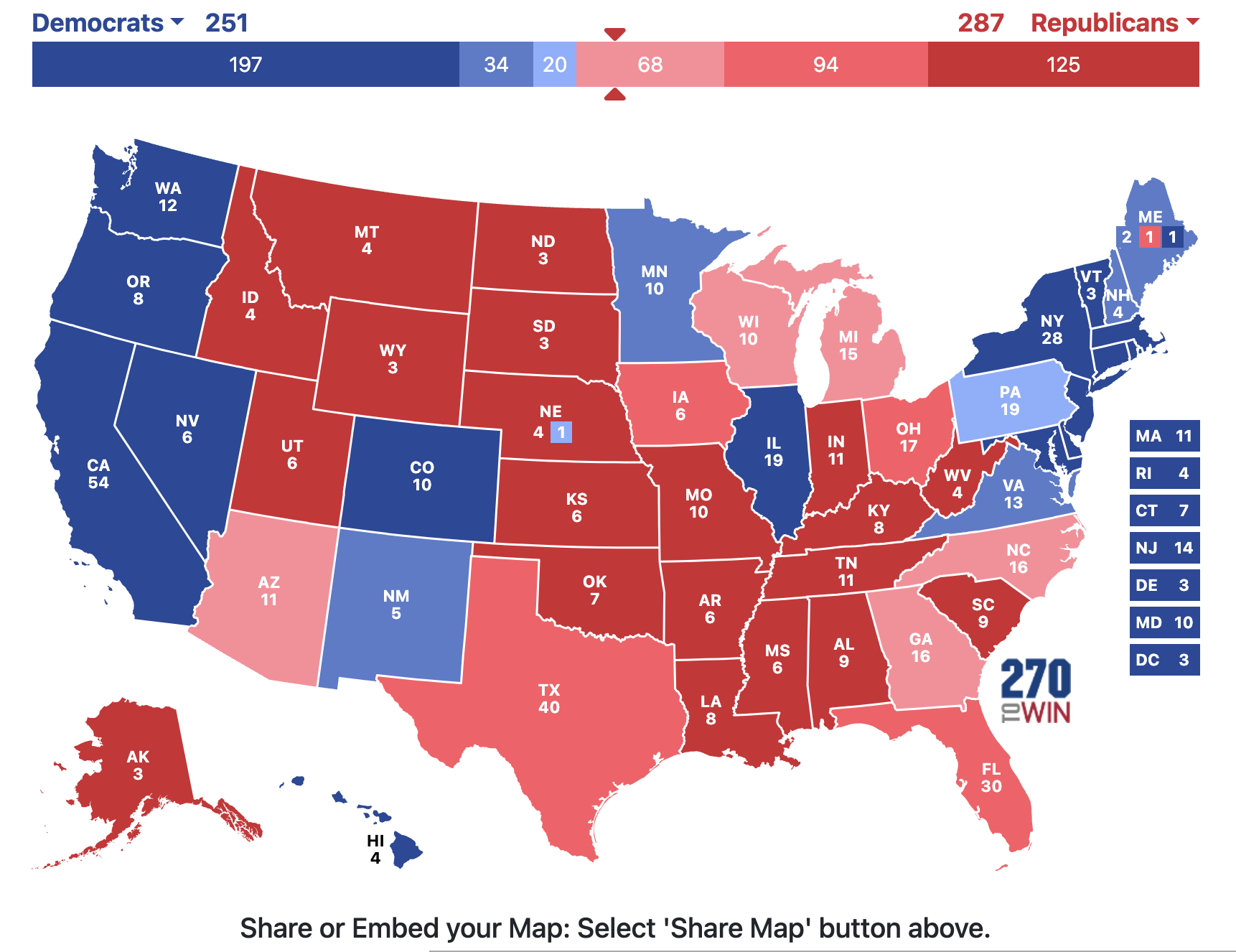
Kamala wins Pennsylvania. Wins the popular vote by 3 points. And loses the election.
What. A. Nightmare.
Cheers.
The thing about multiple hypothesis testing that has always bothered me
Here is what’s always bothered me about multiple hypothesis testing.
Let’s say there are 10 hypothesis tests and they come back and 3 of them are significant at the 0.05 level. However, after correcting for multiple test using, for simplicity, a Bonferroni correction, none of these tests are significant. (Assume that it doesn’t matter what method you use to correct, but after correction you find nothing significant). So when an individual researcher does these tests together, they have to report that they found nothing significant.
Now let’s say that 10 different researchers do one of these ten tests each, and they get the exact same p-values. Now 3 of these researchers will get “significant” results because they are only doing one test. So three of these researchers publish their results.
It’s the same exact set of tests with the same exact p-values. But if a single researcher does it, there is nothing significant. And if they did report something significant they would be accused of p-hacking (and rightly so). But if 10 different independent researchers each do one of the tests, they will come up with 3 out of the 10 tests as significant. Same data. Same results. Same p-values. Different conclusions based on who performed the test. Weird, right?
Cheers.
NFL Picks – Week 3
Total – SU: 32-16-0 (66.67%) ATS: 27-20-1 (57.29% +5 Units) O/U: 31-17-0 (64.58% +12.3 Units)
Week 1 – SU: 10-6-0 ATS: 8-8-0 O/U: 13-3-0
Week 2 – SU: 10-6-0 ATS: 10-6-0 O/U: 10-6-0
Week 3 – SU: 12-4-0 ATS: 9-6-1 O/U: 8-8
Tampa Bay at Atlanta
Prediction: Falcons 24-20 (62.5%)
Pick: Buccaneers +6.5 (55.8%)
Total: Under 45
San Francisco at Arizona
Prediction: 49ers 22-20 (55.9%)
Pick: Cardinals +3 (52.7%)
Total: Under 42.5
San Diego at Buffalo
Prediction: Bills 23-22 (51.8%)
Pick: Chargers +2.5 (55.3%)
Total: Over 44.5
Tennessee at Cincinnati
Prediction: Bengals 24-19 (64.5%)
Pick: Titans +7 (55.1%)
Total: Under 43.5
Baltimore at Cleveland
Prediction: Ravens 22-21 (53.5%)
Pick: Browns +2 (52.2%) PUSH
Total: Over 42
Green Bay at Detroit
Prediction: Lions 25-24 (53.4%)
Pick: Lions -1 (50.5%)
Total: Under 52.5
Indianapolis at Jacksonville
Prediction: Colts 23-20 (57.4%)
Pick: Jaguars +7 (62.3%)
Total: Under 45.5
Kansas City at Miami
Prediction: Dolphins 21-19 (55.9%)
Pick: Chiefs +5 (58.2%)
Total: Under 41.5
Oakland at New England
Prediction: Patriots 29-19 (77.2%)
Pick: Raiders +14.5 (61.5%)
Total: Over 47
Minnesota at New Orleans
Prediction: Saints 27-20 (68.3%)
Pick: Vikings +9.5 (58.0%)
Total: Under 51
Houston at NY Giants
Prediction: Giants 22-21 (51.1%)
Pick: Giants +2.5 (58.2%)
Total: Over 42
Washington at Philadelphia
Prediction: Eagles 25-22 (59.8%)
Pick: Washington Football Team +6.5 (58.6%)
Total: Under 50
Denver at Seattle
Prediction: Seahawks 24-22 (54.6%)
Pick: Broncos +4.5 (58.2%)
Total: Under 49
Dallas at St. Louis
Prediction: Cowboys 23-22 (53.0%)
Pick: Rams +2 (52.7%)
Total: Under 45.5
Pittsburgh at Carolina
Prediction: Panthers 23-20 (59.4%)
Pick: Steelers +3.5 (50.5%)
Total: Over 41.5
Chicago at NY Jets
Prediction: Bears 21-20
Pick: Bears +2.5 (60.1%)
Total: Under 45.5
March Madness Projections Updated – March 5, 2013
Number 1 Seeds: Gonzaga, Indiana, Michigan, Duke
Last 4 in: Boise State, Wichita State, Virginia, Stanford
Last 4 out: California, La Salle, Arizona State, Baylor
 Cheers.
From Deadspin: Nate Silver’s Braying Idiot Detractors Show That Being Ignorant About Politics Is Like Being Ignorant About Sports
This article by David Roher is fantastic: Nate Silver’s Braying Idiot Detractors Show That Being Ignorant About Politics Is Like Being Ignorant About Sports
The article also pointed me to the Princeton Election Consortium, which is also fantastic. They have the probability of an Obama win at 99.0% and predict an electoral college win of 315-223. Below are some of the graphs they have produced about the election, I especially like the 2012 Electoral College Map with each state’s area displayed proportional to its electoral votes.


Cheers.
Rule for Variance Inflation Factors
A quote from here:
“Goldberger (1991) notes that while the number of pages in econometrics
texts devoted to the problem of multi-collinearity in multiple regression is
large the same books have little to say about sample size. Goldberger states:
“Perhaps that imbalance is attributable to the lack of an exotic polysyllabic
name for ‘small sample size.’ If so, we can remove that impediment by introducing the term micronumerosity” (Goldberger, 1991: 248–249).”
Cheers.
NCAAB Rankings – 1/2/2012
Rankings as of 2:31pm on 1/2/2012. Sagarin ratings as of 1/1/2012. AP rankings as of 1/2/2012.
Previous rankings are here.
Pittsburgh, Oklahoma, and Miss St. fall out of the top 25 and New Mexico, North Carolina, and Purdue are in the top 25 this week. The Mountain West conference has 3 teams in my top 25. That is the same number as the ACC, Pac-12 and SEC COMBINED. I’ve even given the MWC there own color (purple). I considered giving them red since the Pac-12 wasn’t using it at all, but I think purple is a more fitting color for the MWC (think purple mountains majesty).
Breakdown by conference: 2, 6, 9, 4, 0, 1, 3
ACC Big East Big Ten Big 12 Pac 12 SEC MWC Other
| Team | Rank | Change | Record | AP | Sagarin |
| Syracuse | 1 | ↑1 | 15-0 | 1 | 1 |
| Baylor | 2 | ↑2 | 13-0 | 4 | 6 |
| Indiana | 3 | ↓2 | 13-1 | 12 | 4 |
| Michigan St. | 4 | ↑5 | 13-2 | 10 | 8 |
| Duke | 5 | ↑7 | 12-1 | 5 | 5 |
| Ohio St. | 6 | ↓3 | 13-2 | 6 | 3 |
| UConn | 7 | ↑10 | 12-1 | 8 | 26 |
| Michigan | 8 | ↑8 | 12-2 | 16 | 41 |
| Missouri | 9 | ↑4 | 13-0 | 7 | 11 |
| Illinois | 10 | ↓3 | 12-3 | 11 | 47 |
| Northwestern | 11 | ↓3 | 11-3 | – | 51 |
| Marquette | 12 | ↓1 | 12-2 | 20 | 19 |
| Wisconsin | 13 | ↓3 | 12-3 | 18 | 15 |
| Georgetown | 14 | ↑11 | 12-1 | 9 | 10 |
| Seton Hall | 15 | ↓1 | 12-2 | 38 | 28 |
| UNLV | 16 | ↑3 | 15-2 | 17 | 12 |
| Kansas State | 17 | ↓2 | 11-1 | 23 | 18 |
| Purdue | 18 | NR | 12-3 | 33 | 27 |
| Kentucky | 19 | ↑4 | 13-1 | 2 | 2 |
| North Carolina | 20 | NR | 13-2 | 3 | 7 |
| Minnesota | 21 | ↓16 | 12-3 | – | 50 |
| Louisville | 22 | ↓16 | 12-2 | 11 | 13 |
| San Diego St. | 23 | ↓5 | 12-2 | 24 | 38 |
| Kansas | 24 | – | 10-3 | 14 | 9 |
| New Mexico | 25 | NR | 12-2 | 34 | 31 |
BCS: My offer still stands…….if you want to contact me you can send me a tweet @StatsInTheWild.
Cheers.
Multidimensional Scaling, Republican Presidential Candidates, and “a douchebag”
If you don’t want to read this whole thing, just check out the graph: Multidimensional Scaling: Republican Candidates – 8/16/2011
I was having a conversation with some friends today and someone mentioned that Rick Perry might have problems in the election because there were rumors he was gay. So I went to google and typed in “Rick Perry is” and google kindly offered me the following auto-complete options: “gay”, “an idiot”, “a rino“, “evil”, “not a conservative”. This got me thinking how this compared with the other candidates google auto-completes. For instance, if you google “Mitt Romney is” you get suggestions like “a mormon” and ” an idiot” as well as three other suggestions. I did this for all of the major candidates (sorry Thaddeus) and recorded the five google auto-complete suggestions.
Then I created a vector for each candidate based on the google auto-complete words. Each candidate was an observation and each word was a variable. The candidate would get a 5 if the word was first on their list, a 4 if it was second, and so on with a 0 if the word was not mentioned in their auto-complete.
I then used multidimensional scaling (the cmdscale function in R) to allow me to visually display the relative positions of the candidates to each other. This all led to this graphic: Multidimensional Scaling: Republican Candidates – 8/16/2011. The location of the circles is based on multidimensional scaling, the size of the circle is relative to their standings in a national poll taken from fivethirtyeight.com, and the top five google auto-completes are displayed in or near the appropriate circle.
Some thoughts:
- Every single candidate has the term “an idiot” in either the first or second auto-complete term
- 3 candidates were listed as “hot” (Palin. Bachmann, and Romney)
- “stupid” was only used to describe women
- Perry and Santorum (who has a much bigger google problem that anything I’ve listed here) had “gay” listed in their autocpmpletes and Pawlenty had “definitely not gay”
- Bachman and Palins circles are nearly identical in size (11.7% ad 11.4%, respectively) and words (they share “an idiot”, “hot”, and “stupid”)
- “a douchebag” appears in auto-completes for Santorum, Gingrich, and Pawlenty. I imagine it will be hard to win with this word attached to your name. (John Kerry couldn’t do it.)
- The only overwhelmingly positive google auto-complete was for Herman Cain whose fifth auto-complete option was “awesome”
